graphics showcase
History
Seasonality of plague deaths
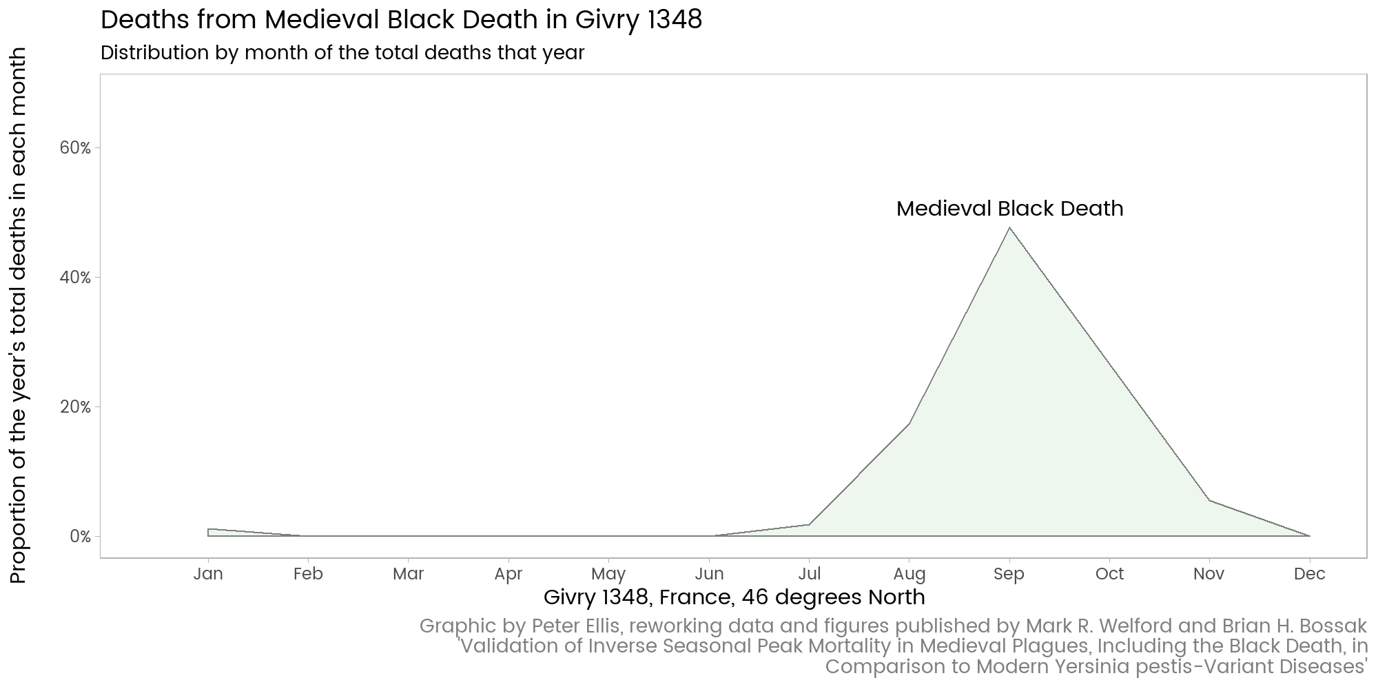
A reworking of Welford and Bossak's graphic showing seasonality of deaths in historical plague outbreaks.
Intercontinental silver flows in the seventeenth and eighteenth centuries
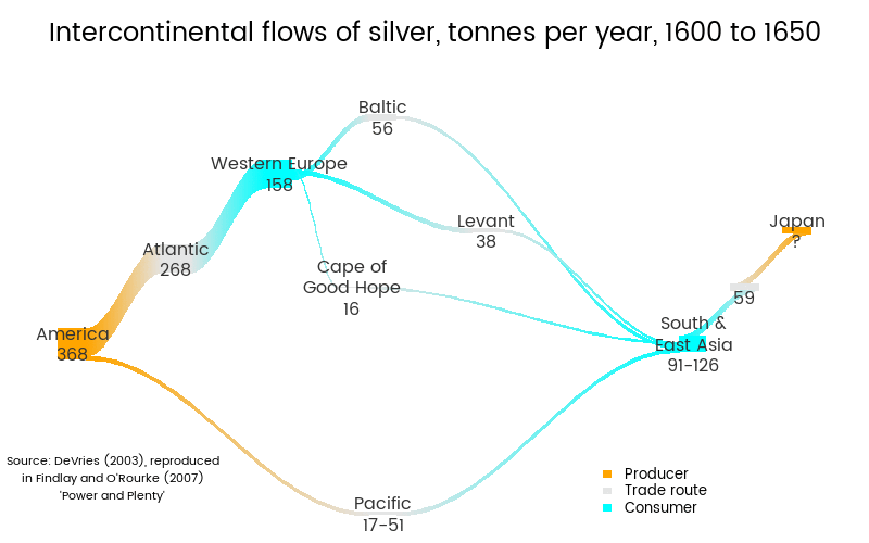
A reworking of Jan DeVries' diagrams showing the best available estimates of the volume of trade in silver in the seventeenth and eighteenth centuries.
Military expenditure over time
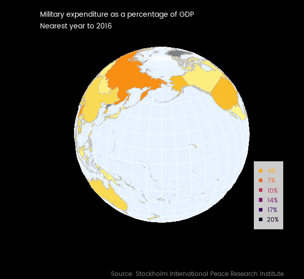
A exploration of choropleth maps of the whole world, with animations and interactive versions. The interactive version is best for most users, particularly if they want to zoom in and hover over countries to get details; but the spinning globe is very eye-catching.
Intra-national inequality over time
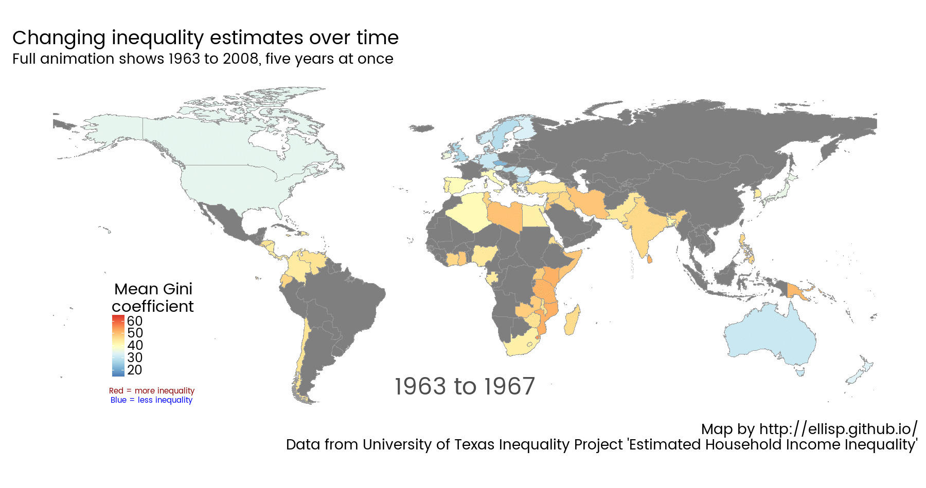
Data from the Estimated Household Income Inequality data led by James K. Galbraith, turned into an animated world map in this blog post.
New Zealand economy and society
Benefits recipients by age, sex and ethnicity
Data from Ministry of Social Development, and explained in New Zealand data on GitHub. This chart is interactive - choose classification of beneficiary to split the data by, and type of chart, and zoom in on a time period.
Income distribution by occupation, region, hours worked, age, sex and ethnicity
Data from Statistics New Zealand's New Zealand Income Survey, with modelling by random forests explained in "Filling in the gaps - highly granular estimates of income and population". This chart is interactive - choose a hypothetical combination of variables to see the expected distribution of incomes for that sort of person (who may or may not exist in New Zealand!). Try the full screen version.
Electronic card transactions in New Zealand

Data published by Statistics New Zealand. Read more about how this image demonstrates seasonal adjustment on the fly with X13-ARIMA-SEATS and ggplot2.
New Zealand cross-district/city commuter patterns
Drawn from the New Zealand Census 2013. Read more about these data and network charts. This graphic is interactive - hover over the points, or drag them around the screen.
Distribution of weekly income in New Zealand, showing negative and zero values too

Drawn from the New Zealand Income Survey 2011 simulated unit record file. Read more about this method of transforming economic data with inconvenient negative and zero values.
Weekly income and hours worked in New Zealand

Drawn from the New Zealand Income Survey 2011 simulated unit record file. Read more about importing and using this data.
Voting behaviour
See also this listing of all my blog posts on voting behaviour.
New Zealand election forecasts

I've developed and keep up to date several forecasting models for the New Zealand 2017 general election. Pictured is the latent voting intention from the Bayesian state space model. It nicely illustrates the importance of correcting for polling firms' "house effects" - under- or over-estimates of the actual election-day vote.
National voting intention polls in the USA

Exploration of the wide range of estimates of intended vote in national polls for the 2016 US Presidential election.
Individual level voting analysis

Analysis showcasing methods such as multiple imputation, generalized additive models and the bootstrap, of individual characteristics of party voters in the 2014 New Zealand general election..
Votes by location in 2014 in New Zealand
Analysis of the 2014 general election in New Zealand with the `nzelect` R package is explained in this post.
Explore the application in full screen.
Time series
A polished up view of Arctic sea ice

A polished up version of a popular graphic of how the extent of Arctic sea ice is on the decline, described in this post.
What happens when you ignore the autocorrelation?
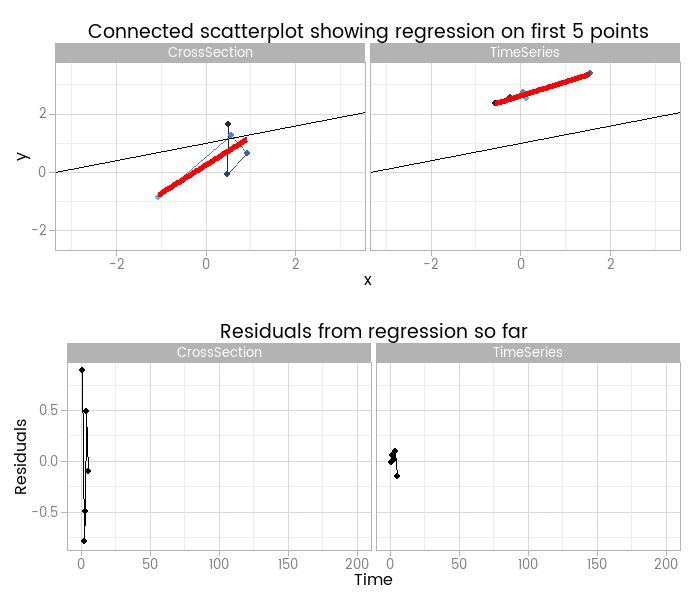
Animated comparison of data from the same structural model but differing random components, with linear models fit as the sample size increases, explained in this post on linear models with a time series component.
Simulating ARIMA time series from white noise
Animated demonstration of how a single white noise series forms the basis of auto-regression, moving average, and integration to form a complex time series. Explained in this post.
{ggseas} R package for seasonal adjustment and decomposition on the fly

My ggseas package for R allows you to easily incorporate seasonal adjustment and seasonal decomposition into an exploratory data analysis workflow based around ggplot2. Read more about it in this post.
Backgammon
Probability of winning a backgammon match given two Elo ratings and match length
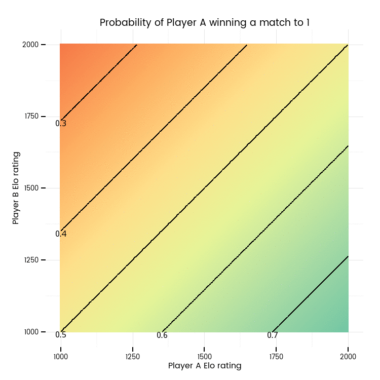
Based on the formula for players' ratings on the First Internet Backgammon Server (FIBS) and explained in Simulating backgammon players' Elo ratings.
Simulated Elo ratings in two player tournament

A simulation of random fluctuation in Elo ratings for two players playing 10,000 5 point matches at a consistent level of skill, Player A with a 0.6 probability of winning each match, explained in Simulating backgammon players' Elo ratings.
Luck more important than skill

Playing well in backgammon helps, but as you often play similarly skilled players luck is in general much more important.
Other and misc.!
Interactive exploration of control charts
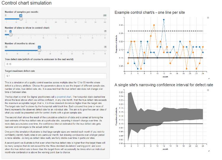
A Shiny web app to help explore what you'll see in p-control charts with different values of the true defect rate, sample size, and acceptable defect rate. Read more about it in this blog post or visit the full app.