New Zealand general election forecasts

This page provides probabilistic predictions for the 2017 New Zealand General Election from “Model A”. The preferred approach in these times of volatility is a hybrid model that combines Model A with Model B.
Both models draws on multiple opinion polls, but go a step beyond a straightforward poll aggregator in that the estimated voting intention from successive polls is used to forecast the chances of each party to actually win seats on election day, taking into account uncertainty. Polling results are also adjusted to take into account different polling firms’ past performance in predicting different parties’ results.
This page is updated periodically as more data become available.
- All material changes are described in this changelog.
- Source code for the analysis, including all committed changes, is available in the nz-election-forecast repository on GitHub
- Source code for the write up, including all committed changes, is available in my blog repository on GitHub
- An alternative approach using state space modelling is available as Model B.
The scenarios outlined in the graphic are defined as:
- “National led coalition similar to 2014” - Under this outcome, the National, Māori, ACT and United Future parties between them would have a majority of seats in Parliament (as per the post-2014 government); but National do not have enough to govern by themselves. This scenario does not distinguish between the many possible subsets of this outcome (eg many of these simulated results involve one of the coalition partners not being essential to form a government).
- “NZ First needed to make government” - In this scenario, neither the National/Māori/ACT/United Future nor the Labour/Green combination would have a majority of seats, but one or (more frequently) either of them could form a majority with support from New Zealand First. Note that this includes some scenarios where Labour + Greens + New Zealand First seats exactly tie with National + Māori + ACT + United Future.
- Other scenarios should be self-explanatory
For simplicity of presentation, no attempt has been made to identify separately all possible scenarios encompassed in the outcomes described above. You can play at building your own coalition with an interactive web app which also lets you tweak the assumptions of allocation of nine key electorate seats (see below).
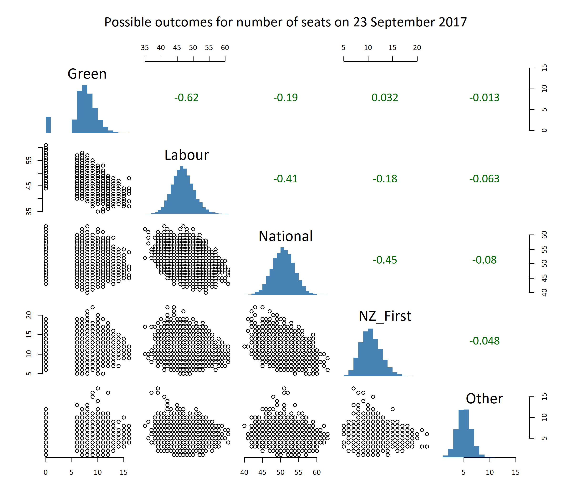
Here are the actual projected seat counts. Note that there is correlation between the predicted seat counts of various parties, which stops us from just adding up the likely values of the various parties. For example, if Labour does particularly well, it will be at least to some extent at the expense of the Greens (going on past results). the projections at the top of this page take this into account, but it isn’t visible in the histograms in the next chart:

How does it work?
The predictions are simulations based on a model which smooths all polling numbers since the 2014 election and projects the trend forward. The model controls for “house effects”, estimates of the amount that different polling firms over- or under-estimate the party vote of different political parties, based on polling firms’ performance in the four previous elections. This adjustment process (amongst other minor changes) generally slightly increases the expected vote for New Zealand First, and decreases it for the Greens, compared to published poll numbers.
The graphic below shows this smoothing model, and the forecasts up to election day, of the underlying tendency for party vote for each party:

The model provides an estimate of the range of party vote outcomes for each of nine political parties for which there are sufficient polling data to make predictions. Voting outcomes are uncertain not just because of the sampling error (this is the margin of error, typically around 3.1% for this sort of variable, usually quoted with survey results in the media and is the uncertainty associated with random sampling with no other sources of error), but because of hard-to-determine non-sampling error, and because of genuine changes in voting intention over time. As more polls become available closer to the election, the prediction intervals provided in the graphic above are expected to narrow.
Party vote is strongly (usually negatively) correlated between parties because parties are competing for the same voters. I get around this by modelling vote as a multivariate normal distribution on a logit scale. The mean and covariance matrix of the distribution on election day are estimated from a generalized additive model implemented in Simon Woods’ mgcv R package. Simulations are done with mvrnorm from Bill Venables’ and Brian Ripley’s MASS R package.
The simulations take into account not only the uncertainty in the forecast of the underlying party vote, but the randomness associated with individual election days. This is the individual level randomness from our statistical model, even after we have an uncertain estimate of the expected value of vote for each party.

The conversion of party vote to seats depends on whether parties exceed the 5% threshold and/or hold an electorate seat. The key electorate seat outcomes are simulated by a very primitive basis:
- Ohariu is assumed to go to United Future 60% of the time, Labour 40%
- Epsom is assumed to go to ACT 80% of the time, National 20%
- The seven Māori electorates are estimated to go to Labour proportionately to their 2014 vote in each electorate with probability \(\frac{Labour2014}{Labour2014 + 0.9 (Mana2014 + Maori2014)}\), and to Mana (Te Tai Tokerau) or the Māori party (the other six electorates) other times
These assumptions are not terribly data-driven, but are better than simply assuming that existing electorate representatives stay the same. Any improvements welcomed; as far as I’m aware there simply aren’t data available to do much better than arbitrary assumptions for these individual electorates.
Seat allocation computation from the simulated party vote results uses the Sainte-Lague allocation formula as implemented in my nzelect R package, which I am confident matches the approach used by the Electoral Commission. All the simulated seat allocations are available for download.
The graphic below shows the simulated outcomes in terms of seats for the various parties in relation to eachother. The numbers in green in the upper right of the chart are correlation coefficients between outcomes in the different simulations; for example, number of Labour and National seats are strongly negatively related to eachother: simulations where National get lots of seats generally means Labour do badly, and vice versa.

You can explore a wider range of coalition possibilities, and tweak the assumptions for individual electorates, with this interactive web app.
Predicting the 2014 election from March 2014 data?
The test for any forecasting method is how it goes at predicting real life results, pretending to come from a position of ignorance. So I used the same method to predict the results of the 20 September 2014 election, limiting myself to data up to 20 March 2014. This meant repeating the house effects estimation with a smaller dataset, refitting the models, etc. I cut a few corners, particularly on the Māori electorates where I just allocated them 50/50 to Labour or someone else; I can’t realistically say what arbitrary guess I would have made three years ago, but I don’t think it makes that much difference.
The results aren’t too bad for a six-month out prediction. In the end, the Green party exceeded these expectations with 10.7% of the party vote, and New Zealand First got 8.7% (out performing the polls materially). Labour under-performed compared to this retrospective prediction, getting only 25.1% of the party vote. The downwards curve in intent to vote for Labour in that election cycle was only just becoming apparent six months in advance - see the chart below. The National Party final party vote in 2014 was 47.0%, within the prediction interval.

If I’d applied this method in March 2014, I would have identified the actual results (which were, very narrowly, a National-led coalition) as the most probable outcome:

Reflections
I strongly recommend reading Nate Silver’s reflections on The Real Story of 2016 about polls, forecasts and political analysis in the 2016 US Presidential election, much of which is relevant in other electoral situations. It includes this gem:
“…there are real shortcomings in how American politics are covered, including pervasive groupthink among media elites, an unhealthy obsession with the insider’s view of politics, a lack of analytical rigor, a failure to appreciate uncertainty, a sluggishness to self-correct when new evidence contradicts pre-existing beliefs, and a narrow viewpoint that lacks perspective from the longer arc of American history.”
Caveat and disclaimer
This page is not associated with any political party, media or commentator. I have made every effort to provide a transparent, technical probabilistic forecast of the election results and limit any subjective judgement to technical matters relating to model building. No political judgement or interpretation is to be inferred from these forecasts. Even more than is always the case, this page has no connection whatsoever to my day job.
Non-politicised corrections, reactions or suggestions are welcomed - use the comments section below or log an issue with the source code repository on GitHub. There are some known areas for follow up already such as:
- weight polling observations proportionately to sample size - I only haven’t done this because I don’t have the sample size data convenient to hand. If/when I add sample sizes to the
nzelectR package I will incorporate it into the analysis here too. - compare this simple approach to a more formally specified Bayesian latent state space model. I’m keen on doing this but it’s less familiar territory for me; and I’m suspicious that it will be extremely computationally intensive (eg multiple days of processing). Will get around to it sooner or later.