free range statistics
I write about applications of data and analytical techniques like statistical modelling and simulation to real-world situations. I show how to access and use data, and provide examples of analytical products and the code that produced them.
Recent posts
Sankey plots can work, but need polishing like any other graphic
25 June 2025
I set out to improve a Sankey plot that had been shared as an example of how bad they are, and hopefully show that some careful design decisions and polish can make these plot useful for purposes like seeing cohorts' progress (up, down, same) over time.

More on power and 'fragile' p-values
14 June 2025
Some more comprehensive simulations of what happens to 'fragile' p values (those between 0.01 and 0.05), when the actual power differs from the minimum detectable difference that an 80% power calculation was depended upon to set the sample size.

Power and 'fragile' p-values
08 June 2025
What proportion of significant p values should be between 0.01 and 0.05? Turns out the answer is 'it depends'.

Animated population pyramids for the Pacific
17 May 2025
How to produce an animation of demographic patterns in Pacific island countries and territories from 1950 to 2050, in just a few lines of code.

World Economic Outlook
26 April 2025
I have a quick look at the latest World Economic Outlook released by the IMF, with a particular eye on the economic growth forecasts for Pacific island countries. The Pacific countries that have had the biggest revision downwards in their growth prospects over the six months since the last Outlook are the three in the Compact of Free Association with USA (Palau, Marshall Islands, and Federated States of Micronesia), plus Fiji.

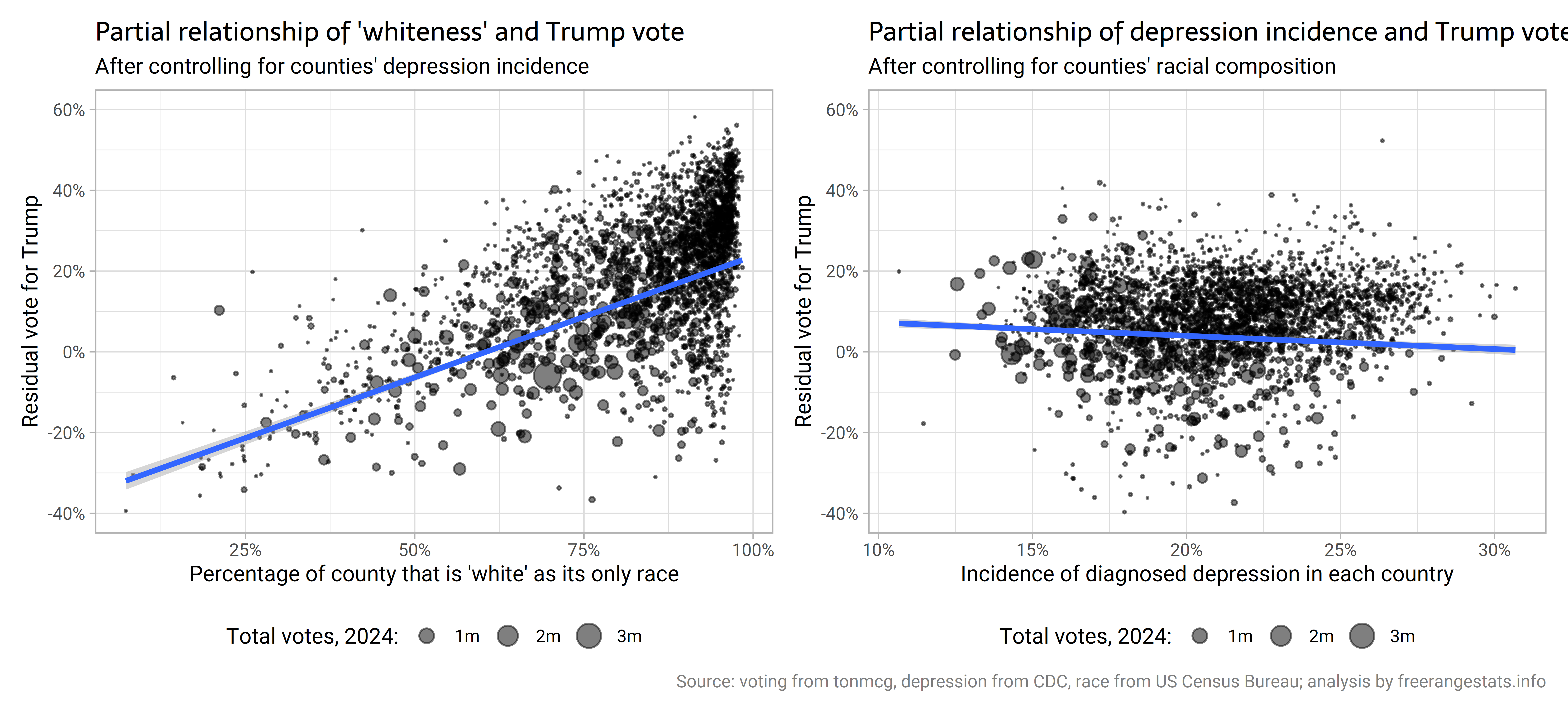
Revisiting depression incidence by county and vote for Trump
03 January 2025
I expand on my last post, to see if the relationship between depression and voting for Trump at county-level persists when you control for the racial composition of counties (it doesn't).
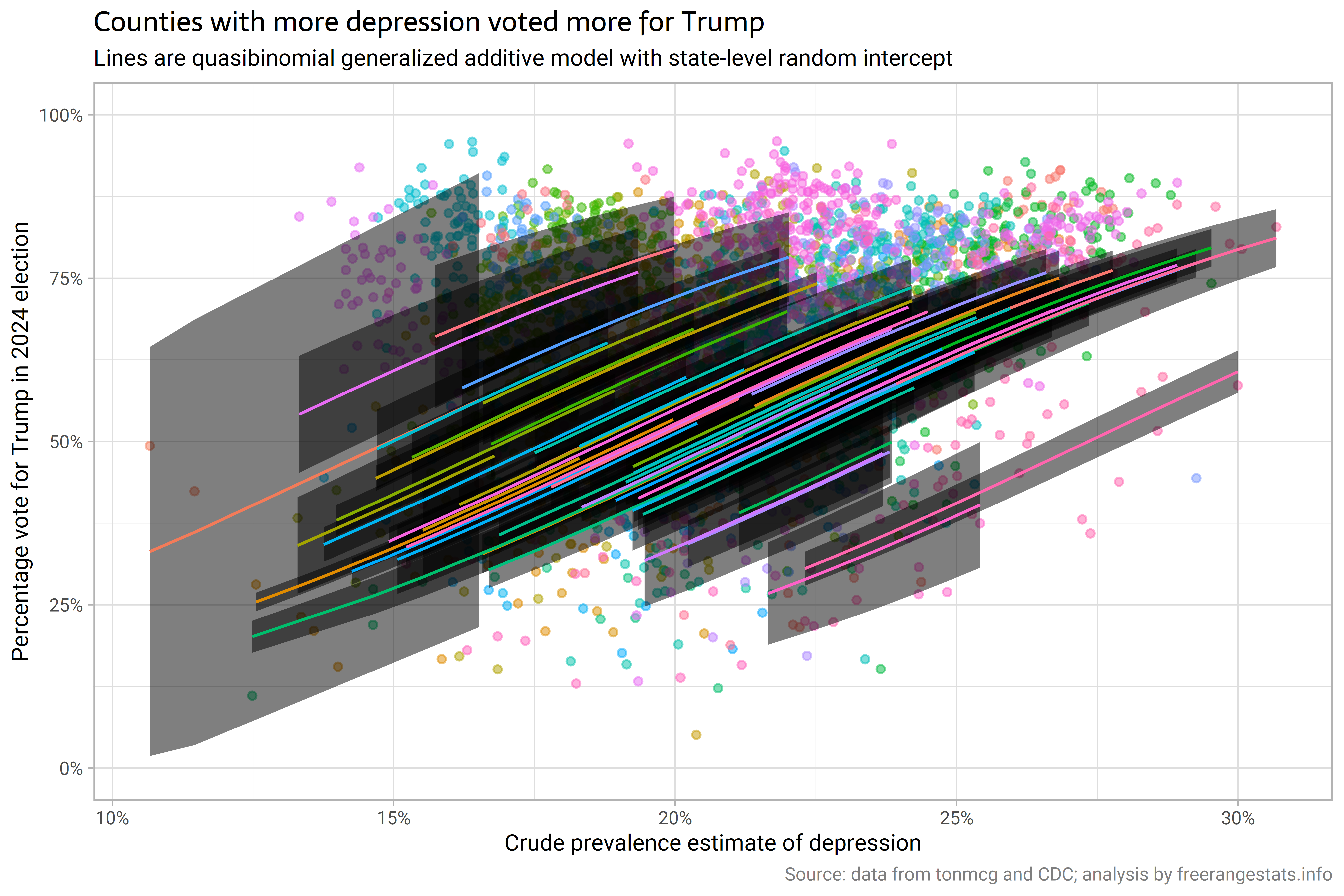
Depression incidence by county and vote for Trump
23 December 2024
Multi-level modelling with spatial auto-correlation! I look at county level data on incidence of depression in 2020, and voting for Trump in the 2024 US Presidential election, and conclude that there's something there, but of course there are lots of potential explanations of what is behind the relationship.
Death rates by cause of death
14 December 2024
I explore death rates by cause of death with OECD data, for the USA and other countries. Causes of death that are relatively high in the USA include assaults, accidents, suicides; diseases of the nervous systems (including Alzheimer's); and diseases of the circulatory system (including heart attacks).

Simulating Ponzi schemes
30 November 2024
I write a function to simulate Ponzi schemes with various types of 'investor' growth, withdrawal rates, and extraction by the scammer / owner of the scheme.

Design effects for stratified sub-populations
16 November 2024
I look at the two different sorts of design effects that Stata will report for estimates from sub-populations of a complex survey, which vary depending on whether or not the hypothetical simple random sample we are comparing the complex survey to has the same sub-population sample sizes as the actual sample.
