Global choropleth maps
Today I’m writing about using country-level choropleth maps at a global level, using example data showing nations’ military spending as a percentage of GDP. There are a few specific issues to work through as a result of the global coverage. I’m going to start with my two preferred end results.
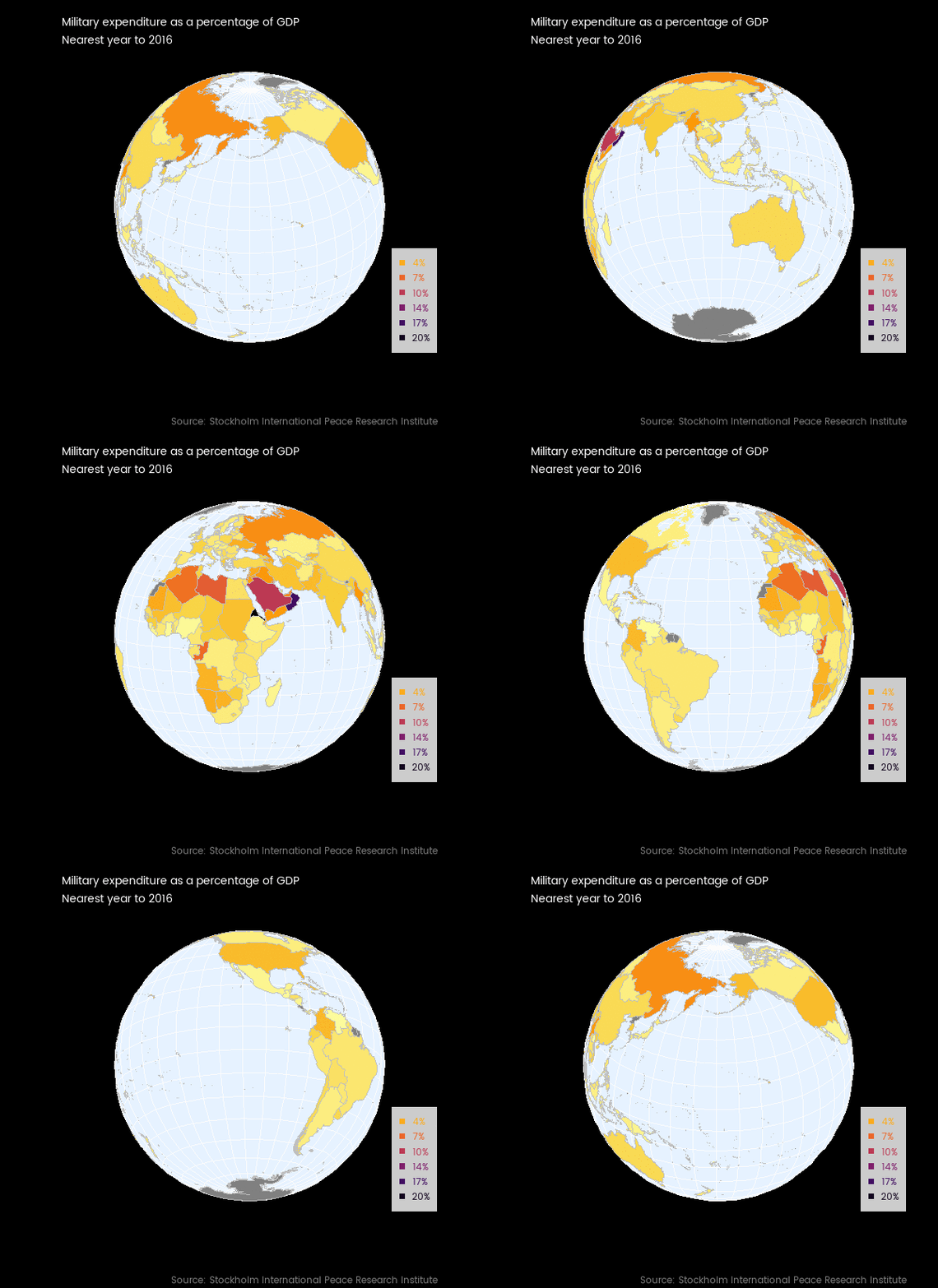
First, here’s a Twitter-friendly rotating globe:

There are a few problems with it I didn’t quite finish. If you watch it long enough you’ll see a few times Canada, the USA or Russia flicker out of the frame. More on that below.
Second, here’s an interactive version, suited for a fully featured web browser:
I find this the most useful version, even though I prefer to look at the rotating globe. The ability to hover over a country to get its name and value, and to zoom into a particular region, adds real value to the visualization. This is really the minimum people expect out of what I call micro-interactivity (I’m sure there’s a proper, technical name) - ability to zoom and get useful information when hovering.
Unless you spend a lot of time looking at maps of the Middle East, you probably wouldn’t have identified those two dark patches of high military spending as Oman and Eritrea, without the help of the hovering tooltips.
Caveat for today’s post - I’m not a GIS expert at all, and in fact am barely into the “conscious incompetence” stage. So there may be mistakes in what follows, and there are almost certainly better ways to do some of what I’m doing.
Data on military spend
First I needed some example data. Choropleth maps are appropriate for variables like proportions and growth rates rather than absolute numbers. Military spending as a percentage of GDP was in the news when I started this, because of USA President Trump drawing attention (in somewhat misleading terms) to the pledge by NATO leaders in 2014 to spend 2% of their GDP on the military by 2024 (the 2% was described as an unofficial floor as early as 2006, but only committed to at the leadership level in 2014 in the atmosphere of nervousness after Russia’s actions in the Ukraine). With seven years to the commitment deadline, it is widely reported that only five countries have yet passed the 2% figure, usually listed as the United States, Greece, United Kingdom, Estonia and Poland. Interestingly, the data I’m using suggest the UK is currently just under 2% and France just over, slightly different to some of the media reporting.
Often my first port of call looking for internationally comparable data is the World Development Indicators of the World Bank. While they are the definitive origin of very little data, the World Bank does a great job in collating data from other sources and making it available in their visualisation tool. There’s also Vincent Arel-Bundock’s handy WDI R package which makes it easy to get the data from the Bank into your own analytical tool.
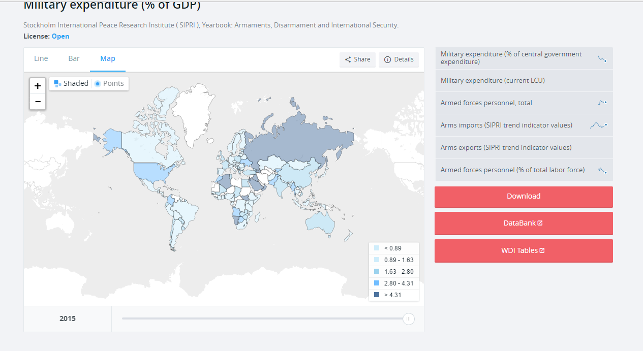
When I started this exercise a couple of weeks ago, I was able to create this choropleth map from the very friendly WDI visualisation tool:

(but interestingly, returning to the site today, I can’t reproduce it). Anyway, there’s a few things that leave me not happy with it:
- The data only go to 2015, whereas the data from the source goes up to 2016 in many cases.
- The Mercator projection of the world map - according to xkcd’s brilliant summary of ‘what your favorite map projection says about you’, Mercator says “you’re not really into maps”. There are several problems, but for me it’s all summed up by Greenland looking way too large.
- There’s a great ability to use the slider at the bottom of the map (not in the above screenshot though) to cycle through the years, but the scale of the colour fill recalibrates itself each year so this doesn’t allow a coherent view of change over time.
- the colour scheme isn’t particularly good at drawing out differences between countries.
So I went to the source, the Stockholm International Peace Research Institute (SIPRI), who collate data from governments around the world into a Yearbook and publish the data separately - at the time of writing, with data from 1949 to 2016, using the countries that exist in 2016 (ie no East Germany, Soviet Union, etc; data for the Russian Federation, Ukraine, etc begins in 1992 or soon after).
Data exploration
If we plot all the data for all the countries and years at once, it looks like this:
First thing you might notice is the massive spike. That turns out to be Kuwait in 1991, when it spent 17 percent more than its GDP on military - the kind of thing that happens when you’re invaded and become the battleground for what in the USA is referred to as the First Gulf War.
In case you’re wondering, there’s no reason why a country can’t spend more than its GDP on the military (or anything else). In fact, while they are both measured in dollars, GDP is not really the same sort of variable as spend. GDP is the sum of value add of economic activity in the country. If spending is on imported goods and services it can exceed GDP. Similarly, while we see economic indicators like “exports as a percentage of GDP” in use (and it is a good indicator of the importance of trade), there’s no ceiling of that indicator at 100%, and countries like Luxembourg, Singapore, Malta and Ireland do in fact exceed 100%.
Here’s the code to download and import the SIPRI “military as a percentage of GDP” data into R and draw that first graph:
# Load in all the packages we need for the full post
library(cshapes)
library(tidyverse)
library(forcats)
library(scales)
library(openxlsx)
library(directlabels)
library(ggthemes)
library(RColorBrewer)
library(countrycode)
library(maps)
library(viridis)
library(leaflet)
library(rworldmap)
library(sf)
library(maptools)

#------------download------------
tf <- tempfile()

download.file("https://www.sipri.org/sites/default/files/SIPRI-Milex-data-1949-2016.xlsx",
              destfile = tf, mode = "wb")

#---------------import and tidy----------
sipri <- read.xlsx(tf, sheet = "Share of GDP", startRow = 6) %>%
   gather(Year, Value, -Country, -Notes) %>%
   mutate(Value = as.numeric(Value),
          Year = as.numeric(Year)) %>%
   filter(!is.na(Value))

#----------------exploratory chart-----------
sipri %>%
   ggplot(aes(x = Year, y = Value, colour = Country)) +
   geom_line() +
   theme(legend.position = "none") +
   scale_y_continuous("Military expenditure as a percentage of GDP", label = percent) +
   ggtitle("Countries' and regions' expenditure on military as a percentage of GDP") +
   labs(caption = "Source: Stockholm International Peace Research Institute", x = "")
As further exploration, I picked the five so called “Five Eyes” countries. I have a little familiarity with their military history so thought this could be a useful way of checking I understood the data. Here is military spend as a percentage of GDP for those five countries, with major conflicts they were involved in indicated in a timeline.
The dates of the conflicts are just taken from Wikipedia.
The spikes in spending clearly and unsurprisingly relate to conflicts or other known political events, most obviously:
- The Korean war led to a big spike for all four countries that had data available.
- The surge in intensity (of their involvement) in the Vietnam war led to spikes for the USA and Australia.
- There was a blip in UK military spending at the time of the Falklands war, but it did not arrest the overall downwards trend, even more marked since significant military conflict in Northern Ireland finished.
- The early 1980s military boom for the USA was the Reagan administration ratcheting up the Cold War as well as militarily engaging in other countries in ways too numerous to show.
- The wars of the George W. Bush era in Afghanistan and Iraq, attempts to create a formal “War on Terror”, temporarily reversed the secular decline in the economic importance of US military spending.
Code for drawing this chart (I’m not particularly happy with the manual data entry for the conflicts and their dates, but it will do for a one-off thing like this):
wid <- 0.01 # width of annotation bars
wars <- data_frame(
   name =          c("Malaysia",  "Korea",     "Aden",        "Vietnam",   "Northern Ireland", "Falklands",  "Gulf",      "Afghanistan",  "Iraq"),
   start = as.Date(c("15/6/1948", "25/6/1950", "10/12/1963",  "1/11/1955", "1/1/1968",         "2/4/1982" ,  "2/8/1990",  "7/10/2001",   "20/3/2003"),
                   format = "%d/%m/%Y"),
   end =   as.Date(c("12/7/1960", "27/7/1953",  "30/11/1967", "30/4/1975", "30/6/1998",        "14/6/1982", "28/2/1991","28/12/2014",   "18/12/2011"),
                   format = "%d/%m/%Y"),
   lead =        c("UK",         "USA",      "UK",            "USA",        "UK",              "UK", "USA",         "USA",         "USA")
) %>%
   mutate(name_seq = n():1,
          ystart = wid * name_seq + 0.12,
          yend = ystart +wid )

countries <- c("Australia", "New Zealand", "USA", "UK", "Canada")
palette <- brewer.pal(5, "Set1")
names(palette) <- countries

p <- sipri %>%
   filter(Country %in% countries) %>%
   mutate(YearDate = as.Date(paste0("30/6/", Year), format = "%d/%m/%Y")) %>%
   ggplot() +
   geom_rect(data = wars, aes(xmin = start, xmax = end, ymin = ystart, ymax = yend, fill = lead),
             alpha = 0.2) +
   geom_text(data = wars, aes(x = end, y = (yend + ystart) / 2, label = name),
             colour = "grey50", hjust = 1, nudge_x = -200, size = 3) +
   geom_line(aes(x = YearDate, y = Value, colour = Country)) +
   scale_y_continuous("Military expenditure as a percentage of GDP", label = percent,
                      breaks = c(0, 5, 10, 15) / 100) +
   ggtitle("Selected countries' expenditure on military as a percentage of GDP",
           "'Five eyes' countries only; periods also shown for conflicts in which they had material deployments") +
   labs(x = "",
        caption = "Source: Stockholm International Peace Research Institute") +
   scale_colour_manual(values = palette) +
   scale_fill_manual(values = palette, guide = "none") +
   theme_tufte(base_family = "myfont") +
   theme(plot.caption = element_text(colour = "grey50")) +
   annotate("text", x = as.Date("1970/6/30"), y =0.145, hjust = 0.5,
            colour = "grey50", size = 3,
            label = "Not shown - Grenada, Panama, Balkans,\nLibya, Lebanon, Haiti and numerous smaller...")

direct.label(p)
Different world projections
OK, time for maps. First I wanted to sort out some projections for flat versions of the world. ggplot2 makes this convenient. You can define a single map object, and just add a different version of + coord_map() to it to get a different projection. Here are two which worked quite nicely:
Globular projection
Projection with bilateral symmetry about the Prime Meridian and the equator. Hemisphere is circle, circular arc meridians equally spaced on equator, circular arc parallels equally spaced on 0- and 90-degree meridians:
Orthographic projection
Viewed from infinity, centering on 20 degrees latitude, 20 degrees longitude:
Code for the basic maps
There’s a bit of work to be done to join the military spend data to a map data. Most importantly I need a country code. The countrycode package is a great example of a specialist package that does one thing well; what it does is convert country names or codes between eachother. For my use case, I want everything to be the ISO three character code (eg NZL for New Zealand). Once this is done, all that is required is to create a flat ggplot-ready version of a map shape file and join the two data frames together.
In the code below I create a single ggplot2 object worldmap which is an un-projected world choropleth map complete with the information on colour scale (I use viridis inferno), legend, captions, etc. Then I can add whatever projection I want (final two lines of code in the chunk below.
#===============map prep========================
sipri <- sipri %>%
   mutate(iso3c = countrycode(Country, "country.name", destination = "iso3c")) %>%
   # two manual concordances of country code:
   mutate(iso3c = ifelse(Country == "Kosovo", "KOS", iso3c))

# for some reason the tidyverse doesn't work for Central African Republic!
# so we fix it old school:
sipri[sipri$Country == "Central African Rep.", "iso3c"] <- "CAF"

world <- map_data("world") %>%
   mutate(iso3c = countrycode(region, "country.name", destination = "iso3c"))

# data on military for just the latest year for each country
the_data <- sipri %>%
   group_by(Country) %>%
   filter(Year == max(Year))

# using the help at http://ggplot2.tidyverse.org/reference/coord_map.html

world2 <- world %>%
   left_join(the_data, by = "iso3c")

# define a ggplot mapping object
worldmap <- ggplot(world2, aes(x = long, y = lat, group = group, fill = Value)) +
   geom_polygon(colour = "grey75") +
   scale_y_continuous("", breaks = (-2:2) * 30) +
   scale_x_continuous("", breaks = (-4:4) * 45) +
   scale_fill_viridis("", label = percent, option = "inferno", direction = -1) +
   theme_minimal(base_family = "myfont") +
   theme(legend.position = "right",
         axis.text = element_blank()) +
   ggtitle("Military expenditure as a percentage of GDP",
           "Most recent data shown for each country; mostly this is 2016") +
   labs(caption = "Source: Stockholm International Peace Research Institute")

#-------------single map, nice projection-------------------
# Lots of the projections in coord_map have problems with drawing
# polygons.  ok are: globular, harrison
worldmap +   coord_map("globular")

worldmap +   coord_map("orthographic", orientation = c(20, 20, 0))
Animated choropleth over time
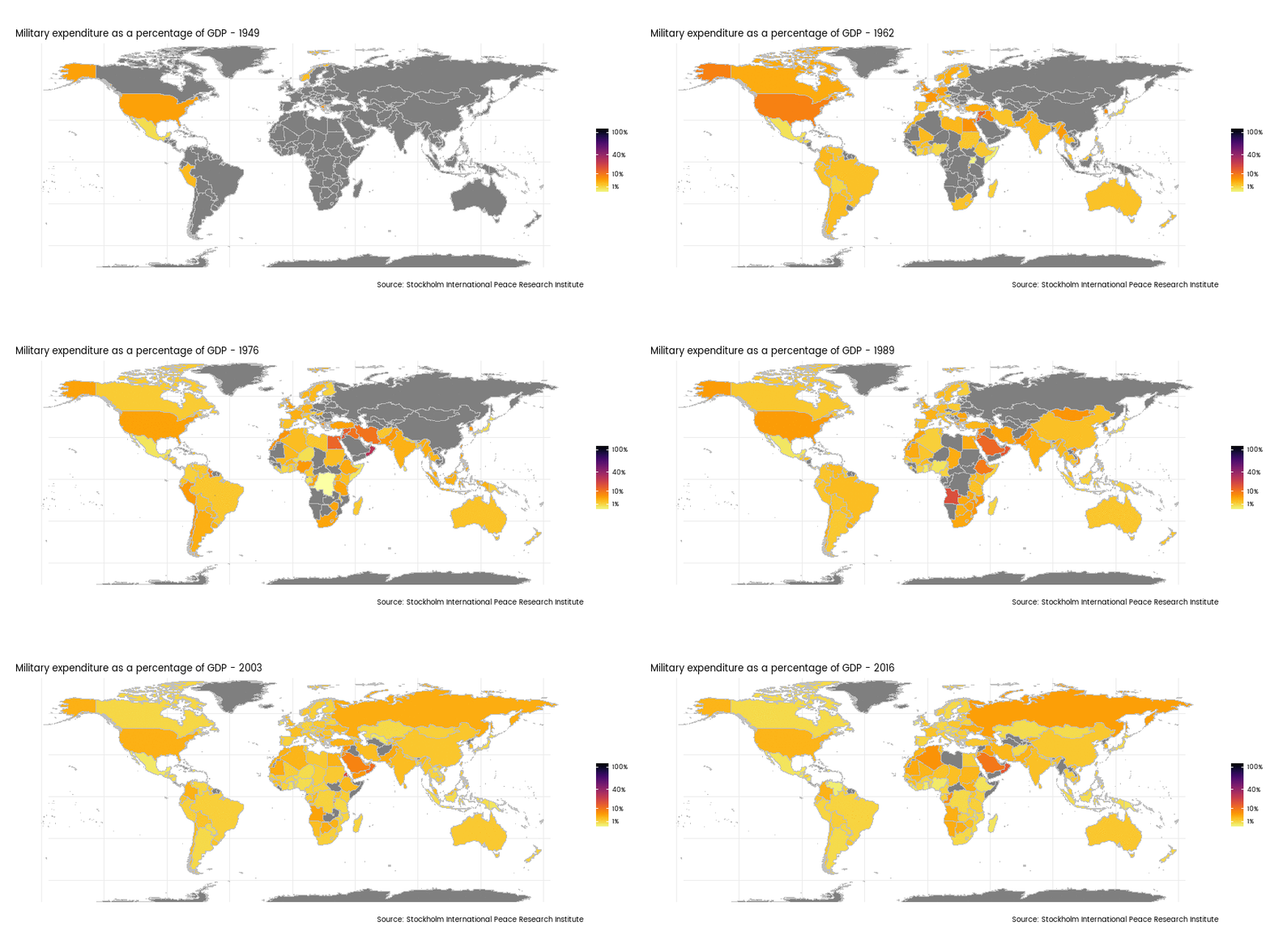
Remebering my reservations with the World Development Indicators site, one of my aims was to have a choropleth map that showed military expenditure as a proportion of GDP for different years, with colour on the same scale. An animated graphic is the obvious way to do this:

… but it has imperfections:
- Because of the few year-country combinations with massive spikes (eg Kuwait in 1991), I needed to use a logarithm transform on the scale or everything looked the same colour.
- The slowly changing dimension of country existence proves a real problem, with data before the 1990s sadly lacking.
- Data existence in general tends to dominate the visual; so rather than a feel for how military expenditure changes over time, the impression one gets is of more data gradually becoming available over time.
Not really a success. Nonetheless, a nice idea (I think) and here’s the code that does it. It’s basically the same idea as the previous chunk of code, but in a loop that repeats the data filtering and joining for each value of year, and saves a single frame for each printed annual map.
#================animated map over time===============
setwd("C:/temp1") # or whatever folder you want to hold the frames in
years <- unique(sipri$Year)

for(i in years){

   this_year_data <- sipri %>%
      group_by(Country) %>%
      filter(Year == i)

   world2 <- world %>%
      left_join(this_year_data, by = "iso3c")

   worldmap <- ggplot(world2, aes(x = long, y = lat, group = group, fill = Value)) +
      geom_polygon(colour = "grey75") +
      scale_y_continuous("", breaks = (-2:2) * 30) +
      scale_x_continuous("", breaks = (-4:4) * 45) +
      scale_fill_viridis("", label = percent, option = "inferno", direction = -1,
                         limits = range(sipri$Value), trans = "sqrt",
                         breaks = c(1, 10, 40, 100) / 100) +
      theme_minimal(base_family = "myfont") +
      theme(legend.position = "right",
            axis.text = element_blank()) +
      ggtitle(paste("Military expenditure as a percentage of GDP -", i)) +
      labs(caption = "Source: Stockholm International Peace Research Institute")

   png(paste0(i, ".png"), 12 * 72, 6 * 72)
      print(worldmap +   coord_map("harrison", dist = 1, angle = 30, ylim = c(-75, 85)))
   dev.off()
}

# Use ImageMagick to convert all those PNG frames into a single animated GIF
# (requires ImageMagick to be separately installed)
system('magick -loop 0 -delay 40 *.png "0099-military-gdp-time.gif"')
Animated globe
Finally, on to the two “good” versions of the data. Here’s a reminder of the animated globe:

The strategy is to create 360 different snapshots of the globe, each one 1 degree changed in longitude and latitude from the previous. Longitude moves 1 degree each frame in the same direction, latitude meanders from 30 degrees north to 30 degrees south and back again.
I had to leave the ggplot2 universe to do this (but I’m not sure I had to). I couldn’t get my projections of the ggplot2 version of the globe to work with enough values of latitude and longitude as the centre point. Whenever one of the larger countries like Russia, China or Canada was split in two ggplot2 would draw the polygons in ugly ways. My best effort can be seen in this tweet - which also has some very useful comments and suggestions in response.
In the end I adapted the suggestion of Edzer Pebesma, which is included in a demo in his amazing sf package. I don’t really understand exactly how it successfully clips the polygons, but it works nearly entirely well.
There were still quite a few frames where countries went missing altogether for the wrong combination of latitude and longitude. Experimenting with different versions of world maps, I found that some were vulnerable to different combinations from others. To reduce the problem, I made each frame of the end animation actually two globes of countries drawn on top of eachother - to increase the chance that at least one of the maps draws each country. This reduced the missing country problem to only three or four frames.
Here’s the code that does that:
#------------sf approach------------------
# this solution came from the demo in the sf package, tweeted about at
# https://twitter.com/edzerpebesma/status/835249468874321920
circ <- function(l = c(-180:180), lon0 = 0, lat0 = 30) {
   deg2rad = pi / 180
   lat = atan(-cos((l - lon0) * deg2rad)/tan(lat0 * deg2rad)) / deg2rad
   xy = if (lat0 == 0) {
      l1 = lon0 - 90
      l2 = lon0 + 90
      rbind(c(l1,-90), c(l2,-90), c(l2,0), c(l2,90), c(l1,90), c(l1,0), c(l1,-90))
   } else if (lat0 > 0) {
      xy = cbind(lon = l, lat = lat)
      rbind(c(-180,90),xy,c(180,90),c(-180,90))
   } else {
      xy = cbind(lon = l, lat = lat)[length(l):1,]
      rbind(c(180,-90), xy, c(-180,-90),c(180,-90))
   }
   st_sfc(st_polygon(list(xy)), crs = st_crs(4326))
}

m <- st_make_grid()

m <- st_segmentize(m, 4e5)


data(wrld_simpl)

# Two versions of the world map, joined to the military/GDP data:
w1 <- st_as_sf(countriesLow) %>%
   left_join(the_data, by = c("ISO3" = "iso3c")) %>%
   mutate(fill = pal(Value))

w2 <- st_as_sf(wrld_simpl) %>%
   left_join(the_data, by = c("ISO3" = "iso3c")) %>%
   mutate(fill = pal(Value))


# latitudes will go from 30 north to 30 south and back again:
lats <- rep(c(30:(-30), (-29):29), 3)
# longitudes will start at 50 and go around backwards:
lons <- c(180:(-179))

dir.create("C:/temp2")
setwd("C:/temp2")


# Frame 234 goes missing if using wrld_simpl
# Frame 269 goes missing if using countriesLow or wrld_simpl
# etc
for(i in 1:length(lons)){
   png(paste0(1000 + i, ".png"), 600, 550, res = 100)
   par(mar <- rep(0, 4), bg = "black")

   lat <- lats[i]
   lon <- lons[i]

   # define the proj4 string:
   p4s <- paste0("+proj=ortho +lat_0=", lat, " +lon_0=", lon)

   # draw the pale blue globe in space
   blank_globe <- st_transform(m, st_crs(p4s), check = TRUE)
   plot(blank_globe, col = '#e6f2ff', border = 'grey99')

   # create a clipped version of the great circle??
   # I don't really understand what is happening, but it seems to work.
   crc <- circ(lat0 = lat, lon0 = lon)
   w10 <- suppressWarnings(st_intersection(w1, crc))
   w20 <- suppressWarnings(st_intersection(w2, crc))

   # cast and re-project the map itself
   w10 <- st_cast(w10, "MULTIPOLYGON")
   w10 <- st_transform(w10["fill"], st_crs(p4s), check = TRUE)
   w20 <- st_cast(w20, "MULTIPOLYGON")
   w20 <- st_transform(w20["fill"], st_crs(p4s), check = TRUE)

   # draw the map
   plot(w10, col = w10$fill, add = TRUE, border = NA)
   plot(w20, col = w20$fill, add = TRUE, border = "grey75")

   # title and legend
   title("Military expenditure as a percentage of GDP\nNearest year to 2016",
         col.main = "white", font.main = 1, adj = 0)
   title(sub = "Source: Stockholm International Peace Research Institute",
         col.sub = "grey50", adj = 1)

   leg_nums <- seq(from = 4, to = 20, length.out = 6) / 100
   legend("bottomright", legend = paste0(round(leg_nums * 100), "%"),
          pch = 15, adj = 0.1,
          col = pal(leg_nums), text.col = pal(leg_nums),
          bg = "grey80")

   dev.off()
}

system('magick -loop 0 -delay 7 *.png "0099-military-gdp.gif"')
Interactive leaflet choropleth
Finally, there’s the interactive version (my favourite):
To draw this, I used leaflet and went back to sp spatial polygons data frames. The code for this is actually some of the simplest in this post. While most of the examples I’ve seen of leaflet use Mercator projections, it’s possible to reproject your map (so long as you don’t need Google or other map tiles) with a couple of lines of code:
#-------------------------leaflet------------------
shape <- countriesCoarse

# define colour palette
pal <- colorNumeric(
   palette = inferno(10, direction = -1),
   domain = the_data$Value)

# uses the_data defined earlier in the ggplot2 demos
data2 <- shape@data %>%
   left_join(the_data, by = c("ISO_A3" = "iso3c")) %>%
   mutate(tooltip = paste0(ADMIN, " ", Year, ", ", round(Value * 100, 1), "%"))

# EPSG4326 means latitude and longitude
coarse_crs <- leafletCRS(crsClass = "L.CRS.EPSG4326", proj4def = proj4string(countriesCoarse))

shape %>%
   leaflet(options = leafletOptions(crs = coarse_crs))  %>%
   addPolygons(stroke = FALSE, smoothFactor = 0.2, fillOpacity = 1,
               color = ~pal(data2$Value),
               label = data2$tooltip)
Happy mapping!


