New data listing for New Zealand
Wellington’s PrototypeAlex has created a new GitHub repository aiming to list data about New Zealand.
My first reaction was “hmm, will this be an improvement?” After all, we already have data.govt.nz which is meant to be the definitive aggregator of government datasets; we have the Figure.NZ (recently rebranded from “Wiki New Zealand”, as it isn’t really a Wiki and has evolved into something else, still very useful, entirely) which aims to be:
“the place to play with New Zealand’s data”.
And according to PrototypeAlex on Twitter:
“There’s a heap of NZ data/api metalists floating around, so I made another one.”
I think (and am pretty sure so does PrototypeAlex) that the difference is being on GitHub. This means that anyone with a GitHub account can fork his repository, make and commit additions or corrections, and submit a pull request to him. I’ve already done this twice for a bunch of small things I noticed, as have half a dozen others, and he’s pretty prompt at accepting those changes. In effect, Alex can start crowd sourcing his list. Maybe he was inspired by Wiki New Zealand dropping the “Wiki” from their name, because that’s what he’s doing. It’s simple but effective.
It’s a good initiative and I hope it goes well, but there’s a few things to work on. The fact that it’s difficult is shown by the problems others have had. For example both data.govt.nz and opengovt.org.nz try to be catalogues of New Zealand government (national and local) datasets. Both now show up as links from PrototypeAlex’s list (and I think probably rightly - if not, I’d probably be obligated to submit a pull request to correct it, rather than blog about it myself). Both have a number of out of date descriptions, broken links, and the like.
Reflecting on all this, here’s what I think would make the best list possible:
- The list itself should be machine-readable - in fact it should be a database itself, but a super simple one, say a pipe delimited text file. I don’t think any of the options out there do this yet.
- It should have one dataset per entry. opengovt.org.nz and data.govt.nz aspire to this but don’t always achieve it (mostly when the hosts of the data, which I concede includes me in my day-job, have an ambiguous view of what is a dataset).
- Each entry should have metadata - is its format CSV, API, Excel? Ideas of what constitutes a ‘dataset’ clearly vary. Quite a few of the links I’ve tried from the various aggregation sites this morning go to web pages that present datasets in human-oriented summary tables or interactive web-apps, but don’t have an obvious way of downloading the whole thing for re-use. In my view being able to “download the whole thing” (for reasonable definition of “whole thing” of course - more on that in another post) is the minimum requirement for a dataset to be said to be fully open and available. Tables that have been summarised beyond the minimum needed for confidentiality don’t allow this, and in fact many APIs (for other reasons) don’t make it easy either. Analysts are interested in the datasheet of an Excel pivot table, not so much the pivot table itself; so Excel data is ok (not preferred!), but not if the source is hidden or did not get exported from its database.
- It should be correctable by the crowd. The new GitHub version allows this but not others that I’m aware of. Facilitating this is another reason why a text file is the ideal way to store this particular datasets of datasets; technology like Git makes it easy to see who is adding what, and keep track of versions, when it’s all in text.
Example: characteristics of recipients of main benefits
So, inspired by looking at these lists, I had a go at finding some data I could use, to trial end to end identification, download, tidying and use. I wanted something I knew nothing about, and that was definitely not connected to my work. After dealing with a few broken links and data-that-wasn’t-really-data I chose more or less at random the Ministry of Social Development’s Five Year National level datatables. Thanks to MSD for making this available!
I decided to focus on just one of their tables, the “Main benefits in the last 5 years”. The value variable is counts of total number of recipients of that categorisation of benefits in New Zealand. The dimension variables are:
- sex
- age group
- ethnicity
- short term (<1 year) or longer term period on benefits
- time (quarter ending March, June, etc)
The data have been published in aggregate form, which means in this case the first four of those dimensions are only present one at a time. For example, we can say how many males are in the data, and how many people of Pacific background, but can’t disaggregate the Pacific people by sex. This loss of granularity (which limits the analysis that can be done on interaction effects) might be due to confidentiality and data reliability, or it might be a matter of needing to summarise the data somehow to get it into this human-readable workbook.
First problem is to get the data out of Excel into R. My preferred way of doing this is usually the openxlsx package. However, it only works with newer .xlsx files, which are based on XML. For the older .xls files there are a range of options, including the useful XLConnect package which in this case preserves a fair bit (not all) of the formatting information (for example, recognising “143,022” as a number despite the comma in it; and keeping the dates). Here’s how I imported the data. The code below is all in R and should run smoothly end to end.
library(XLConnect)
library(dplyr)
library(tidyr)
library(shinyapps)
#-----------------import data---------------
# Original URL. Use of paste0 here is just to make readable in narrow screen:
url <- paste0(
"https://www.msd.govt.nz/documents/about-msd-and-our-work/publications-resources",
"/statistics/benefit/2015/quarterly-benefit-fact-sheets-national-benefit-tables-june-2015.xls"
)
# Note use of wb mode (for binary file)
download.file(url = url, destfile = "benefits.xls", mode = "wb")
# Import into R
wb <- loadWorkbook("benefits.xls")
benefits_orig <- readWorksheet(wb, "Main benefits - last 5 years",
startRow = 4, endRow = 21, # excluding total deliberately
startCol = 2, endCol = 23,
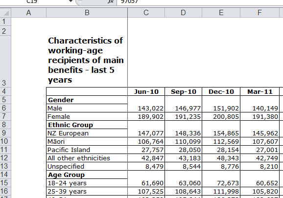
dateTimeFormat = "%Y-%m")Now we have the data in our R environment, we have a job to turn it into a tidy data set. There are two little obstacles, arising from the Excel worksheet we’re using being set up for human rather than computer readers. Here’s how it looks in Excel:
First challenge is that the time variable is spread across columns, rather than being a set of different values in a single column. This is a common issue - the need to convert from ‘wide’ to ‘long’ format - and there are straightforward solutions, of which the best in today’s R environment is the gather function in Hadley Wickham’s tidyr package.
A slightly trickier issue is that the value cells for rows 5 and 6 have been merged together; also for 8 and 9, 14 and 15, etc. We can fix this by taking advantage of the still regular structure of the data, with an old-school for loop trundling through it one row at a time and looking to see if it’s one of those rows where a classification heading and a first level of the classification have been merged together. Resolving this and “gathering” the data into tidy format takes about 30 lines of code:
#-----------------tidy----------------
#
# First we need to deal with where merged cells cause problems. For example, the "Gender" row
# has the values for "Male", and "Male" row is all NA. We get round this by changing the word "Gender"
# to "Male" and adding a new Category column with "Gender" in it, until we get to the next heading.
# Meanwhile we note the original rows of NAs to knock them out
benefits <- benefits_orig
knockout <- numeric()
Headings <- c("Gender", "Ethnic Group", "Age Group", "Continuous Duration")
for(i in 1:nrow(benefits_orig)){
if(benefits_orig[i, "Col1"] %in% Headings){
benefits[i, "Col1"] <- benefits[i + 1, "Col1"]
knockout <- c(knockout, i + 1)
last_category <- benefits_orig[i, "Col1"]
}
benefits[i, "Category"] <- last_category
}
benefits <- benefits[-knockout, ] # at this point should visually check with View(benefits) matches Excel version
# put into tidy format and clean up the inconsistent Dates
benefits <- benefits %>%
gather(Date, Value, -Col1, -Category) %>%
rename(Variable = Col1) %>%
mutate(Date = as.character(Date),
Date = gsub("X", "", Date),
Date = gsub("Jun.15", "2015.06", Date, fixed = TRUE),
Date = gsub("Mar.15", "2015.03", Date, fixed = TRUE),
CentreMonth = as.numeric(substring(Date, 6, 7)) - 1, # central month of each quarter
Year = as.numeric(substring(Date, 1, 4)),
Period = Year + (CentreMonth - 0.5) / 12) %>% # decimal representation of mid-quarter
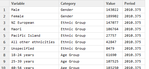
select(-CentreMonth, -Date, -Year)So, now our data is tidy and looks like this:
It’s now straightforward to use the data for analysis. I won’t go into that now, but as a taster here is a simple web-app taking advantage of the tidy format of the data. The code behind the web app is available on GitHub. We can do some simple exploring just with this visual tool. For example, an overall downwards trend in number of beneficiaries in the last five years is obvious; as is a clear seasonal pattern with an increase in the numbers on benefits in the final quarter of each year. Choosing the “Continuous Duration” classification (which splits beneficiaries into those who have been on benefits for less than or more than one year) shows - unsurprisingly that it is the short term beneficiaries that cause that pattern.