A new cross tab tool
I recently put up a simple web app, built with R Shiny, to let users explore the relationship between party vote in the 2014 New Zealand general election and a range of demographic and attitudinal questions in the New Zealand Election Study. The image below is a link to the web app:
The original motivation was to answer a question on Twitter for a breakdown of National party vote by gender. I was surprised how interesting I found the resulting tool though. Without a fancy graphic, just a table of numbers, there’s a lot to play around with here. I deliberately kept the functionality narrow, because I wanted to avoid a bewildering array of choices and confusing user interface, so it tries to do only one thing and does it well. The thing it does is show cross tabs of party vote with other variables from the study.
The source code of the Shiny app is available as is the preparation script but they’re quite unremarkable so I won’t reproduce them here; follow the links and read them on GitHub in their natural habitat.
A few interesting statistical points to note:
- I produced a new set of weights so population totals would match the actual party vote. Even after the NZES team did their weighting, the sample wasn’t representative of the population of people on the electoral roll in terms of actual party vote. In fact, people who did not vote were particularly over-represented. This isn’t that surprising - people who don’t vote for whatever reason (whether it is apathy or being out of the country and busy with other things) are probably also disproportionately likely not to respond to surveys. The web app gives the user the choice of the original NZES weights or my re-calibrated ones, defaulting to the latter. I think that’s useful because people might use the app to say “X thousand voters for party Y have Z attitude”, so adding up to the right number of voters by party is important.
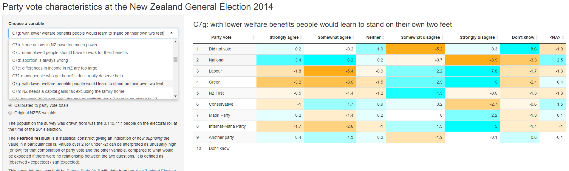
- I included an option to see the Pearson residuals, which compare the observed cell count with what would have been expected in the (nearly always implausible) null hypothesis of no relationship at all between the two variables making up the cross tab. I think this is by far the best way to look at which cells of the table are unusual. For example, in the screenshot above, it is highlighted clearly that National voters had unusually strong levels of agreement with the statement “with lower welfare benefits people would learn to stand on their own two feet”, whereas voters for Labour and the Greens were unusually unlikely to agree with that statement (and likely to disagree). This won’t be a surprise for any watchers of New Zealand politics.
- One version I tested had a little Chi square test of the null hypothesis of no relationship between the two. But it was nearly always returning a p value of zero, because of course there is a relationship between these variables. I decided it was uninteresting, and didn’t want to focus people on null hypothesis testing anyway, so left it out.
- I resisted the urge to put multiple numbers in each cell of the table, as is done in some stats package output (eg SPSS). I think tables like these work as visualisations if the eye can sweep across, knowing that every number in the table is somehow comparable. This isn’t possible when you combine values in each cell (eg include both row-wise and column-wise percentages).
- It was interesting to think through what should be the default way of calculating percentages in a table like this. I decided in the end to default to row-wise, which means the user is reading (for example) “Of the people who voted X, what percentage thought Y?” I don’t think there’s a right or wrong, just a contingent guess that this is most likely to be the first want of people.
- An early version of the tool had an option for “margin of error” for each cell and this drew my attention to the difficult of conceptualising the margin of error in a single cell of a contingency table. I’m going to think more about this one.
- Adding the heatmap colour was a late addition, made easy by the wonder of the easy combination of
datatableJavaScript with R via theDTpackage.
More stuff using the New Zealand Election Study
So I now have two web apps with this data:
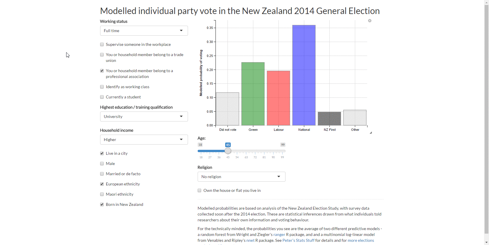
- Predict party vote given a combination of demographic characteristics
- Cross tab of your choice of variable with party vote
… and six blog posts. To recap, here’s all the blog posts I’ve done so far with this data:
1. Attitudes to the “Dirty Politics” book
In my first post on the data, I did quick demo analysis of what the attitudes were of voters for various parties to Nicky Hagar’s book “Dirty Politics”

2. Modelling individual level party vote
I did some reasonably comprehensive modelling of who votes for whom. The main work here was deciding how many degrees of freedom could be spared for the various demographic variables, and clumping/tidying them up into analysis-ready form. This was also a good opportunity for some thinking about modelling strategy, the role of the bootstrap, and multiple imputation which is essential with this sort of problem.

3. Web app for individual vote
This led to my first web app with the New Zealand Election Study data, which lets you explore the predicted probability of different types of people voting for different parties.
4. Sankey chart of ‘transitions’ from 2011 vote to 2014
This was an interesting experiment in looking at what one survey can tell us about people swapping from party to party:
5. Modelling voter turnout
I adapted my approach of modelling party vote to the perhaps even more important question of who turns out to vote at all.

6. Cross tab tool
The sixth blog post is today’s.
For New Zealand readers, have a good final five weeks up to the 2017 election!