Just before Christmas I blogged about the positive correlation between depression incidence in US counties and their vote for Trump in the 2024 presidential election. In addition to my casual interest in the topic, I used it as a case study in multilevel modelling while adjusting for spatial correlation. I explicitly said that I didn’t think it likely that the depression-vote relationship was a causal link; I suspected that most likely, some underlying variable that caused depression was also related to voting behaviour.
I’m coming back to the issue because on reflection, I have three bits of unfinished business:
- I had a nagging thought that with 50+ counties per state (and hence some degrees of freedom to spare), I perhaps should have allowed random slopes for depression incidence in each state, rather than just random intercepts
- I thought my spatial statistics workaround, of just adding a rubbery mat to space to suck up the spatial autocorrelation between observations, perhaps was a bit slap-dash and I should be as a matter of course modelling the spatial autocorrelation explicitly
- An alert reader, Jonathan Spring, pointed out that in the USA there are very marked racial differences between depression diagnoses and suggested that perhaps in my model the depression incidence was standing in as a proxy for “whiteness”.
Of these, the first two felt like bits of probably-immaterial-to-the-question methodological details that I should polish up, whereas number 3 seemed likely to be the explanation of the whole phenomenon. In other words, race is likely a confounder of the depression-voting relationship, as per this directed acyclic graph:
Which means that if we want to actually understand the causal relationship of depression on voting we would need to control for race in the regression. Now, there are other things we’d need to do too; in particular to identify and control for the various “other factors”. I’m not up for that right now - this is someone else’s job - but I’m interested enough to go part-way into things to at least check out the degree to which race makes the depression relationship go away.
This is a long post and parts of it are likely to be of interest only to people concerned with the minutiae of multilevel modelling with spatial autocorrelation. If you just want to see what including race in the model does to the depression effect on voting for Trump, you can skip down to the final section.
All the code for this post assumes that the code from the previous post has already been run. If you want a version of the whole script that just runs, it’s here in the source repository of the whole blog.
But here’s the code for just that DAG diagram:
library(GGally)
library(ggdag)
library(patchwork)
library(kableExtra)

# you need to have run the code from the previous blog first, line below will
# work only for those who are running this from a clone of my whole repository:
if(!exists("combined2")){
  source("0286-voting-and-depression.R")
}

#-----------diagram--------------
dag <- dagify(
  Vote ~ Race + Depression + 'Other factors',
  Depression ~ Race + 'Other factors'
)

set.seed(125)
ggdag(dag, edge_type = "link", node = FALSE) +
  theme_dag_blank()  +
  geom_dag_node(colour = "lightgreen", shape = c(19, 19, 19, 17)) +
  geom_dag_edges(edge_colour = rep(c("lightblue", "lightblue", "grey", "black", "black"), each = 100),
                 edge_width = rep(c(1.5, 3, 0.8, 1.5, 3), each = 100),
                 edge_linetype = rep(c(1,1, 3, 1, 1), each = 100)) +
  geom_dag_text(colour = "steelblue")
OK, on to fixing up the loose ends with my modelling approach.
Move from gam to gamm
I decided that the simplest material improvement to my approach to the spatial autocorrelation would be to explicitly model the spatial co-variance of the residuals. One way of doing this that is the minimal change from my approach so far would be to move the model-fitting from mgcv::gam() to mgcv::gamm(). gamm() fits models by iterating between calls to nlme::lme() and a generalized additive model until convergence. Basically this gives us the ability to use the correlation structures for residuals and mixed random and fixed effects of lme() while still using the splines and response distributions of gam(). This is what I need as I want to continue modelling my response with a quasi-binomial family, and I am probably going to want to keep my “rubber sheet” nuisance effect over the US space modelled with a two-dimensional spline (s(x, y)), even while using the correlation features of lme().
So the first thing I do is create a model6b, as similar as possible to the model6 that was the best and final model from the last blog post, but just changes the estimation method. So here it is, a straight transfer from gam() to gamm()
#---------------moving from gam to gamm--------------
# start with the same model as our final one in the last post, but estimated differently:
model6b <- gamm(per_gop ~ cpe + s(x, y) + s(state_name, bs = "re"),
                weights = total_votes, family = quasibinomial, data = combined2)

# we can't compare the AIC of models created with gam and gamm, see
# https://stats.stackexchange.com/questions/70512/huge-%CE%94aic-between-gam-and-gamm-models

# some differences eg effective degrees of freedom less in the GAMM. But the
# main conclusions (significance of cpe) the same
summary(model6)
summary(model6b$gam)
… which gives us these two different results:
> summary(model6)

Family: quasibinomial
Link function: logit

Formula:
per_gop ~ cpe + s(x, y) + s(state_name, bs = "re")

Parametric coefficients:
            Estimate Std. Error t value Pr(>|t|)
(Intercept)  -2.7972    20.7488  -0.135    0.893
cpe          15.5908     0.6778  23.001   <2e-16 ***
---
Signif. codes:  0 ‘***’ 0.001 ‘**’ 0.01 ‘*’ 0.05 ‘.’ 0.1 ‘ ’ 1

Approximate significance of smooth terms:
                edf Ref.df     F p-value
s(x,y)        28.39  28.94 7.995  <2e-16 ***
s(state_name) 49.00  49.00 7.949  <2e-16 ***
---
Signif. codes:  0 ‘***’ 0.001 ‘**’ 0.01 ‘*’ 0.05 ‘.’ 0.1 ‘ ’ 1

R-sq.(adj) =  0.386   Deviance explained = 44.8%
GCV = 3138.5  Scale est. = 3170.7    n = 3107
> summary(model6b$gam)

Family: quasibinomial
Link function: logit

Formula:
per_gop ~ cpe + s(x, y) + s(state_name, bs = "re")

Parametric coefficients:
            Estimate Std. Error t value Pr(>|t|)
(Intercept)  -2.8878     0.1481  -19.50   <2e-16 ***
cpe          15.0166     0.6271   23.95   <2e-16 ***
---
Signif. codes:  0 ‘***’ 0.001 ‘**’ 0.01 ‘*’ 0.05 ‘.’ 0.1 ‘ ’ 1

Approximate significance of smooth terms:
                edf Ref.df     F p-value
s(x,y)        25.41  25.41 6.438  <2e-16 ***
s(state_name) 39.91  49.00 7.154  <2e-16 ***
---
Signif. codes:  0 ‘***’ 0.001 ‘**’ 0.01 ‘*’ 0.05 ‘.’ 0.1 ‘ ’ 1

R-sq.(adj) =  0.382
  Scale est. = 3005.3    n = 3107
There’s some differences coming from the different estimation methods. The gamm() model uses less effective degrees of freedom for both the s(x,y) rubber mat and the s(state_name, bs="re") state level random intercept. The fixed effect coefficient for cpe (‘crude prevalence estimate’ of county-level depression) is a little different - 15.0 versus 15.6. But we can see we’re fitting the same model and getting substantively the same results.
Next small change I make is to move the state level random intercept from the gam specification into lme. Again, this is an identical model, just changing how the fitting is done:
# move the state random effect into the things to be estimated by nlme:
model6c <- gamm(per_gop ~ cpe + s(x, y),
                random = list(state_name = ~1),
                weights = total_votes, family = quasibinomial, data = combined2)

# fixed coefficients are identical to 6b, but fit was much faster
summary(model6c$gam) # not shown
This is a big performance speed up (which we’re going to need as the models start getting more complex) for materially the same results.
Random slopes
Now I’m ready to take advantage of the move to the gamm syntax and I let the slopes, not just the intercepts, vary for each state:
#----------------random slopes--------------------
model7 <- gamm(per_gop ~ cpe + s(x, y),
                random = list(state_name = ~1 + cpe),
                weights = total_votes, family = quasibinomial, data = combined2)

# AIC is 200 less so worth having the random intercepts
AIC(model7$lme, model6c$lme)
summary(model7$lme)
…which gives us these results. Note that the Akaike Information Criterion has decreased by 200 from adding the random slopes, suggesting the model is overall worth the increased complexity. The cpe (depression) coefficient has decreased in size but is still quite large and definitely significant.
> AIC(model7$lme, model6c$lme)
            df      AIC
model7$lme   9 8605.692
model6c$lme  7 8806.902
> summary(model7$lme)
Linear mixed-effects model fit by maximum likelihood
  Data: data
       AIC      BIC    logLik
  8605.692 8660.064 -4293.846

Random effects:
 Formula: ~Xr - 1 | g
 Structure: pdIdnot
             Xr1      Xr2      Xr3      Xr4      Xr5      Xr6      Xr7
StdDev: 4.440986 4.440986 4.440986 4.440986 4.440986 4.440986 4.440986
             Xr8      Xr9     Xr10     Xr11     Xr12     Xr13     Xr14
StdDev: 4.440986 4.440986 4.440986 4.440986 4.440986 4.440986 4.440986
            Xr15     Xr16     Xr17     Xr18     Xr19     Xr20     Xr21
StdDev: 4.440986 4.440986 4.440986 4.440986 4.440986 4.440986 4.440986
            Xr22     Xr23     Xr24     Xr25     Xr26     Xr27
StdDev: 4.440986 4.440986 4.440986 4.440986 4.440986 4.440986

 Formula: ~1 + cpe | state_name %in% g
 Structure: General positive-definite, Log-Cholesky parametrization
            StdDev    Corr
(Intercept)  3.294624 (Intr)
cpe         15.833056 -0.985
Residual    50.963709

Variance function:
 Structure: fixed weights
 Formula: ~invwt
Fixed effects:  list(fixed)
                 Value Std.Error   DF   t-value p-value
X(Intercept) -2.099504 0.5204783 3054 -4.033796  0.0001
Xcpe         10.482779 2.5041023 3054  4.186243  0.0000
Xs(x,y)Fx1    0.221830 0.1339667 3054  1.655859  0.0979
Xs(x,y)Fx2    0.134028 0.1735957 3054  0.772070  0.4401
 Correlation:
           X(Int) Xcpe   X(,)F1
Xcpe       -0.985
Xs(x,y)Fx1 -0.083  0.084
Xs(x,y)Fx2 -0.121  0.126  0.568

Standardized Within-Group Residuals:
        Min          Q1         Med          Q3         Max
-9.65917765  0.05092882  0.32541129  0.62277480  6.27537901

Number of Observations: 3107
Number of Groups:
                g state_name %in% g
                1                50
We can use this model to make a new version of the final chart from the previous blog post:
preds7 <- predict(model7$gam, se.fit = TRUE, type = "response")

combined2 |>
  mutate(fit = preds7$fit,
         se = preds7$se.fit,
         lower = fit - 1.96 * se,
         upper = fit + 1.96 * se) |>
  ggplot(aes(x = cpe, group = state_name)) +
  geom_point(aes(y = per_gop, colour = state_name), alpha = 0.5) +
  geom_ribbon(aes(ymin = lower, ymax = upper), fill = "black", alpha = 0.5) +
  theme(legend.position = "none") +
  scale_y_continuous(limits = c(0, 1), label = percent) +
  scale_x_continuous(label  = percent)  +
  labs(x = "Crude prevalence estimate of depression",
       y = "Percentage vote for Trump in 2024 election",
       subtitle = "Grey ribbons are 95% confidence intervals from quasibinomial generalized additive model with spatial effect and state-level random intercept effect",
       title = "Counties with more depression voted more for Trump",
       caption = the_caption) +
  facet_wrap(~state_name)
It doesn’t look much different. So my hunch on this aspect was right; there’s enough data to justify letting the depression-vote slope vary in each state (ie we get a better model) but it doesn’t change the substantive conclusion.
Better spatial autocorrelation
Now I’m ready to improve the way I’m handling spatial autocorrelation. As I mentioned last time, my approach to this is to model the centroid of each county with an s(x, y) two-dimensional spline, a sort of rubber mat overlaid over the USA to soak up the things counties have in common with their neighbouring counties. I still think this is much better than nothing, but admit there is still a problem that even after doing this the residuals of counties that are close together will still be correlated. Which means that each observation is not worth as much as if it were truly independent, which means that my inferences are over-confident in their precision.
First I wanted to check out if this hunch was correct. The standard way to look for spatial autocorrelation is via a variogram. I couldn’t get the Variogram() function in nlme to return sensible results from the models that had been fit with gamm() so I had to make one more explicitly with the variogram() function in gstat:
library(sp)
library(gstat)

sp_data <- combined2 |>
  mutate(res = residuals(model7$lme))
coordinates(sp_data) <- ~x+y

plot(variogram(res ~ 1, data = sp_data),
       main = "Variogram for pairs of counties' residuals",
       xlab = "Distance between pairs of counties")
… which gets me this:
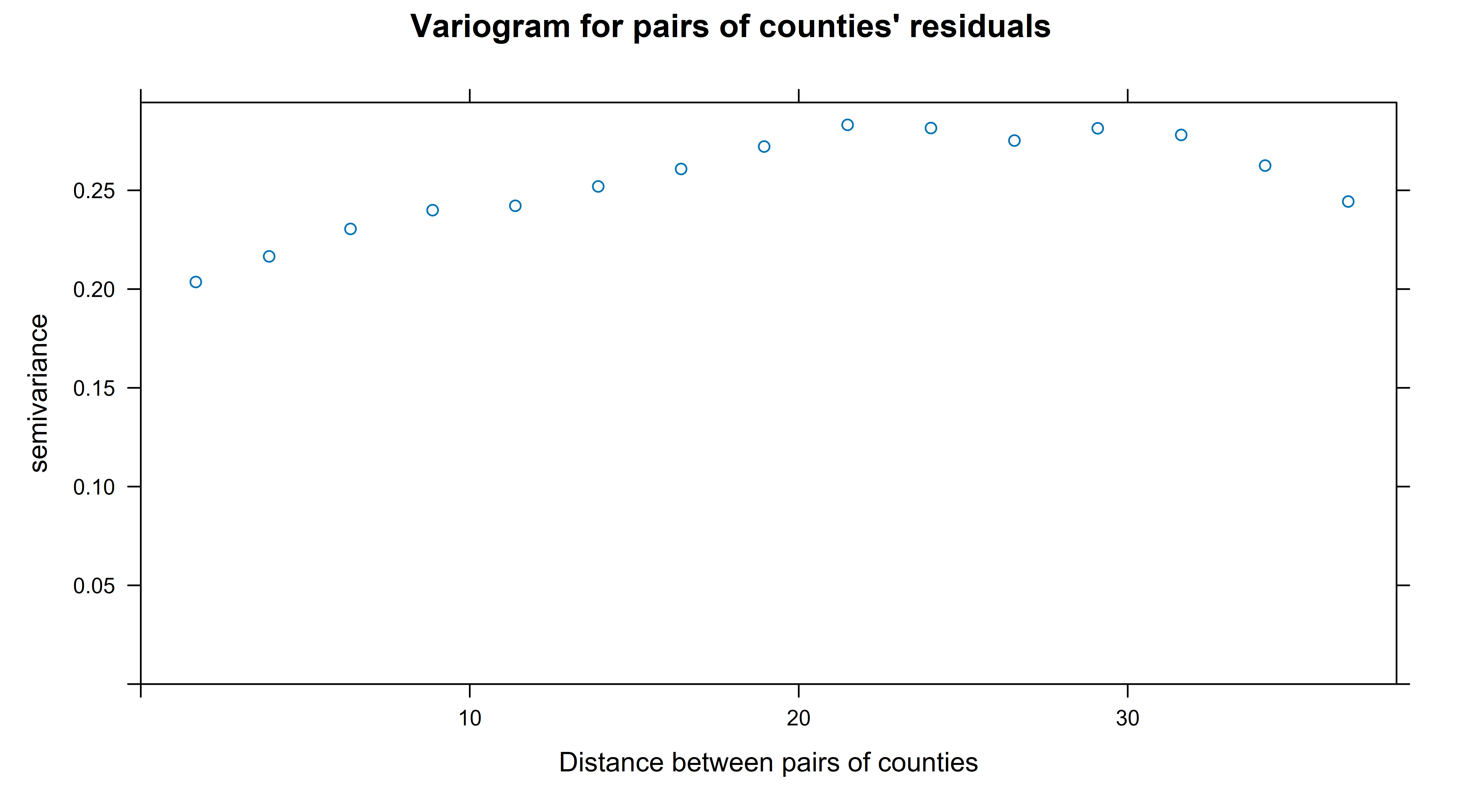
A variogram works by calculating the distances between each pair of observations, binning these and then assessing how related the pairs of observations (in this case, residuals after the model fitting) are in each bin. It doesn’t do this by a correlation coefficient but by another measure that I haven’t got my head around but is described as ‘half the variance of the differences between all possible points spaced a constant distance apart.’. The important thing is that a score of zero means perfect correlation, and the higher the numbers are the more independent the pairs of observations contained in the bin are. So to interpret the chart above we can say that the counties that are about 20 degrees (of latitude/longitude, ignoring curvature of the earth) apart or closer have some degree of correlation with eachother; once they get to that far apart this measure more or less stablises.
I don’t know why spatial statistics doesn’t just use a good-ole correlation coefficient for this job, but presume there are interesting historical reasons. To check that I wasn’t mangling things, I decided to “roll my own” spatial correlation measure, with:
# let's roll our own on a similar concept to see what's happening
counties <- select(combined2, county_fips, x, y)

# find the counties' distance from each other country
county_pairs <- expand_grid(from = counties$county_fips,
                            to = counties$county_fips) |>
  filter(from > to) |>
  left_join(counties, by =c("from" = "county_fips")) |>
  rename(fx = x, fy = y) |>
  left_join(counties, by =c("to" = "county_fips")) |>
  rename(tx = x, ty = y) |>
  mutate(distance = sqrt((fx - tx) ^ 2 + (fy - ty) ^ 2))

res7 <- combined2 |>
  mutate(res = residuals(model7$lme, type = "response")) |>
  select(county_fips, res)

county_pairs |>
  left_join(rename(res7, from_res = res), by = c("from" = "county_fips")) |>
  left_join(rename(res7, to_res = res), by = c("to" = "county_fips")) |>
  mutate(distance = cut(distance, breaks = c(0, 0.5, 1,2,3, 4,6, 8,12,24,48,108)))  |>
  group_by(distance)  |>
  summarise(correlation = cor(from_res, to_res),
            n = n()) |>
  ungroup() |>
  ggplot(aes(x = distance, y = correlation, size = n)) +
  geom_point(colour = "red") +
  scale_size_area(label = comma) +
  labs(title = "Correlation between pairs of counties' residuals",
       x = "Distance between two counties",
       y = "Correlation in residuals from model7",
       size = "Number of county-pairs")
That gives me this chart, which is more like the sort of thing we use in time series analysis.
I’m pleased it tells a similar story to the variogram (which is more of a black box to me) - the correlation between pairs of counties’ residuals is above zero for counties that are within 6 degrees/units of eachother, and stablises at a small negative number from about 20 units apart onwards.
My conclusion from this is that yes, there is still some spatial autocorrelation that should be taken into account. Particularly for those counties very close together (around 2 degree/units apart or less).
Now, there is a tricky problem with the shape of spatial autocorrelation. Even if you’re prepared to assume (as I am in this case) that it is symmetrical north-south and east-west (not always the case when it depends on eg wind), there are differing shapes of decay in the level of correlation, as a function of distance. Experts can apparently/allegedly judge which method is best by looking at the shape of the variogram, but I feel safest by trying all five correlation structures available to me and choosing the one with the lowest AIC.
# o help us decide the shape of the spatial autocorrelation
model8 <- list()

model8[[1]] <- gamm(per_gop ~ cpe + s(x, y),
               random = list(state_name = ~1 + cpe),
               correlation = corExp(form = ~x +y),
               weights = total_votes, family = quasibinomial, data = combined2)

model8[[2]] <- gamm(per_gop ~ cpe + s(x, y),
                random = list(state_name = ~1 + cpe),
                correlation = corGaus(form = ~x +y),
                weights = total_votes, family = quasibinomial, data = combined2)

model8[[3]] <- gamm(per_gop ~ cpe + s(x, y),
                random = list(state_name = ~1 + cpe),
                correlation = corLin(form = ~x +y),
                weights = total_votes, family = quasibinomial, data = combined2)

model8[[4]] <- gamm(per_gop ~ cpe + s(x, y),
                random = list(state_name = ~1 + cpe),
                correlation = corRatio(form = ~x +y),
                weights = total_votes, family = quasibinomial, data = combined2)

model8[[5]] <- gamm(per_gop ~ cpe + s(x, y),
                random = list(state_name = ~1 + cpe),
                correlation = corSpher(form = ~x +y),
                weights = total_votes, family = quasibinomial, data = combined2)

sapply(model8, \(m){round(AIC(m$lme), -1)})
AIC(model7$lme)
That gets me these results:
> sapply(model8, \(m){round(AIC(m$lme), -1)})
[1] 8230 8600 8590 8330 8580
> AIC(model7$lme)
[1] 8605.692
We see that all the models that adjust for spatial correlation are better than model7 (which doesn’t), but the models using corExp and corRatio are much better than the other three. The corExp model (model8[[1]]) is our new best model so far.
If we look at the t statistics for the coefficients of these five models, we see that for the first time our best model has a “non-significant” slope for cpe (ie depression), 1.695. Now, I’m not going to remove a variable from a complex mixed effects model like this because of a non-significant t statistic, but it is definitely note-worthy that the depression effect has become less important once we let it vary by state and do the best correction for spatial autocorrelation:
> sapply(model8, \(m){summary(m$gam)$p.t})
                 [,1]      [,2]      [,3]      [,4]      [,5]
(Intercept) -2.031622 -4.036009 -3.987122 -3.494438 -3.952872
cpe          1.695218  4.206850  4.193251  3.746362  4.167077
Also noteworthy though is that the other spatial correlation shapes still leave depression with significant t statistic.
Here’s the full report from the lme part of the best fit so far:
> summary(model8[[1]]$lme)
Linear mixed-effects model fit by maximum likelihood
  Data: data
       AIC      BIC    logLik
  8231.487 8291.901 -4105.744

Random effects:
 Formula: ~Xr - 1 | g
 Structure: pdIdnot
            Xr1     Xr2     Xr3     Xr4     Xr5     Xr6     Xr7     Xr8
StdDev: 6.68243 6.68243 6.68243 6.68243 6.68243 6.68243 6.68243 6.68243
            Xr9    Xr10    Xr11    Xr12    Xr13    Xr14    Xr15    Xr16
StdDev: 6.68243 6.68243 6.68243 6.68243 6.68243 6.68243 6.68243 6.68243
           Xr17    Xr18    Xr19    Xr20    Xr21    Xr22    Xr23    Xr24
StdDev: 6.68243 6.68243 6.68243 6.68243 6.68243 6.68243 6.68243 6.68243
           Xr25    Xr26    Xr27
StdDev: 6.68243 6.68243 6.68243

 Formula: ~1 + cpe | state_name %in% g
 Structure: General positive-definite, Log-Cholesky parametrization
            StdDev    Corr
(Intercept)  2.702224 (Intr)
cpe         12.092468 -0.99
Residual    66.289425

Correlation Structure: Exponential spatial correlation
 Formula: ~x + y | g/state_name
 Parameter estimate(s):
    range
0.7289188
Variance function:
 Structure: fixed weights
 Formula: ~invwt
Fixed effects:  list(fixed)
                 Value Std.Error   DF    t-value p-value
X(Intercept) -0.889436 0.4390918 3054 -2.0256268  0.0429
Xcpe          3.370112 1.9919865 3054  1.6918346  0.0908
Xs(x,y)Fx1    0.165268 0.1447102 3054  1.1420604  0.2535
Xs(x,y)Fx2    0.000906 0.1909150 3054  0.0047431  0.9962
 Correlation:
           X(Int) Xcpe   X(,)F1
Xcpe       -0.988
Xs(x,y)Fx1 -0.065  0.066
Xs(x,y)Fx2 -0.131  0.141  0.510

Standardized Within-Group Residuals:
       Min         Q1        Med         Q3        Max
-5.2880800  0.2592565  0.5963373  1.0331947  4.6052452

Number of Observations: 3107
Number of Groups:
                g state_name %in% g
                1                50
I believe that Formula: ~Xr - 1 | g bit refers to the s(x,y) term from the GAM when brought into the linearised LME fit. The range of 0.73 refers to the exponential spatial correlation.
Race
Finally I’m ready to look at the question that’s of most substantive interest - does incuding race in the model make the “depression effect” go away, suggesting that depression is acting as a proxy for whiteness. I sourced data on county characteristics of various sorts from the UN Census Bureau. I considered four candidate variables:
white_alonewhich is the proportion of the county that describe themselves as white and not other racewhite_allwhich is the proportion of the county that describe themselves as white, whether or not they also are of another race as wellhispanicproportion of county that describe themselves as hispanichispanic_multiproportion of county that describe themselves as hispanic and more races in addition
I deliberately left out the proportion of African-Americans in each county, assuming it would be very collinear with some combination of the others. If were seriously interested in how race worked in this election I would probably have included it anyway.
Looking at these four variables (without peeking at their relationship to vote) gives me this pairs plot:
which convinces me I should save a degree of freedom and drop the white_all variable from my modelling as containing virtually no extra information from the white_alone variable. Here’s the code to import that data and draw the pairs plot:
---------------------data on 'race'-------------

# county characteristis from US Census Bureau
# see https://www2.census.gov/programs-surveys/popest/technical-documentation/file-layouts/2020-2023/CC-EST2023-ALLDATA.pdf
# for metadata

df <- "cc-est2023-alldata.csv"
if(!file.exists(df)){
  download.file("https://www2.census.gov/programs-surveys/popest/datasets/2020-2023/counties/asrh/cc-est2023-alldata.csv",
                destfile = df)
}

# key columns:
# TOT_POP total population
# WA_MALE "White alone" male
# WAC_MALE "white alone or in combination" male
# H_MALE Hispanic male
# HTOM_MALE Hispanic AND more races male

race <- read_csv(df) |>
  # just 2023 and TOTAL age group:
  filter(YEAR == 5 & AGEGRP == 0) |>
  mutate(white_alone = (WA_MALE + WA_FEMALE) / TOT_POP,
         white_all = (WAC_MALE + WAC_FEMALE) / TOT_POP,
         hispanic = (H_MALE + H_FEMALE) / TOT_POP,
         hispanic_multi = (HTOM_MALE + HTOM_FEMALE) / TOT_POP) |>
  mutate(county_fips = paste0(STATE, COUNTY)) |>
  select(white_alone:county_fips, CTYNAME)

 race |>
  select(-county_fips, -CTYNAME) |>
  ggpairs()
Next I wanted to look at the relationship of these race variables to the logit of vote for Trump, to check if a linearity assumption was going to be reasonable. That got me this chart, which seemed linear enough for me (for my purposes):
…produced with this code:
combined4 <- combined2 |>
  left_join(race, by = "county_fips")

# visual check that the counties joined correctly:
select(combined4, county_name, CTYNAME)

# check for linearity of relationships to the response variable

logit <- function(p){
  log(p / (1 -p))
}

combined4 |>
  mutate(logit_gop = logit(per_gop)) |>
  select(logit_gop, total_votes, `
         Depression incidence` = cpe,
         `Proportion only white` = white_alone,
         `Proportion only hispanic` = hispanic,
         `Proportion hispanic plus another` = hispanic_multi) |>
  gather(variable, value, -logit_gop, -total_votes) |>
  ggplot(aes(y = logit_gop, x =value)) +
  geom_point(aes(size = total_votes), alpha = 0.5) +
  geom_smooth(method = "lm", aes(weight = total_votes)) +
  facet_wrap(~variable, scales = "free_x") +
  scale_x_continuous(label = percent) +
  labs(x = "Explanatory variable value",
       y = "logit of vote for Trump, 2024")
OK so now I fit a whole bunch of different models to be confident that individual decisions from me weren’t going to be leading to my final conclusions. I fit models with many of the combinations of using a rubber mat to deal with spatial autocorrelation, explicitly modelling the spatial autocorrelation, random or fixed slopes (ie varying by state) for cpe (depression), random or fixed slopes (ie varying by state) for hte race variables. Then I calculated the AIC of all these models and the t statistics for cpe (depression), which gets me this table, sorted with the best models (lowest AIC) at the top:
| model | AIC | rubber_mat | random_cpe_slope | race | random_race_slope | SAC_fix | cpe_t_stat |
|---|---|---|---|---|---|---|---|
| 15 | 5676.498 | 1 | 1 | 1 | 1 | 1 | -1.612598 |
| 13 | 5904.910 | 1 | 1 | 1 | 0 | 1 | -1.900880 |
| 10 | 6063.537 | 0 | 1 | 1 | 0 | 1 | -1.581859 |
| 14 | 6241.311 | 1 | 0 | 1 | 0 | 1 | -4.612077 |
| 11 | 6416.801 | 0 | 0 | 1 | 0 | 1 | -2.996010 |
| 12 | 7136.013 | 0 | 0 | 1 | 0 | 0 | 5.347793 |
| 8 | 8231.487 | 1 | 1 | 0 | 0 | 1 | 1.695218 |
| 9 | 8246.613 | 0 | 1 | 0 | 0 | 1 | 2.162823 |
Lots of interesting things here, but most important:
- The best models are definitely those that include race
- The best model of all is also the most complex - random slopes for both race and depression, rubber mat, plus addressing the spatial autocorrelation (SAC) explicitly with an exponential correlation structure
- The best models all have a negative sign for
cpe, indicating that after controlling for race, it is the counties with less depression that were more likely to vote for Trump - a compelling change in narrative from looking at the data without controlling for race. But in the best model of all, depression isn’t very important. - One model that I describe in the code below as “definitely illegitimate because it makes no attempt at all to correct for spatial autocorrelation” is the one that gives the biggest positive effect (as in t statistics) for the depression impact on voting for Trump
I regard this as good evidence that in fact incidence of depression by county wasn’t important in driving the vote for Trump, but that race composition of counties probably was (or at least ‘more likely’ was). Of course, how that mechanism works, and whether ‘whiteness’ here is in fact standing in for something else, is beyond the scope of this blog post (already far too long) to explain.
Here’s the code that fit all those candidate models described above and generates the table:
# no rubber mat, no race, but does have spatial autocorrelation
model9 <- gamm(per_gop ~ cpe,
                    random = list(state_name = ~1 + cpe),
                    correlation = corExp(form = ~x +y),
                    weights = total_votes, family = quasibinomial, data = combined2)

# no rubber mat, but race:
model10 <- gamm(per_gop ~ cpe  + white_alone + hispanic + hispanic_multi,
               random = list(state_name = ~1 + cpe),
               correlation = corExp(form = ~x +y),
               weights = total_votes, family = quasibinomial, data = combined4)

# no random slopes or rubber mat, but race:
model11 <- gamm(per_gop ~ cpe  + white_alone + hispanic + hispanic_multi,
                random = list(state_name = ~1),
                correlation = corExp(form = ~x +y),
                weights = total_votes, family = quasibinomial, data = combined4)

# no random slope, rubber mat or spatial autocorrelation fix at all. this model
# is definitely illegitimate in that it makes no effort to fix for spatial issues.
model12 <- gamm(per_gop ~ cpe  + white_alone + hispanic + hispanic_multi,
                random = list(state_name = ~1),
                weights = total_votes, family = quasibinomial, data = combined4)


# rubber mat, race, random slope for cpe
model13 <- gamm(per_gop ~ cpe  + s(x, y) + white_alone + hispanic + hispanic_multi,
                random = list(state_name = ~1 + cpe),
                correlation = corExp(form = ~x +y),
                weights = total_votes, family = quasibinomial, data = combined4)

# rubber mat, race, only random intercept
model14 <- gamm(per_gop ~ cpe  + s(x, y) + white_alone + hispanic + hispanic_multi,
                random = list(state_name = ~1),
                correlation = corExp(form = ~x +y),
                weights = total_votes, family = quasibinomial, data = combined4)

# fullest model so far PLUS giving random slopes to the nuisance variables
# rubber mat, race, random slope for cpe & random slope for the two main
# race variables:
model15 <- gamm(per_gop ~ cpe  + s(x, y) + white_alone + hispanic + hispanic_multi,
                random = list(state_name = ~1 + cpe + white_alone + hispanic),
                correlation = corExp(form = ~x +y),
                weights = total_votes, family = quasibinomial, data = combined4)


# compare the no-rubber mat models (expect #15 to be best, with random slopes
# for CPE and race - the most flexibility)
tibble(model = 8:15,
       AIC = c(AIC(model8[[1]]$lme),
               AIC(model9$lme),
               AIC(model10$lme),
               AIC(model11$lme),
               AIC(model12$lme),
               AIC(model13$lme),
               AIC(model14$lme),
               AIC(model15$lme)),
       rubber_mat = c(1,0,0,0,0,1,1,1),
       random_cpe_slope = c(1,1,1,0,0,1,0,1),
       race = c(0,0, 1,1,1,1,1,1),
       random_race_slope = c(0,0,0,0,0,0,0,1),
       SAC_fix = c(1,1,1,1,0,1,1,1),
       cpe_p_value = c(
         summary(model8[[1]]$gam)$p.pv['cpe'],
         summary(model9$gam)$p.pv['cpe'],
         summary(model10$gam)$p.pv['cpe'],
         summary(model11$gam)$p.pv['cpe'],
         summary(model12$gam)$p.pv['cpe'],
         summary(model13$gam)$p.pv['cpe'],
         summary(model14$gam)$p.pv['cpe'],
         summary(model15$gam)$p.pv['cpe']),
       cpe_t_stat = c(
         summary(model8[[1]]$gam)$p.t['cpe'],
         summary(model9$gam)$p.t['cpe'],
         summary(model10$gam)$p.t['cpe'],
         summary(model11$gam)$p.t['cpe'],
         summary(model12$gam)$p.t['cpe'],
         summary(model13$gam)$p.t['cpe'],
         summary(model14$gam)$p.t['cpe'],
         summary(model15$gam)$p.t['cpe'])
       )  |>
  mutate(cpe_p_value = round(cpe_p_value, 4)) |>
  arrange(AIC)  |>
  # for space decided not to show this column, can just use t stat
  select(-cpe_p_value) |>
  knitr::kable(format = "html") |>
  kable_styling()|>
  writeClipboard()
Here’s the key results from the overall winning model:
> summary(model15$lme)
Linear mixed-effects model fit by maximum likelihood
  Data: data
       AIC      BIC    logLik
  5676.498 5797.326 -2818.249

Random effects:
 Formula: ~Xr - 1 | g
 Structure: pdIdnot
             Xr1      Xr2      Xr3      Xr4      Xr5      Xr6      Xr7
StdDev: 4.947787 4.947787 4.947787 4.947787 4.947787 4.947787 4.947787
             Xr8      Xr9     Xr10     Xr11     Xr12     Xr13     Xr14
StdDev: 4.947787 4.947787 4.947787 4.947787 4.947787 4.947787 4.947787
            Xr15     Xr16     Xr17     Xr18     Xr19     Xr20     Xr21
StdDev: 4.947787 4.947787 4.947787 4.947787 4.947787 4.947787 4.947787
            Xr22     Xr23     Xr24     Xr25     Xr26     Xr27
StdDev: 4.947787 4.947787 4.947787 4.947787 4.947787 4.947787

 Formula: ~1 + cpe + white_alone + hispanic | state_name %in% g
 Structure: General positive-definite, Log-Cholesky parametrization
            StdDev    Corr
(Intercept)  1.503864 (Intr) cpe    wht_ln
cpe          6.544726 -0.761
white_alone  1.055536 -0.437 -0.188
hispanic     1.719388 -0.134 -0.152  0.180
Residual    43.651012

Correlation Structure: Exponential spatial correlation
 Formula: ~x + y | g/state_name
 Parameter estimate(s):
    range
0.8315562
Variance function:
 Structure: fixed weights
 Formula: ~invwt
Fixed effects:  list(fixed)
                    Value Std.Error   DF   t-value p-value
X(Intercept)    -2.395289  0.271082 3051 -8.836033  0.0000
Xcpe            -1.862160  1.155263 3051 -1.611892  0.1071
Xwhite_alone     3.678207  0.191161 3051 19.241375  0.0000
Xhispanic       -0.544371  0.327396 3051 -1.662729  0.0965
Xhispanic_multi  1.751862  4.307237 3051  0.406725  0.6842
Xs(x,y)Fx1       0.202288  0.093536 3051  2.162664  0.0306
Xs(x,y)Fx2       0.429865  0.131173 3051  3.277087  0.0011
 Correlation:
                X(Int) Xcpe   Xwht_l Xhspnc Xhspn_ X(,)F1
Xcpe            -0.761
Xwhite_alone    -0.461 -0.164
Xhispanic       -0.178 -0.053  0.161
Xhispanic_multi -0.002 -0.114  0.101 -0.278
Xs(x,y)Fx1      -0.051  0.030  0.028 -0.032  0.157
Xs(x,y)Fx2      -0.121  0.101  0.083  0.000 -0.081  0.350

Standardized Within-Group Residuals:
       Min         Q1        Med         Q3        Max
-6.1786290  0.2312745  0.4830700  0.8228585  5.5847101

Number of Observations: 3107
Number of Groups:
                g state_name %in% g
                1                50
Looking at that table of fixed effects, we see the white_alone variable is definitely significant, as is the rubber mat s(x,y) spatial correlation absorber. So we could tentatively conclude that this suggests that whiteness strongly contributed to vote for Trump; that depression incidence didn’t contribute anywhere near as much; and there was a strong spatial correlation not explained by either whiteness or depression.
Looking for a way to summarise all this I came up with this chart of the partial relationship of whiteness and of depression incidence to vote for Trump; after controlling for the other things in the final model:
That was produced with this code, which involved fitting a new model to produce the residuals after controlling for race but not controlling for depression (once combination that hadn’t yet been done in the frenzy of model-fitting above):
#--------------------partial charts-------------------
# model 8[[1]] is the full model except for race. we also need a full model except
# for depression (cpe). then we will use the residuals from each for some charts

model17 <- gamm(per_gop ~ s(x, y) + white_alone + hispanic + hispanic_multi,
                random = list(state_name = ~1 + white_alone + hispanic),
                correlation = corExp(form = ~x +y),
                weights = total_votes, family = quasibinomial, data = combined4)

# Difference between this and model 15 is no depression variable
c(AIC(model17$lme), AIC(model15$lme))

p5 <- combined4 |>
  mutate(after_cpe = residuals(model8[[1]]$gam, type = "response"))  |>
  ggplot(aes(x = white_alone, y = after_cpe)) +
  geom_point(alpha = 0.5, aes(size = total_votes)) +
  geom_smooth(aes(weight = total_votes), method = "lm") +
  scale_x_continuous(label = percent) +
  scale_y_continuous(label = percent, limits = c(-0.4, 0.6)) +
  scale_size_area(label = comma_format(suffix = "m", scale = 1e-6)) +
  labs(x = "Percentage of county that is 'white' as its only race",
       y = "Residual vote for Trump",
       subtitle = "After controlling for counties' depression incidence",
       title = "Partial relationship of 'whiteness' and Trump vote",
       size = "Total votes, 2024:")


p6 <- combined4 |>
  mutate(after_race = residuals(model17$gam, type = "response"))  |>
  ggplot(aes(x = cpe, y = after_race)) +
  geom_point(alpha = 0.5, aes(size = total_votes)) +
  geom_smooth(aes(weight = total_votes), method = "lm") +
  scale_x_continuous(label = percent) +
  scale_y_continuous(label = percent, limits = c(-0.4, 0.6)) +
  scale_size_area(label = comma_format(suffix = "m", scale = 1e-6)) +
  labs(x = "Incidence of diagnosed depression in each country",
       y = "Residual vote for Trump",
       subtitle = "After controlling for counties' racial composition",
       title = "Partial relationship of depression incidence and Trump vote",
       size = "Total votes, 2024:",
       caption = "Source: voting from tonmcg, depression from CDC, race from US Census Bureau; analysis by freerangestats.info")

print(p5 + p6)
That’s it for today. I hope that’s of interest for someone, either as a messy but realistic modelling strategy case study, or for those interested in the specific issue of depression and the 2024 election.