free range statistics
I write about applications of data and analytical techniques like statistical modelling and simulation to real-world situations. I show how to access and use data, and provide examples of analytical products and the code that produced them.
Recent posts
Pacific island remittances
08 March 2026
Pacific island countries have some of the highest dependencies in the world on remittance payments from overseas.
Pacific island population pyramids (again)
01 March 2026
Population pyramids for Pacific countries, one or two at a time. I use these to highlight contrasts between two coral atoll nations, one of which has free movement to a large, rich country, and one of which doesn't.
Pacific diaspora
18 February 2026
Some Pacific countries have dramatically more of "their" people living overseas than in the origin country. And some don't.
The world's biggest 'Pacific' cities
16 February 2026
My best hasty effort at presenting the cities around the world with the most Pacific Islanders resident.
Visualising income inequality social tables
08 February 2026
Visualising income inequality social tables as a scatter plot rather than a dual axis bar/line plot. I use examples from eighteenth and nineteenth century France, England and Wales drawing on Branko Milanovic's Visions of Inequality 2023 publication.
New Caledonia's nickel exports
01 January 2026
Accessing data and drawing charts for nickel exports from New Caledonia, and world nickel prices, from 2008 to 2025.
Net migration in Pacific island countries
04 December 2025
Accessing data and drawing visualisations of net migration for Pacific island countries and territories.
Visual summaries of population in Pacific islands
30 November 2025
Accessing population data for the Pacific and drawing two visual summaries of its recent and projected growth and absolute size, as used recently in a side event before the Pacific Heads of Planning and Statistics meeting in Wellington.
Distribution of p-values under the null hypothesis for discrete data
09 November 2025
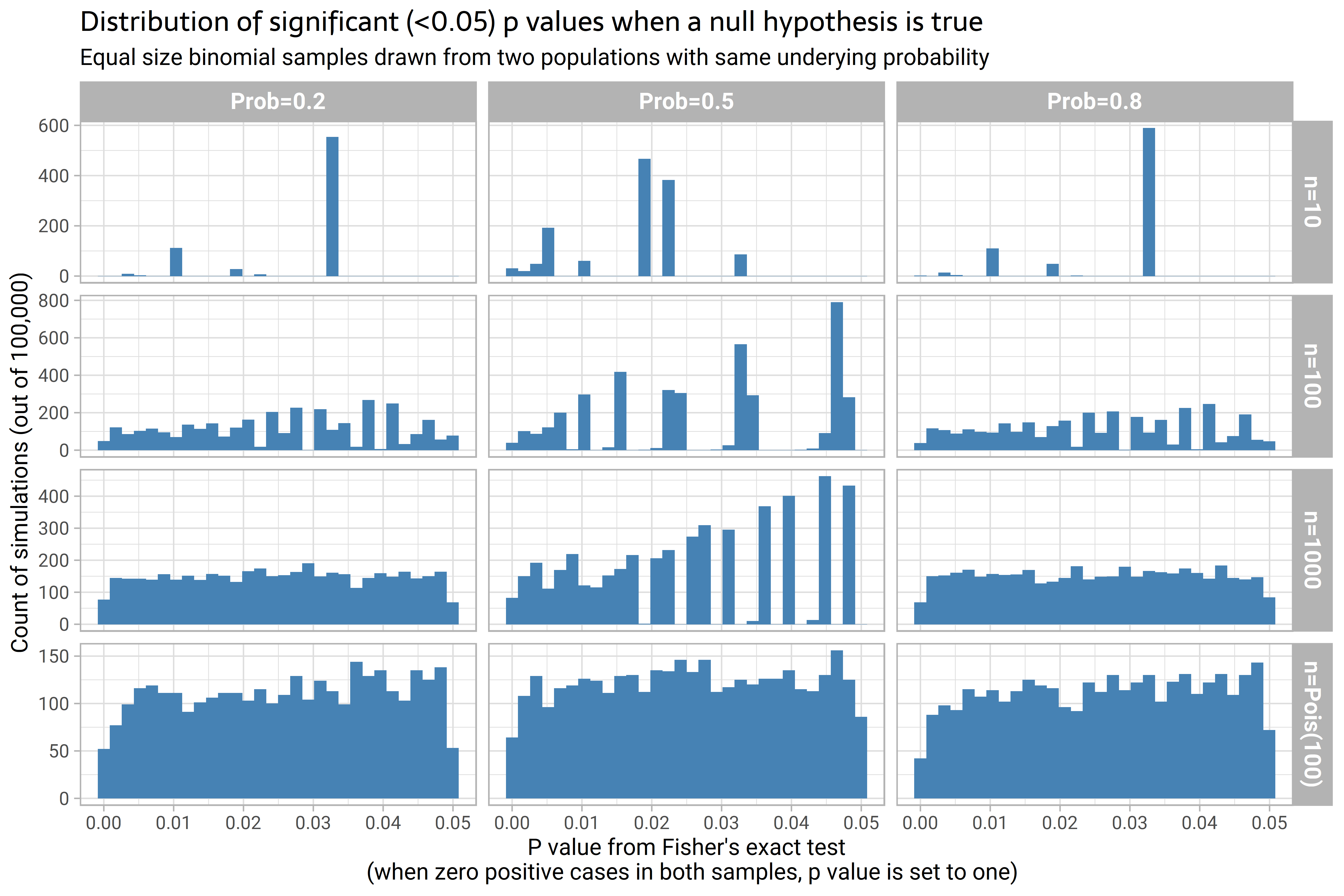
p-values under the null hypothesis do not necessarily have a uniform distribution.
Inequality and homicide, within-country and between country
18 October 2025
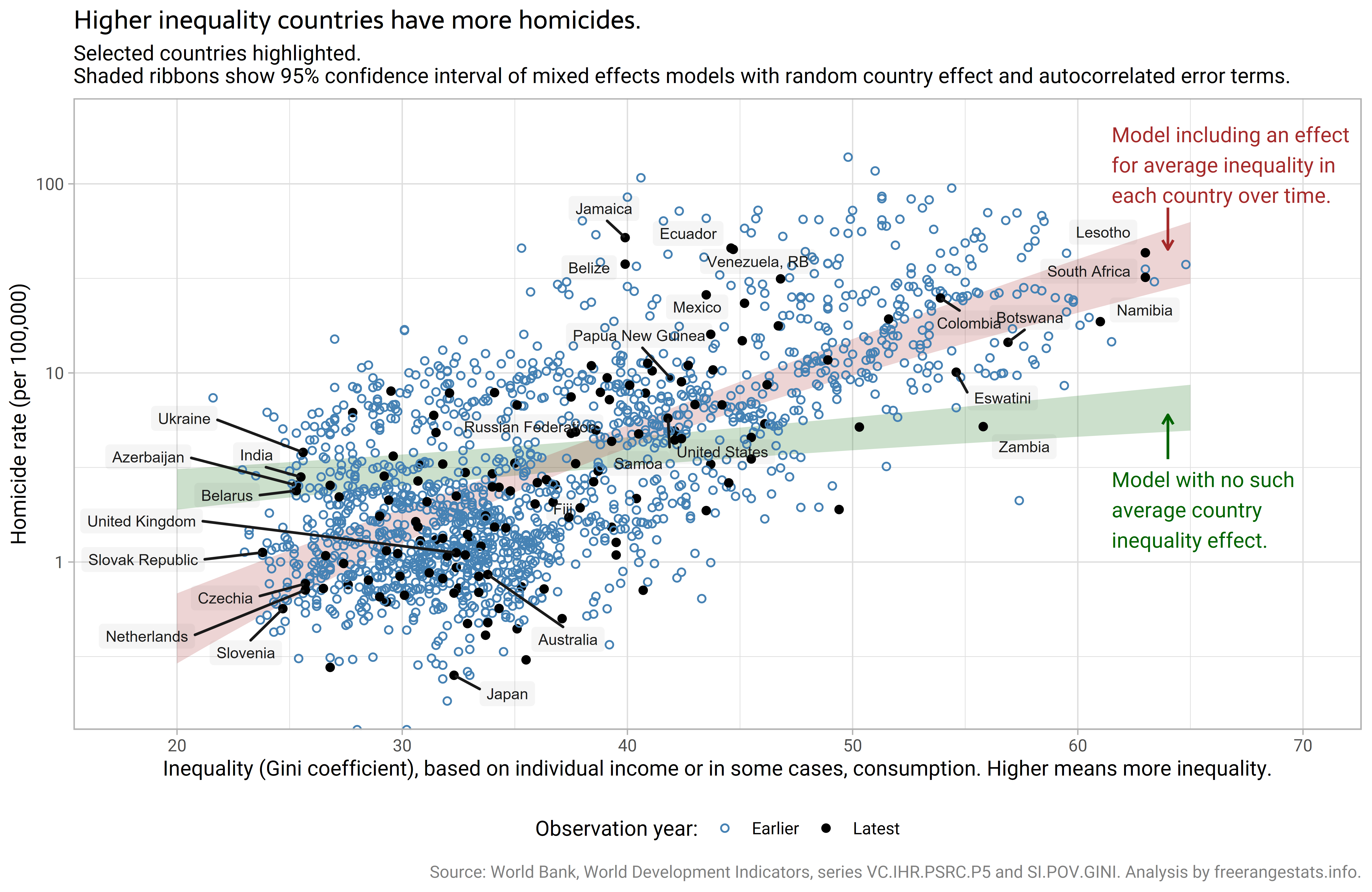
Countries with higher income or consumption inequality tend to have more homicides per population. But looking at the relationship within each country's data, there does not seem to be a consistent relationship between inequality and homicide rates (that is, when there is a relationship in some countries, on average there is no evidence of such a relationship). This is an interesting multilevel or mixed-effects modelling problem that could easily trip one up.


