Like most people, I was surprised at yesterday’s result for the Australian federal election. But I was much less surprised than most people. The two-party-preferred vote for the ALP (currently 49.11%, with a lot of pre-polling still to count) came down at the bottom of my prediction interval but was still inside it; and they look to have a chance of making 68 or 69 seats, which was the lower range of my 80% prediction interval for number of seats. A 95% prediction interval would have comfortably included the result. While I thought that a narrow ALP (or ALP + Greens) win was the most likely outcome, in the last month I’d only given it a 40% to 50% chance and had always seen other outcomes as very possible.
The main reason I was less surprised than others was that my model discounted the polling companies’ reported ALP voting intention, based on their past performance. As I wrote a few days ago, this involved the problematic assumption that the biases in these estimates didn’t change over time, an assumption I’d like to improve on if possible. But the treatment implicitly adopted by others, of assuming that there are no biases in the estimates at all, never seemed to me an improvement on assuming the same biases we’d seen before.
There’s a lot of comment out there about the “national polling failure” of “unprecedented” proportions. The perception is that Australian polls are much better for predictive purposes than in other countries; in the days leading up to the election I was in several Twitter discussions where others dismissed the large degrees of uncertainty in my model and were convinced the polls were going to be spot on. Now the results have come in, people are talking up how surprising the polling error is.
To put some perspective into things, here are the polls’ reported voting intention (two-party-preferred for the ALP) in the 28 days leading up to each of the past four elections:
The polls clearly did quite badly this time around, but not by an order of magnitude worse than previously. If like me you expected them to over-estimate the ALP vote by about the historical average, they were about 1.5 percentage points out more than expected. If you expected them to be on average right, then you were 2.5 percentage points out. For my way of interpreting surveys of people, even 2.5 percentage points out is pretty close. Certainly close enough that I think all the pundits who declared days ago that the election was over and the Coalition had lost should have a rethink not just about polling methodologies, but about how much they over-interpret survey results. After all, even if the polls had been right and the ALP gained 51% of the two-party-preferred vote, they did the same in 1998 and still failed to win due to vagaries of distribution of supporters between seats. So there was simply no excuse for pundits’ being as judgemental as they were leading up to the election.
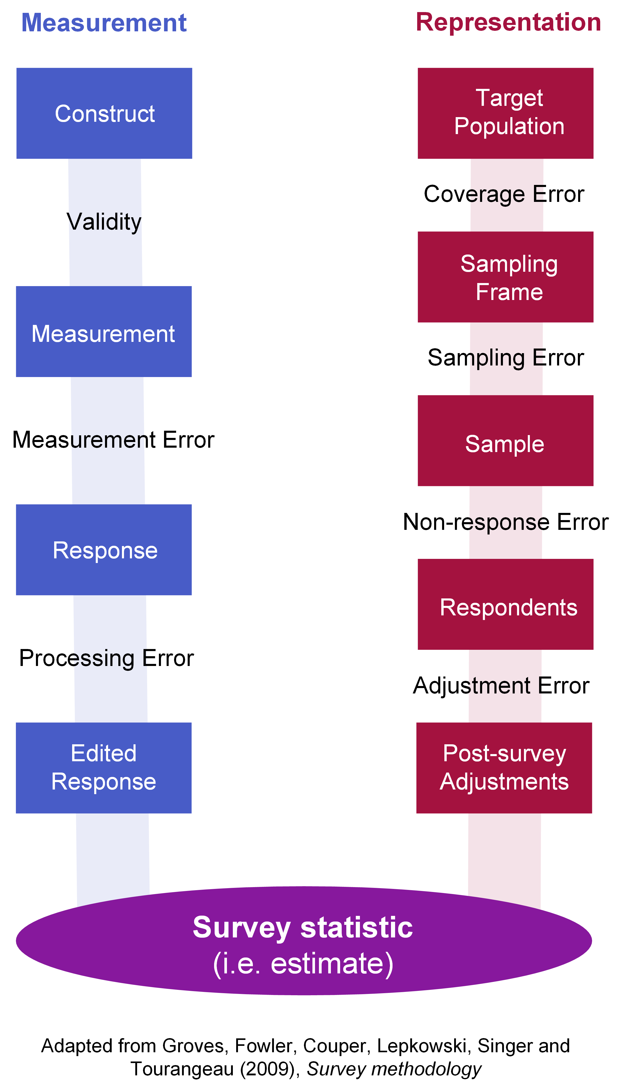
Doubling any reported margin of error in your head is a good starting point for dealing with this. The reported margin of error for surveys is invariably based just on sampling error, because that’s easiest to quantify; other sources of uncertainty are going to be at least as important as sampling error in many situations. For example, it is clear that people who respond to surveys of voting intention, whether on internet or mobile phone, are going to be systematically different from people who don’t; and we don’t know how successful weighting is at addressing the systematic difference. In fact, generally we don’t know the details of weighting schemes used by polling firms in Australia. Anyone who wants to participate in the debate on polling methods should familiarise themselves with the concept of “total survey error”, as seen in this diagram (not my own, but my version of a standard one). I first used this diagram in a post last year on books and courses about surveys.
None of this lets the polling companies off the hook. Surveying is hard and in many ways getting harder, but that’s not a complete excuse. They clearly did worse than normal; they don’t publish enough of their sampling, processing and weighting methodology; and they have clearly been introducing errors through smoothing of results towards a consensus, proven by the visible “herding” of results (less variance than would be seen if they were genuine random samples). So I hope there will be some hard thinking and improvements to come from the polling firms. I just think that those improvements are less important than pundits understanding uncertainty better, and not pretending to more confidence than the facts deserve.
That’s all for today. Here’s the R code for that graphic of surveyed voting intention versus actual results. The data are all collected in my ozfedelect R package, available from GitHub.
library(ozfedelect)
library(tidyverse)

# Get the actual election dates
elections <- ozpolls %>%
  filter(firm == "Election result" &
           preference_type == "Two-party-preferred" &
           party == "ALP") %>%
  mutate(election_year = election_year - 3) %>%
  select(election_year,
         election_date = mid_date,
         actual_vote = intended_vote) %>%
  rbind(tibble(
    election_year = 2019,
    election_date = as.Date("2019-05-18"),
    actual_vote = 49.11
  ))

# draw the graphic
ozpolls %>%
  filter(firm != "Election result"  &
           preference_type == "Two-party-preferred" &
           party == "ALP") %>%
  left_join(elections, by = "election_year") %>%
  mutate(days_away_election = as.numeric(election_date - mid_date),
         alp_overestimate = intended_vote - actual_vote) %>%
  filter(days_away_election < 28 & days_away_election > 0) %>%
  ggplot(aes(x = mid_date, y = alp_overestimate)) +
  theme(panel.grid = element_blank()) +
  geom_hline(yintercept = 0, colour = "grey") +
  geom_smooth(se = FALSE, method = "gam") +
  geom_point(aes(colour = firm)) +
  facet_wrap(~election_year, scales = "free_x", nrow = 1) +
  ggtitle("2019 polls overestimated the ALP result somewhat more than usual",
          "Showing polls in the 28 days up to the election. 2019 result is provisional, at 16 hours.") +
  labs(x = "Polling date",
       y = "Survey voting 2pp intention minus result on the day",
       colour = "",
       caption = "freerangestats.info")