Motivation
This post is the third in a series that make up my entry in Ari Lamstein’s R Election Analysis Contest.
First I introduced the nzelect R package from a user perspective. Second was a piece on how the build of that package works. Today, the third in the series introduces an interactive map of results by voting location drawing on the data in nzelect, built with Shiny.
Overview
The point of the tool is to facilitate comparison of support for parties by fine grained location, well below the electorate level that is usually used as the area of analysis. I’ve included data for the party vote of the eight most successful parties in the 2014 election. Party vote determines the ultimate make up of Parliament (see this previous post for a brief discussion of how the New Zealand system works) and is more comparable across locations than is candidate vote for a number of reasons.
Here’s the Shiny app in action:
Most users will prefer the full screen version.
What you can do with this app includes:
- you can use the drop down box to add circles representing the percentage of vote at any voting place for each of up to 8 parties. Each time you select a new party, it adds new circles on the front of the graphic - so if you want to compare two parties it’s a good idea to choose the more popular (for your shown location) first, and overlay the less popular one on top of it
- you can move the map around to a part of New Zealand you’re interested in and zoom in or out, and the markers will resize to be visible
- you can click on the individual circles to get a tooltip showing the actual number of votes for that party in that location (only really readable in the full screen version).
- you can rescale the circles - recommended if you’re looking at parties other than Labour, National and Green.
It’s definitely most interesting when you’re comparing two parties. Remember that these data show the locations where people voted (on a Saturday), which is presumed to be generally but not always close to but not identical to where they live and / or (less often) work. Here’s some snapshots of interesting contrasts:
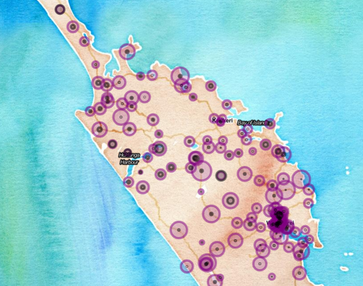
New Zealand First compared to Maori Party in the Northland area

New Zealand First outperformed the Maori Party comprehensively in Northland, showing there’s no inevitable link from higher proportions of Maori ethnicity to supporting the party of that name. More exploring shows the Maori Party’s strongest support in parts of Bay of Plenty, Taupo and Gisborne (upper right north island, for non-New Zealanders, and like Northland, concentrations of people with Maori ethnicity).
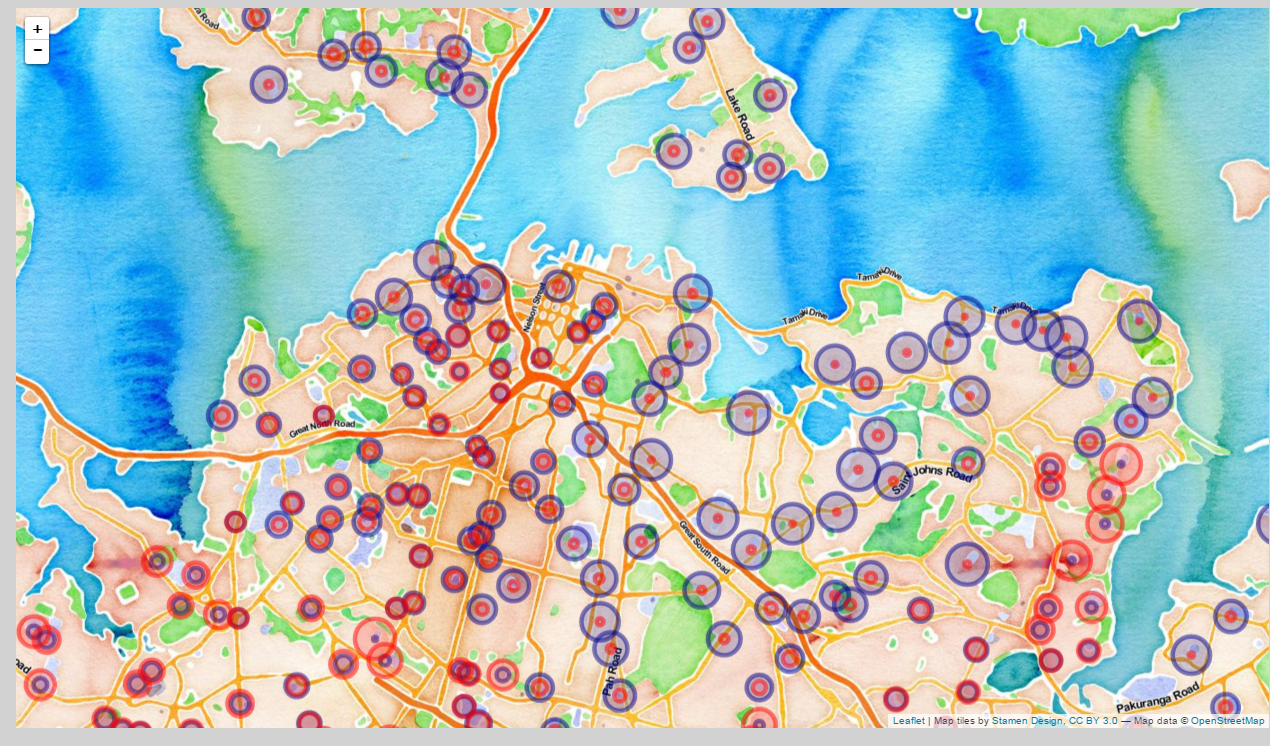
National compared to Labour in Auckland

The fine grained pattern of National Party (blue circle) support compared to the Labour Party in Auckland’s inner suburbs is extremely marked:
- Near parity in the city centre;
- National dominance in the eastern and (to a lesser extent) northern inner suburbs;
- Labour stronger around Tamaki (to the right of the image) plus some pockets in the south-west.
When analysed at an electorate level, that Labour support in the bottom right of the image in Tamaki the suburb is missed because it is wrapped up in the overall strongly-National Tamaki electorate, Robert Muldoon’s old electorate and returning National MPs uninterruptedly since the 1960s.
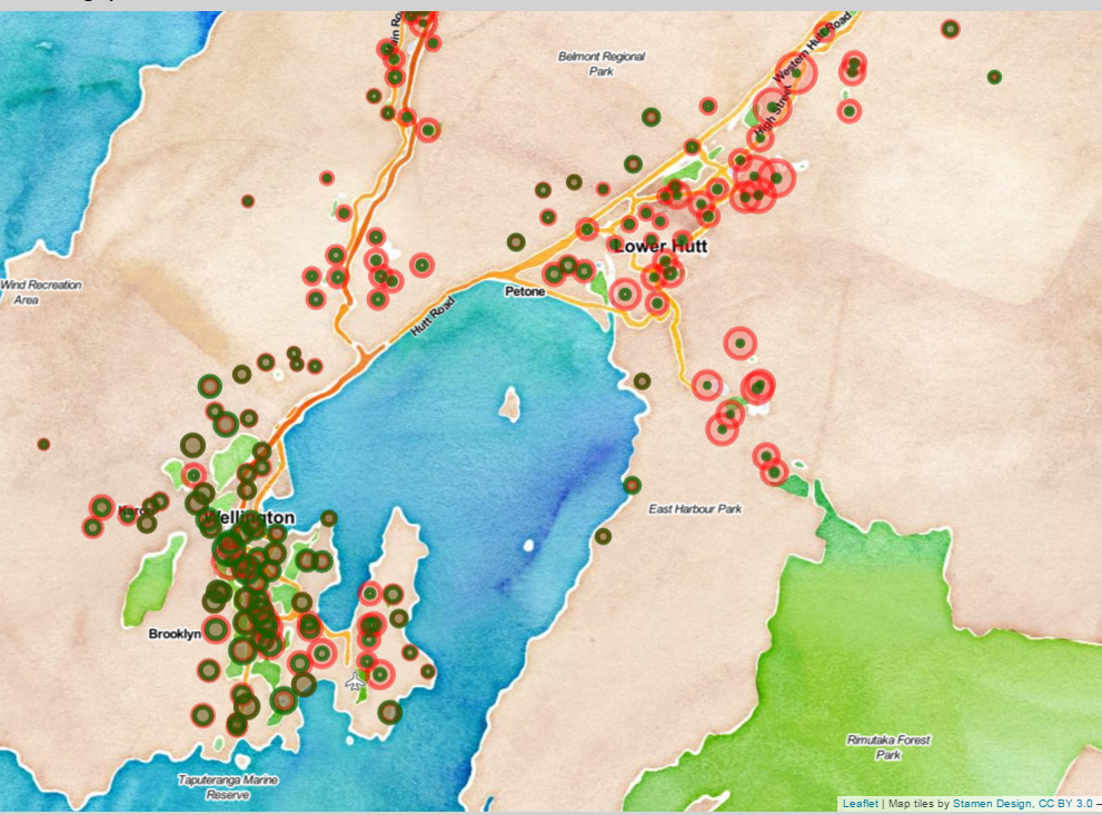
Greens compared to Labour in Wellington

The two main parties of the left in New Zealand are Labour and the Greens. Green Party support relative to Labour Party in the Wellington area is a very regional phenomenon. Green party votes in 2014 were focused in the inner city and suburbs with small patches in other suburbs that perhaps are unsurprising to political tacticians who know Wellington’s spatial socio-demographics. This follows the trend (in New Zealand and similar countries) for the educated, well off, younger left to more generally support the Greens than the older parties of the left. Note the traditional working class Labour Party strongholds in Lower Hutt and Wainuiomata areas.
A trick with leaflet and Shiny
The web app is put together with shiny and leaflet. This next snippet of blog assumes the reader knows the basics of Shiny and is interested in specifics related to this app.
The source code of the Shiny app is at https://github.com/ellisp/nzelect/tree/master/examples/leaflet. There’s some prep done to create the necessary data files elsewhere in the repository at https://github.com/ellisp/nzelect/blob/master/prep/shiny_prep.R.
Updating an existing map
I won’t go through it line by line but will point out one interesting feature now available with leaflet and R. The leafletProxy() function in the leaflet package, in combination with observe() from shiny, let’s you delete or redraw elements of an existing leaflet map that the user has zoomed in or out on and changed its location, without redrawing the whole map. This is essential for a decent user experience and wasn’t in the early releases of the leaflet R package.
In case someone else is interested in it here is an excerpt from the shiny.R file of my Shiny app showing how the existing map MyMap gets circles added to it when the reactive object the_data() changes as a result of the user picking a new political party to show. In this case, a new set of circles is added with addCircleMarkers(), superimposed over whatever is currently on the map.
observe({
     leafletProxy("MyMap", data = the_data()$df) %>%
            addCircleMarkers(~WGS84Longitude,
                             ~WGS84Latitude,
                             color = the_data()$thecol,
                             radius = ~prop * 30 * input$sc,
                             popup = ~lab)
    })
Similarly, here’s the trick I use to clear all the circle markers when the user presses the button labelled “Clear all parties”. That button increases the value of input$clear1 by one, and by referring to it inside an observer with the otherwise pointless x <- input$clear1 (see below) I activate that observer, which then updates the selected party to be blank, and clears all the markers off MyMap.
    observe({
        x <- input$clear1
        updateSelectInput(session, "party", selected = "")
        leafletProxy("MyMap") %>% clearMarkers()
    })
That watercolour background…
The beautiful (I think) water colour background, with just enough labels on it to let you know where you are but not clutter it up like the usual roadmap, comes from overlaying Stamen Watercolor and TonerLabels layers.
That’s all for today. Happy exploring the fine grained details of New Zealand voting locations. If you spot a bug or other issue with the map please file an issue with the nzelect project. If you just want to comment on this post or anything related, use comments section below.