The contest
Inspired by Ari Lamstein’s R Election Analysis Contest, I’ve fast-tracked a project that’s been at the back of my mind for a while, to make available in a friendly, tidy R package a range of data about New Zealand elections. My entry for the contest will involve 3 or 4 posts over the next week or so:
- Today’s post, introducing the
nzelectpackage from a user angle and demonstrating some basic use - A post to come on how
nzelectwas put together - A post on this Shiny app which provides an interactive map to explore the detail (down to individual voting location) of the New Zealand 2014 general election
- (if I get around to it) a more formal piece of statistical modelling of some of the spatial aspects of the 2014 general election
The first three posts are really about setting up infrastructure - tidying up the data for convenience, and exploring it in an interactive tool - so the four posts need to be seen as a unified whole. Hopefully I’ll get round to that last one!
The need for an R package
Election results data in New Zealand is in pretty good shape. The Electoral Commission publishes results in a nice nearly-there machine-readable format. However, there’s still a bit of work required to make it analysis-ready, particularly for anything that gets seriously into the spatial aspects or matching to demographic or economic data.
For example, consider this blog post by kiwipollguy. He identifies that it would be useful to do a regression of voting behaviour on economic characterstics of the meshblocks (lowest geographical unit in the New Zealand census) in which they’re located, but it’s clearly a job of work to organise the data to do that.
Statistics New Zealand publish census data at an electorate level, which is potentially useful, but not enough for those seeking to go an extra level of spatial granularity.
By spending a couple of days in working on the nzelect package I hope to make the data that much more accessible that this sort of serious analysis will be possible. For example, I’ve now done the work of matching voting locations to meshblocks, which means that R users don’t need to confront shapefiles and polygon overlays in order to match the data to other variables.
Background
A bit of background for international readers. New Zealand has a single house of parliament (ie no equivalent of a Senate house of review as in Australia or the USA), and the Executive is drawn from the party that can command the confidence of the house (ie no independent election of a President as in the USA).
The New Zealand electoral system is a mixed-member proportional (MMP) system. Each voter gets two votes. A candidate vote is for an individual parliamentary representative of a particular electorate, defined by place of residence of the registered voter, and counting is first past the post. The party vote counts towards proportional representation and determines the overall make up of Parliament. That is, the number of representatives a party gets in Parliament is determined by their share of the party vote; and the gap between the number of successful individual candidates and that number is made up from a party “List”. The system has been around since 1996 (replacing a simple first past the post one electorate - one candidate system). Many voters understand it well enough to engage in tactical voting (more on that below).
Installation and objects provided
Currently {nzelect} is available on GitHub. I’ll consider a CRAN release once it’s stable. So far I’ve only got the 2014 General Election results in there; I’d like to have at least the 2011 election added too.
devtools::install_github("ellisp/nzelect/pkg")
library(nzelect)
So far there are just two data frames (and their helpfiles) in the package:
GE2014is the results of both the candidate and party votes, for each combination of voting location and electorate. In data modelling terms, voting location and electorate have a many-to-many relationship because people can physically vote in locations that are not in the electorate for which they are enrolled.Locations2014is information on the 2,568 individual voting locations: their coordinates in both NZTM and WGS terms, which electorate they are physically located in, and which mesh block, area unit, Territorial Authority, and Regional Council they are located in.
The two datasets can be matched by the street address of the location, called VotingPlace in both dataframes.
Overall results
Here’s how to replicate the overall election results for 2014, matching the official numbers published by the Electoral Commission.
library(nzelect)
library(ggplot2)
library(scales)
library(dplyr)
library(tidyr)
library(showtext)
library(GGally) # for ggpairs
library(RColorBrewer)
library(gridExtra) # for grid.arrange

GE2014 %>%
   mutate(VotingType = paste0(VotingType, "Vote")) %>%
   group_by(Party, VotingType) %>%
   summarise(Votes = sum(Votes)) %>%
   spread(VotingType, Votes) %>%
   select(Party, PartyVote, CandidateVote) %>%
   ungroup() %>%
arrange(desc(PartyVote))Source: local data frame [28 x 3]
Party PartyVote CandidateVote
(chr) (dbl) (dbl)
1 National Party 1131501 1081787
2 Labour Party 604535 801287
3 Green Party 257359 165718
4 New Zealand First Party 208300 73384
5 Conservative 95598 81075
6 Internet MANA 34094 NA
7 Maori Party 31849 42108
8 ACT New Zealand 16689 27778
9 Aotearoa Legalise Cannabis Party 10961 4936
10 Informal Party Votes 10857 NA
.. ... ... ...Here’s how to get the results for a single electorate:
GE2014 %>%
   filter(VotingType == "Candidate" & Electorate == "Wellington Central 60") %>%
   group_by(Candidate, Party) %>%
   summarise(Votes = sum(Votes)) %>%
   ungroup() %>%
   mutate(Proportion = round(Votes / sum(Votes) * 100, 1)) %>%
arrange(desc(Votes))Source: local data frame [11 x 4]
Candidate Party Votes Proportion
(chr) (chr) (dbl) (dbl)
1 ROBERTSON, Grant Murray Labour Party 19807 51.6
2 FOSTER-BELL, Paul Ayers Robert National Party 11540 30.1
3 SHAW, James Peter Edward Green Party 5077 13.2
4 BARR, Hugh New Zealand First Party 580 1.5
5 GREGORY, Alistair Aotearoa Legalise Cannabis Party 353 0.9
6 HOOPER, Brian William Conservative 307 0.8
7 Informal Candidate Votes Informal Candidate Votes 273 0.7
8 VALENTINE, Callum Nicholas Internet Party 217 0.6
9 ROBINSON, Peter Franklin Independent 90 0.2
10 KNUCKEY, James Nicholas Ransom Democrats for Social Credit 57 0.1
11 KARENA WHUIMAONO, Geoffrey Independent 52 0.1Comparing party and candidate vote
The first table shown above reveals an interesting pattern, perhaps more visible in a graphic:

The Labour Party gets more candidate votes than party votes; whereas the Green Party, New Zealand First Party and Conservatives receive more party votes than their individual candidates receive. This is an expected feature resulting from how voters and parties treat the MMP system. Voters who want to support a minority party’s presence in the overall makeup of Parliament cast their crucial party vote for that party; but in the absence of preferential voting for the candidate vote it often makes sense to support whichever of the top two parties (Labour and National) most closely matches their actual preference; this makes sense because of the first past the post system for the candidate vote. The National Party might be expected to similarly lose party votes to minor parties that are in general its supporters - which would mean the Maori Party and ACT New Zealand in recent years - but this hasn’t been the case in the way it has for the Green Party and Labour.
This feature is nicely shown in a scatterplot matrix of the proportion of Party and Candidate votes given to five parties at the Voting Place level. In the graphic below, each point is an individual Voting Place. We see the proportion voting Labour and that voting National is strongly negatively correlated as might be expected, reflecting this as the primary competition in the New Zealand electoral system at the moment. The proportion voting Green in any voting place has a more complex relationship with that voting Labour. The blue points, representing the party vote, show if anything a slightly positive relationship, until a bunch of blue dots in the bottom right corner indicate locations that vote strongly for Labour with low support for the Greens.

The orange bulge in the density plot of voting places proportion for Labour indicates the on average stronger candidate vote, with the blue party vote more bunched up to the left. This contrasts with the Nationals, who receive roughly similar densities of candidate and party votes.
In this light, it’s useful to look one party at a time at the relationship between candidate and party vote (apologies for those with small screens):

Interestingly, the National Party have a cluster of voting locations (shown with the red ellipse in the bottom left graphic) where the candidate seems relatively unpopular (or their rival is popular) compared to the party vote that determines the overall composition of Parliament. Obviously these would be locations for strategists (ie not me) to identify and plan for.
New Zealand First generally do much better on the party vote than the candidate vote, like the Green Party; but they also have a noticeable bunch of locations that do much better for individual candidates than on the party vote (also indicated by a red ellipse in the graphic above). Again, one for the strategists identifying the success or popularity of individual candidates.
Here’s the code that produced the three graphics above:
br <- c(1000, 10000, 100000, 10^6)
GE2014 %>%
   mutate(VotingType = paste0(VotingType, "Vote")) %>%
   group_by(Party, VotingType) %>%
   summarise(Votes = sum(Votes)) %>%
   spread(VotingType, Votes) %>%
   select(Party, PartyVote, CandidateVote) %>%
   ungroup() %>%
   arrange(desc(PartyVote)) %>%
   ggplot(aes(x = CandidateVote, y = PartyVote, label = Party)) +
   geom_abline(slope = 1, intercept = 0) +
   geom_text(colour = "rosybrown", angle = -10) +
   geom_point() +
   coord_equal() +
   scale_x_log10("First past the post vote for candidates",
                 label = comma, breaks = br) +
   scale_y_log10("Proportional representation vote for parties",
                 label = comma, breaks = br)


#--------------proportions----------
proportions <- GE2014 %>%
   group_by(VotingPlace, VotingType) %>%
   summarise(ProportionLabour = sum(Votes[Party == "Labour Party"]) / sum(Votes),
             ProportionNational = sum(Votes[Party == "National Party"]) / sum(Votes),
             ProportionGreens = sum(Votes[Party == "Green Party"]) / sum(Votes),
             ProportionNZF = sum(Votes[Party == "New Zealand First Party"]) / sum(Votes),
             ProportionMaori = sum(Votes[Party == "Maori Party"]) / sum(Votes))

ggpairs(proportions, aes(colour = VotingType), columns = 3:7)

#----------------------------candidate v party vote for Labour and Greens---------------
p1 <- proportions %>%
   select(VotingPlace, VotingType, ProportionLabour) %>%
   spread(VotingType, ProportionLabour) %>%
   ggplot(aes(x = Candidate, y = Party)) +
   geom_point() +
   geom_abline(intercept = 0, slope = 1, colour = "blue", size = 2) +
   scale_x_continuous(label = percent) +
   scale_y_continuous(label = percent) +
   ggtitle("In the 2014 General Election by voting location,\nLabour candidate vote usually exceeded the party vote") +
   labs(x = "Proportion of Candidate Vote for Labour",
        y = "Proportion of Party Vote for Labour")


p2 <- proportions %>%
   select(VotingPlace, VotingType, ProportionGreens) %>%
   spread(VotingType, ProportionGreens) %>%
   ggplot(aes(x = Candidate, y = Party)) +
   geom_point() +
   geom_abline(intercept = 0, slope = 1, colour = "blue", size = 2) +
   scale_x_continuous(label = percent) +
   scale_y_continuous(label = percent) +
   ggtitle("\nThe situation is reversed for Greens party") +
   labs(x = "Proportion of Candidate Vote for Greens",
        y = "Proportion of Party Vote for Greens") +
   annotate("text", x = 0.4, y = 0.1, label = "Blue line shows\nequality of the two\nvoting types",
            colour = "blue")

tmp <- proportions %>%
   select(VotingPlace, VotingType, ProportionNational) %>%
   spread(VotingType, ProportionNational)
p3 <- tmp %>%
   ggplot(aes(x = Candidate, y = Party)) +
   geom_point() +
   geom_abline(intercept = 0, slope = 1, colour = "blue", size = 2) +
   scale_x_continuous(label = percent) +
   scale_y_continuous(label = percent) +
   ggtitle("For the National Party, candidate and\nparty vote are more closely aligned, but not always") +
   labs(y = "Proportion of Party Vote for National Party",
        x = "Proportion of Candidate Vote for National Party") +
   stat_ellipse(data = filter(tmp, Party > 2 * Candidate & Party > 0.5), colour = "red")

tmp <- proportions %>%
   select(VotingPlace, VotingType, ProportionNZF) %>%
   spread(VotingType, ProportionNZF)
p4 <- tmp %>%
   ggplot(aes(x = Candidate, y = Party)) +
   geom_point() +
   geom_abline(intercept = 0, slope = 1, colour = "blue", size = 2) +
   scale_x_continuous(label = percent) +
   scale_y_continuous(label = percent) +
   ggtitle("New Zealand First generally does better\nfor the party than candidates, but not always") +
   labs(x = "Proportion of Candidate Vote for New Zealand First Party",
        y = "Proportion of Party Vote for New Zealand First Party") +
   stat_ellipse(data = filter(tmp, Candidate > 1.6 * Party & Candidate > 0.15), colour = "red")

grid.arrange(p1, p2, p3, p4)
Voting Locations
nzelect does the work of matching voting results to the point locations where the votes were made, when available (noting that nearly a million votes this information is not available). This lets us do more fine grained geographic analysis than is possible by focusing just on electorates.
The dominant party in the 2014 election was the National Party so if we need to consider a single variable of interest without any particular research question in mind it would be the proportion of voters in any location that voted National. The map below is a starting point for this sort of analysis.
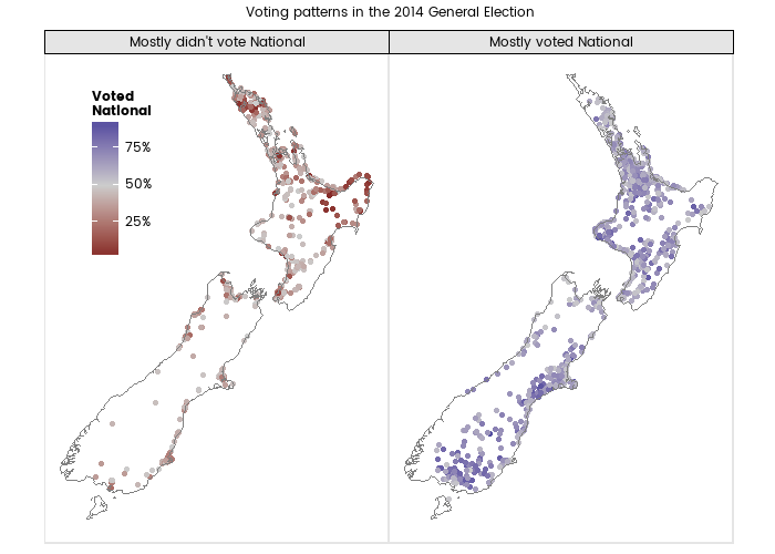
Splitting the map into two facets as is done above, we can visually identify some areas that tended to support the National Party less than elsewhere: Northland (top left of north island), Bay of Plenty and Gisborne (top right), Tasman (top left of south island), and Dunedin. This is unlikely to surprise anyone with an interest in New Zealand politics; the same conclusions could be reached from electorate-level analysis. For now we’ll park that and perhaps come back to it in a later post.
Code that produced the map:
# theme_map proviaged by briatte@GitHub
source("https://gist.githubusercontent.com/briatte/4718656/raw/2c4e71efe6d46f37e7ea264f5c9e1610511bcb09/ggplot2-map-theme.R")

GE2014 %>%
   filter(VotingType == "Party") %>%
   group_by(VotingPlace) %>%
   summarise(ProportionNational = sum(Votes[Party == "National Party"] / sum(Votes))) %>%
   left_join(Locations2014, by = "VotingPlace") %>%
   filter(VotingPlaceSuburb != "Chatham Islands") %>%
   mutate(MostlyNational = ifelse(ProportionNational > 0.5,
                                  "Mostly voted National", "Mostly didn't vote National")) %>%
   ggplot(aes(x = WGS84Longitude, y = WGS84Latitude, colour = ProportionNational)) +
   geom_point() +
   facet_wrap(~MostlyNational) +
   coord_map() +
   borders("nz") +
   scale_colour_gradient2("Voted\nNational", label = percent, mid = "grey80", midpoint = 0.5) +
   theme_map(base_family = "myfont") +
   theme(legend.position = c(0.04, 0.55)) +
   ggtitle("Voting patterns in the 2014 General Election\n")
Rolling up to meshblock, area unit, Territorial Authority and Regional Council
One of the purposes of the nzelect package is to match voting point locations to the geographical category they are part of, facilitating analysis with socio-economic variables. This was done by overlaying the points with polygons of the area boundaries, to be discussed more in the next post. For now, here’s how to use this feature to roll up to Regional Council, showing the proportion of party vote that went to the National Party from lowest to highest.
GE2014 %>%
   filter(VotingType == "Party") %>%
   left_join(Locations2014, by = "VotingPlace") %>%
   group_by(REGC2014_N) %>%
   summarise(
      TotalVotes = sum(Votes),
      ProportionNational = round(sum(Votes[Party == "National Party"]) / TotalVotes, 3)) %>%
arrange(ProportionNational)Source: local data frame [17 x 3]
REGC2014_N TotalVotes ProportionNational
(fctr) (dbl) (dbl)
1 Gisborne Region 14342 0.351
2 Nelson Region 18754 0.398
3 Northland Region 53688 0.427
4 Wellington Region 165207 0.430
5 Manawatu-Wanganui Region 78841 0.447
6 Otago Region 75933 0.447
7 NA 934589 0.451
8 Hawke s Bay Region 53833 0.460
9 Tasman Region 17935 0.465
10 West Coast Region 12226 0.465
11 Bay of Plenty Region 89065 0.473
12 Auckland Region 478760 0.486
13 Waikato Region 134511 0.512
14 Canterbury Region 192577 0.520
15 Marlborough Region 17474 0.520
16 Southland Region 36158 0.528
17 Taranaki Region 42586 0.552Note the 934,589 votes that can’t be allocated to a Regional Council. These are mostly (630,000) ordinary votes cast before polling day and (150,000) special votes cast on polling day. In New Zealand the election is on a Saturday but voters are encouraged to cast their vote beforehand. Because it seems that location isn’t captured and reported on in this instance, as this behaviour becomes more prevalent analysis by voting place will become less meaningful.
Another note - for all the above I’ve left “informal party votes” in the denominator when calculating percentages. This gives slightly deflated figures compared to those reported by the Electoral Commission but saves a few lines of code. The package’s unit tests take care to use the correct method to exactly match the Electoral Commission results. Of course, the Electoral Commission don’t report results by Regional Council, only by Electorate.
Finally, here’s the voting results rolled up to Territorial Authority (a local government classification below that of Regional Council - but not neatly hierarchically classified, much to the annoyance of statisticians).

GE2014 %>%
   filter(VotingType == "Party") %>%
   left_join(Locations2014, by = "VotingPlace") %>%
   group_by(TA2014_NAM) %>%
   summarise(
      TotalVotes = sum(Votes),
      ProportionNational = round(sum(Votes[Party == "National Party"]) / TotalVotes, 3)) %>%
   arrange(desc(ProportionNational)) %>%
   mutate(TA = ifelse(is.na(TA2014_NAM), "Special or other", as.character(TA2014_NAM)),
          TA = gsub(" District", "", TA),
          TA = gsub(" City", "", TA),
          TA = factor(TA, levels = TA)) %>%
   ggplot(aes(x = ProportionNational, y = TA, size = TotalVotes)) +
   geom_point() +
   scale_x_continuous("Proportion voting National Party", label = percent) +
   scale_size("Number of\nvotes cast", label = comma) +
   labs(y = "", title = "Voting in the New Zealand 2014 General Election by Territorial Authority")
Conclusion
Hopefully I’ve created an asset that will be used by a few people; and we can extend it to further (past and future) election results. In this post I’ve:
- demonstrated some basic analysis that’s made relatively easy with this package;
- made observations about the relationship of candidate and party vote; and
- touched on some the regional patterns in voting behaviour.
Issues and enhancement requests can be filed on GitHub.
Extra disclaimer
As always, this post is very much written in my personal capacity and should not be associated in any way with my day job. To be absolutely explicit, I’m operating in accordance with this part of the Cabinet manual:
Generally, public servants acting in a private capacity have the same rights of free speech and conduct of their private affairs as other members of the public. They should, however, ensure that their personal contribution to public discussion maintains a level of discretion appropriate to the position they hold. Senior public servants, or those working closely with Ministers, need to exercise particular care.
For me ‘discretion’ means I’ll be very careful in drawing conclusions, and won’t be making judgements on parties’ strategies or tactics. Any conclusions will be aiming to inform public debate and understanding of voting patterns, rather than being aimed at influencing the political process itself. In fact, public servants have rights as political citizens and it might be acceptable to go considerably further than I am; but I’m just being clear that I’m not seeking to go into that space in these posts.