New job!
I started an exciting new job just over a month ago. I am the Director of the Statistics for Development Division at the Pacific Community, which is commonly known by its now-old acronym the SPC (this used to stand for the South Pacific Commission, then the Secretariat of the Pacific Community, and is now an orphan or pseudo-acronym without specific meaning for the ‘S’).
The Pacific Community is the principal scientific and technical organisation in the Pacific region, proudly supporting development since 1947.
The new job is going to have less hands-on coding than my last role, which will probably mean I reinvigorate this blog. One of my original purposes of starting this after all - seven years ago now! - was to give me a coding outlet and motivation to keep my skills from rusting, several roles ago.
I’m not going to blog about work here, or only briefly in passing, but I might occasionally drop some work-related stuff in when it fits with the overall mood here (and there are definitely a lot of synergies). Also, because I’ve moved to New Caledonia and I’m naturally going to be thinking a lot more about the Pacific, there’s likely to be more Pacific data popping up in my examples.
Some Pacific data
Today I’m showcasing the connection from R to the Pacific Data Hub, which is a central repository of data about the Pacific and from the Pacific. It’s led by the Pacific Community, specifically by the Statistics for Development and Information Services divisions in partnership. It’s fairly new and so far most of its data is from the official statistics systems of our members, but we have hopes and plans for a lot more. It’s currently funded by the New Zealand government.
One of the parts of the Pacific Data Hub that is most developed is PDH.Stat, our implementation of the OECD-originated tool for disseminating aggregate indicator data. The .Stat technology, which is based on the SDMX standard for data and metadata, is commonly used by national statistics offices (including for example NZ.Stat and the ABS’ .Stat Data Explorer), but it is very non-trivial tech to set up and maintain. The median number of staff at Pacific Island country and territory national statistics offices is 14 (compared to just over one thousand at Stats NZ, for example), and it’s not feasible for most of those individual countries to manage their own .Stat implementation. So we at the Pacific Community host it collectively and aim to provide a one-stop shop for all the important aggregate information on the Pacific.
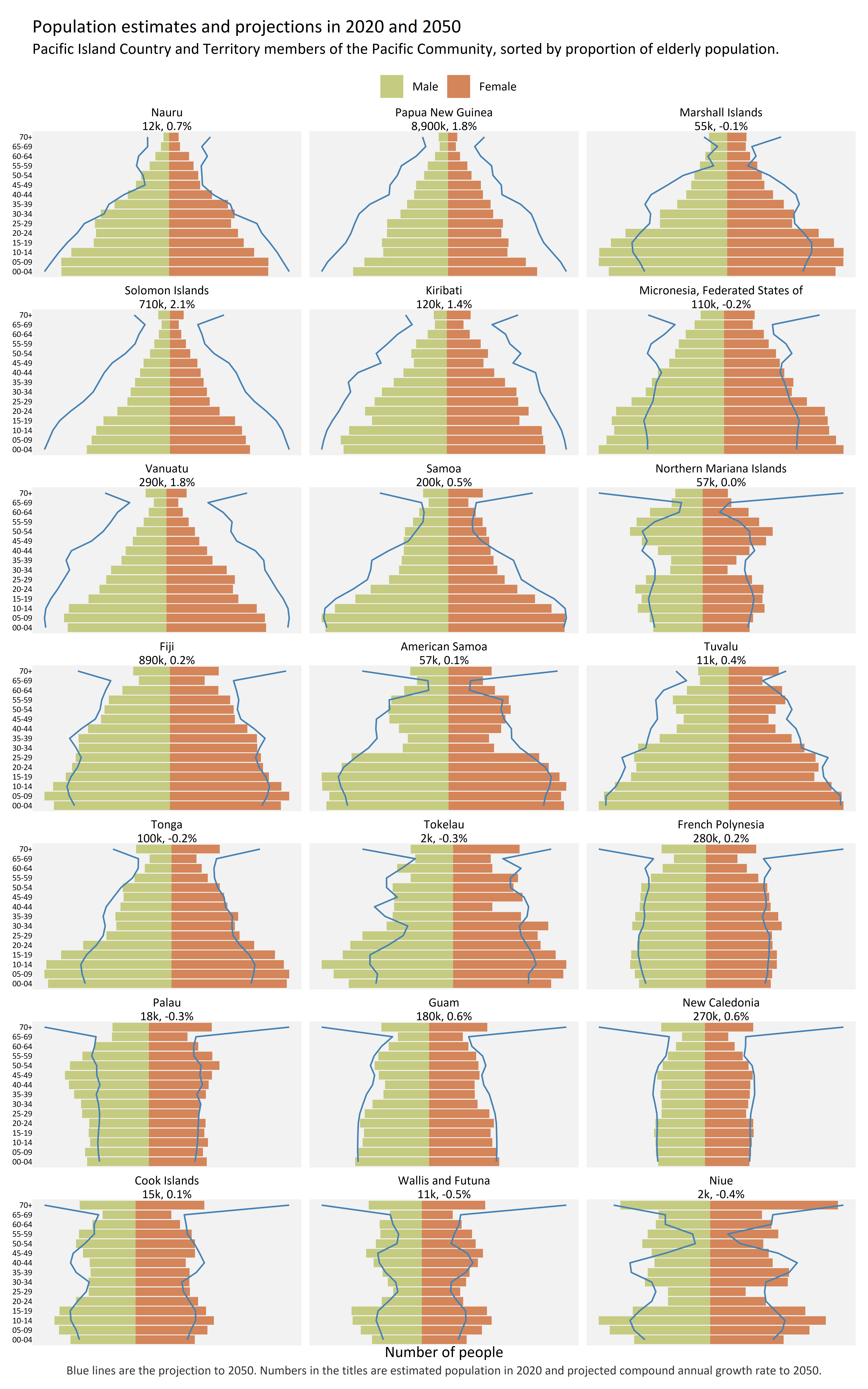
Here’s the image I’m producing today from some of that data. It’s population estimates (for 2020) and projections (for 2050) for 21 Pacific Island countries and territories - all of the Pacific Community Pacific Island members except tiny Pitcairn Island.

Depending on your screen size that should be either 7 countries across and 3 down, or 3 across and 7 down. It really should be printed out on A3 or viewed on a large screen for best effect.
There’s some very interesting things here.
First is that in 2050, quite a few of these countries are going to have a lot of people in that “70+” age bracket, as shown by the blue lines leaping out to the edge of the facets in cases like Palau, Guam and my own new home New Caledonia. We’ll probably need to use more levels of the classification…
Then, in PNG, Solomon Islands, Vanuatu and (to a lesser extent) Kiribati, we see the classic wide base population pyramids familiar in poor, rapidly growing countries where death rates have dropped over the past century but birth rates have not done the same. These shapes are projected to stay similar in the future, just much wider - population growing at around 2% per year, which is fast (the global growth rate right now is about 1% and dropping steadily - the projected average growth from 2020 to 2050 would be much less).
In contrast, we see in Fiji a pattern common in middle income countries further along the pathway called the demographic transition. People have fewer children, the pyramid’s walls are steeper in 2020 and nearly vertical in 2050, and projected population growth rates are accordingly pretty low (0.2%). New Caledonia is even further along that path.
But in some other countries and territories though there are unusual patterns. Examples of one pattern can be seen in Marshall Islands, Federated States of Micronesia, Tuvalu, Samoa and Tonga. These have a wide-base population pyramid showing lots of young people, relatively speaking, in 2020. But projected growth rates are very low. What’s happened to the young people from 2020? As the age bands are 5 years and the difference between the 2020 bars and the 2050 blue lines is 30 years, we should see the bulge move up vertically by 6 slots, and stay the same horizontal size barring deaths and migration. But the blue line for ages 30 to 50 is closer to the central axis than are the bars for 0 to 20. The people who are aged 0 to 20 in 2020 (bottom 4 bars) are literally not projected to be in these countries once they are aged 30 to 50 in 2050.
This isn’t because of a catastrophic early adult death rate, but large scale migration. It’s interesting to see this feature so prominent in the projections, which of course are based in part on a model of net migration based on previous history in each country.
Getting and presenting data from PDH.Stat
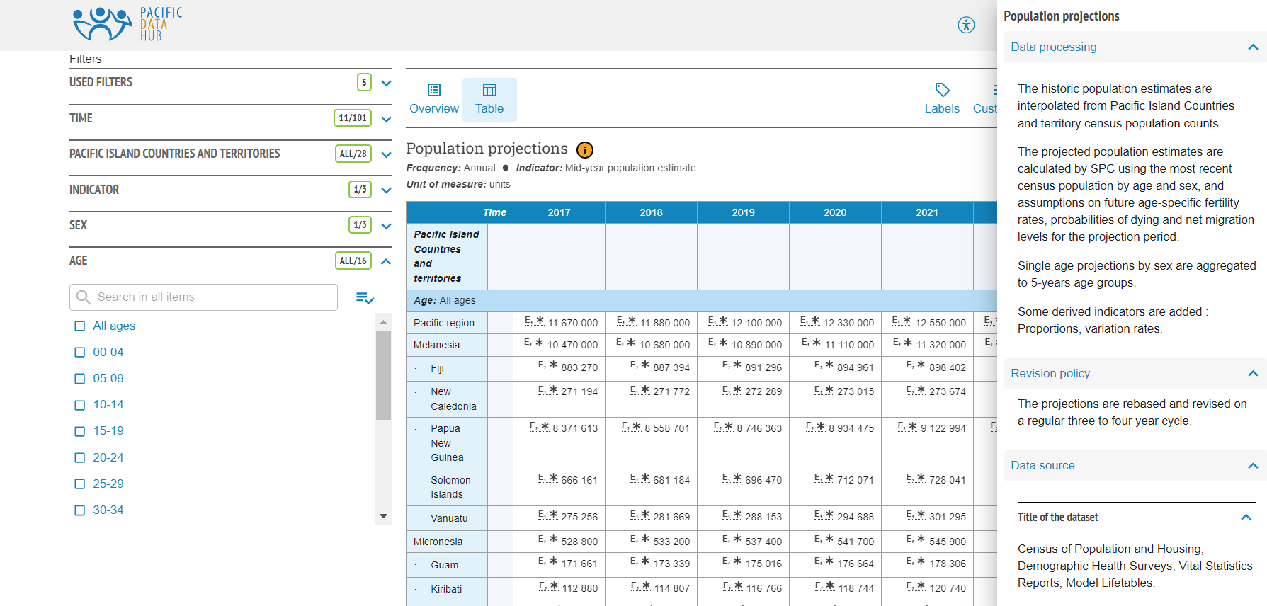
This is what the data looks like if you’re browsing for it on the web:

Note the nice description of the data and its source, which is intrinsically linked to it. But while navigating this and browsing to see roughly what data and metadata is nice in the browser, it’s unpleasant to use for serious analytical work.
Because PDH.Stat is part of the bigger international community of .Stat implementers, we can leverage development at the OECD and elsewhere. For example, we have made sure that all the data in PDH.Stat is accessible by RESTful API in the SDMX format; and made PDH.Stat accessible by plugins for Excel, Power BI, Stata, Python and of course R.
For R, we use the rsdmx package which interacts with many of the official sites around the world providing data via SDMX. The CRAN version of rsdmx is all you need. To get a dataset, you just need to know the provider ID for the Pacific Data Hub (which is PDH) and the code of the data flow. This can be found by clicking on the “Developer API” button in the browser when you’ve got a data set you want (in this case it is DF_POP_PROJ), or in this next code snippet you can download them all - codes and names:
library(tidyverse)
library(rsdmx)

readSDMX(providerId = "PDH", resource = "dataflow") |>
  as_tibble() |>
  View()
Further inspection of the metadata, in browser or via the API, can reveal other things you need to know like data descriptions, units and what various codes stand for.
Anyway, assuming we have loaded tidyverse and rsdmx and know the ID for the data set we want, we can now read the data itself with readSDMX() and the correct flowRef. This next chunk of code does this, and also some basic tidying up of the data to filter out various regional aggregates (for Polynesia, etc); make the age bracket descriptions more readable; and convert country ISO codes to their readable names thanks to the ISOcodes package.
library(scales)
library(janitor)
library(ISOcodes)
library(glue)

if(!exists("proj_raw")){
  # This is quite slow - several minutes - but the slow part is apparently parsing
  # the XML in the as_tibble
  proj_raw <- readSDMX(providerId = "PDH",
                       resource = "data",
                       flowRef = "DF_POP_PROJ")  |>
    as_tibble() |>
    clean_names()
}

y1 <- 2020
y2 <- 2050

pops <- proj_raw |>
  filter(sex != "_T" & age != "_T") |>
  filter(!geo_pict %in% c("_T", "_TXPNG", "MELXPNG", "MEL", "POL", "MIC")) |>
  filter(indicator == "MIDYEARPOPEST") |>
  mutate(age = gsub("^Y", "", age)) |>
  separate(age, into = c("from", "to"), sep = "T", remove = FALSE) |>
  mutate(age = gsub("T", "-", age),
         age = gsub("-999", "+", age, fixed = TRUE),
         sex = case_when(
           sex == "M" ~ "Male",
           sex == "F" ~ "Female"
         )) |>
  mutate(age = factor(age),
         sex = fct_relevel(sex, "Male"))|>
  left_join(ISO_3166_1, by = c("geo_pict" = "Alpha_2")) |>
  rename(pict = Name)
Next chunk makes some secondary data objects that calculate the population estimated in 2020, the proportion of it that is 70 or older, and the compound annual growth rate to 2050. I need these to include in the facet titles and to order the facets. Final task in the chunk below is to join these back to the original data.
#-------------------some secondary versions of the data for sorting and labels-------

# Proportion of people who are 70 or older:
prop_old <- pops |>
  filter(obs_time == y1) |>
  group_by(pict) |>
  summarise(total = sum(obs_value),
            prop_70_plus = sum(obs_value[age == "70+"]) / total) |>
  ungroup()


# Growth rates
growth <- pops |>
  filter(obs_time %in% c(y1, y2)) |>
  group_by(pict, obs_time) |>
  summarise(pop = sum(obs_value)) |>
  group_by(pict) |>
  summarise(cagr = (pop[obs_time == y2] / pop[obs_time == y1]) ^ (1 / (y2 - y1)) - 1) |>
  ungroup()

# Combine all the three data frames into one
pops$prop_70_plus <- NULL
pops$total <- NULL
pops$cagr <- NULL

pops <- pops |>
  left_join(prop_old, by = "pict") |>
  left_join(growth, by = "pict") |>
  # make a label for use in the facet titles:
  mutate(pict_label = fct_reorder(
    glue("{pict}\n{comma(signif(total, 2), scale = 1/1000, accuracy = 1, suffix = 'k')}, {percent(cagr, accuracy = 0.1)}"),
    prop_70_plus)) |>
  arrange(pict, age)
Now we’re ready to draw the chart. Here’s the code that does that. There have been a few important design choices here.
The more controversial one is probably to omit numbers from the horizontal axis. I don’t thik they add anything for my purposes other than clutter, just a general sense of the scale for each country (which is provided the population total in the facet title).
The second big choice was how to show the 2050 projections. The 2020 bars are an easy choice, from demographic convention. The poster published by ourselves that inspired this for me used outline boxes to show the projections for 2050 (it also has a lovely map of where all the countries are in the middle, but this really needs to be printed large to make the whole thing work). Using hollow boxes for 2050 has the advantage that it is instantly relatable to the 2020 bars (basically, they are bars but with transparent fill and grey stroke around the edge). I tried this, and some variants, before deciding that it would be more consistent with the style of my blog to use a different coloured line. Uncluttered and clean.
Anyway, here’s the code that defines this plot, and saves two versions (one wide and one tall):
#-----------------------Draw plot--------------------
# see https://blog.datawrapper.de/gendercolor/
pal <- c("#D4855A", "#C5CB81")
names(pal) <- c("Female", "Male")
# Reverse order so Male appears on left in legend:
pal <- pal[2:1]

proj_col <- "steelblue"
ff <- "Calibri"


p1 <- ggplot(pops, aes(y = age, fill = sex)) +
  geom_col(data = filter(pops, sex == "Male" & obs_time == y1),
           aes(x = obs_value)) +
  geom_col(data = filter(pops, sex == "Female" & obs_time == y1),
           aes(x = -obs_value)) +
  geom_path(data = filter(pops, sex == "Male" & obs_time == y2),
            aes(x = obs_value, y = as.numeric(age)),
            colour = proj_col) +
  geom_path(data = filter(pops, sex == "Female" & obs_time == y2),
            aes(x = -obs_value, y = as.numeric(age)),
            colour = proj_col) +
  scale_fill_manual(values = pal) +
  scale_x_continuous(label = comma) +
  theme_void(base_family = ff) +
  theme(axis.text.y = element_text(hjust = 1, size = 6),
        axis.title.x = element_text(),
        legend.position = "top",
        plot.caption = element_text(hjust = 0.5, colour = "grey20"),
        panel.background = element_rect(fill = "grey95", colour = NA),
        plot.margin = unit(c(3,3,3,3), "mm")) +
  facet_wrap(~pict_label, scales = "free_x", ncol = 7) +
  labs(title = glue("Population estimates and projections in {y1} and {y2}"),
       subtitle = "Pacific Island Country and Territory members of the Pacific Community, sorted by proportion of elderly population.\n",
       x = "Number of people",
       fill = "",
       caption = glue("Blue lines are the projection to {y2}. Numbers in the titles are estimated population in {y1} and projected compound annual growth rate to {y2}."))

# For this blog post I have omitted the actual location of the folder for this output
png("0240-pop-pyramids-wide.png", width = 7000, height = 4000, res = 600, type = "cairo-png")
print(p1)
dev.off()

png("0240-pop-pyramids-tall.png", width = 5000, height = 8000, res = 600, type = "cairo-png")
print(p1 + facet_wrap(~pict_label, scales = "free_x", ncol = 3))
dev.off()
One other snippet of non-R code I want to include so I don’t forget it. I wanted to make the browser choose between the wide or the tall versions of the image based on width of the browser showing it, but still keeping control of the images’ polish and precise proportions that I would lose if it was redone in JavaScript. To do this I used the <picture> HTML tag, which I’d borrowed from this StackOverflow exchange
<picture  >
    <source srcset="/img/0240-pop-pyramids-wide.png" width = '100%' media="(min-width: 1200px)">
    <img src="/img/0240-pop-pyramids-tall.png" width = '100%' alt="Population pyramids with 5 year age bands and sex for 20 Pacific Island country and territories">
</picture>
If you made it this far, congratulations! Here’s the chart again to save you scrolling up:

OK, all too easy; c’est tout!.
Go forth and download lots of data from PDH.Stat. We would really love this great asset to be used more, including by our neighbours in the Pacific or its rim that we just know are looking for data to use (Australia, New Zealand, Japan, USA - looking at you here).