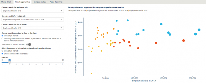
One of the more interesting projects I worked on in 2019 could be loosely described as building a Shiny app for the Royal Melbourne University of Technology (RMIT). But this wasn’t just any Shiny app. It was the front end for a big analytical data build which precalculated many indicators (many of them newly developed for this project, such as measures of how hard employers are finding it to recruit particular skillsets) for multiple levels of Australia’s industry, occupation and education classifications; drew on datasets ranging from our daily feed of job adverts collected by Burning Glass through to the Labour Force Survey, Census, and tertiary education enrolments; was supported by its own R package built specifically to support this one tool; and involved many thousands of lines of R and SQL code. The regular overnight build of the dataset that goes into the Shiny app took more than 10 hours by the project end.
The Shiny app itself was to “present complex analysis of national and state labour market and skills trends in order to improve decision-making in developing courses and training products”. It involved two major modules, one focused on “market analysis” (in this case, analysis of the skills employers are looking for and their relation to education, salary, industry, etc) and one on “skills analysis” (for a given skill, what are the trends in demand for it across industries and occupations, what are related skills, etc).
The project recently got this write up on our website (I am the Chief Data Scientist at Nous Group, a management consultancy that operates in Australia, Canada and the UK).

There were four of us on the project team, including two of us writing R and SQL code nearly full time. The user interface was pretty complex for a Shiny app, with tabs and radio buttons driving the navigation within an overall navbarPage format, and bits of JavaScript for various special but necessary effects. For example, we had a lot of conditionally formatted and interactive data tables in the end presentation for the user, as well as ability to drill up and down through classifications. Depending on how one counts them, there are about a dozen distinct ‘pages’ in the app. Advice from our graphic design team was very helpful in improving layout, colours and general look.
The experience reinforced for me how effectively and efficiently Shiny can be as a platform for rapidly developing professional-quality tools of this sort, including in a commercial setting. There is simply no way the project could have been done if the web application were built in a more traditional platform.
This reminds me that a while back I gave a talk on using Shiny in the public sector. I must dig out the slides and post them here. In the meantime, it’s worth mentioning one slide from that presentation - when not to use Shiny:
- if you want non-coders just to flexibly access a database to produce cross tabs and visualisations - use Power BI or Tableau
- if you want guide a user through an interactive story - use JavaScript
- if have just a few charts that need micro-interactivity (tooltips etc) - use JavaScript, plotly or Power BI
The case for when to use shiny depends on two things:
- convenience and efficiency when you’ve got a lot of R code and R analysts to hand that can give a big headstart and it integrates well with the toolchain and skillset on broader project
- power when you want to perform statistical modelling in response to user settings, specialist graphics only conveniently available through R, and more customisation of the web interface than possible with Power BI and Tableau (but without going the whole hog of writing in HTML / JavaScript).
Unfortunately I can’t link to the app because, well, it was expensive to build and we are saving it for our clients! But we are able to re-sell it… If you’re an Australian university interested in a product to help you target your business-to-business training opportunities, or a skills-oriented government agency, please get in touch.