Possibly you have seen this graphic circulating on social media. At first it doesn’t look too remarkable, but then you notice the vertical axis. Oh. The gridlines are equally spaced on the page, but sometimes the same space represents 30 people, sometimes 10, and sometimes 50. It isn’t even strictly increasing - which might be expected if someone was trying to crudely copy by hand the effect of a logarithmic scale - but seems to be completely arbitrary.
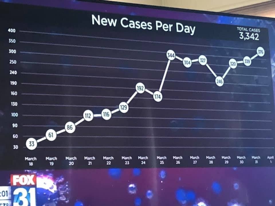
It’s so bad it’s funny. This is clearly incompetence not malevolence. But it’s a serious degree of incompetence.
I actually find this image sad, more so the more I look at it. Like many people I first found it amusing, then I just thought “how did they even do that?” I really don’t know, but most likely seems to be that in effect it was made (or heavily edited) by hand in graphic design software. Then I just felt sorry for whomever created it - out of their depth, under time pressure, or whatever their problems are.
Of course, a flip version of that question, “how would you do this if you wanted to?”, is an interesting one. I took it on and decided it’s worth writing up as an illustration of the elegant power of the scales package (by Hadley Wickham and Dana Seidel), one of the important complements of ggplot2.
First, let’s draw a conventional version of the chart with the usual approach to axis scales:
This was created with the code below, most of which is about theming the chart to resemble the original look and feel. We’ll be able to use this plot, stored as p, later.
library(tidyverse)
library(scales)

fox_data <- tibble(
  cases = c(33, 61, 86, 112, 116, 129, 192, 174,
            344, 304, 327, 246, 320, 339, 376),
  day = as.Date("2020-03-18") + 0:14)

foxcol <- "#0c244a"
foxfont <- "Montserrat"

p <- ggplot(fox_data, aes(x = day, y = cases, label = cases)) +
  geom_line(size = 3, colour = "white") +
  geom_point(size = 10, colour = "white", shape = 19) +
  geom_point(size = 10, colour = "black", shape = 1) +
  geom_text(size = 3.5, fontface = 'bold', family = foxfont) +
  theme_dark(base_family = foxfont, base_size = 10) +
  theme(panel.grid.major.x = element_blank(),
        panel.grid.minor.x = element_blank(),
        panel.grid.major.y = element_line(colour = "grey50"),
        panel.grid.minor.y = element_blank(),
        panel.background = element_rect(fill = foxcol),
        plot.background = element_rect(fill = foxcol),
        text = element_text(colour = "white"),
        axis.text = element_text(colour = "white"),
        plot.title = element_text(hjust = 0.5, size = 20),
        plot.caption = element_text(colour = "grey50")) +
  scale_x_date(breaks = fox_data$day, labels = format(fox_data$day, "%B\n%d")) +
  labs(x = "",
       y = "",
       title = "New Cases Per Day")

p + labs(caption = "Standard scaling (or non-scaling) of vertical axis")
In order to transform the vertical axis to the same, twisting and turning transformation implicitly used in Fox News’ version, we’ll create a new “transformation” object with the scales function trans_new. Each transformation in the scales paradigm goes two ways:
- convert the the original value of y to a transformed version representing the position on the page (in this case, we need to convert any value of y from 30 to 90 to
y / 30so it will align with positions 1 to 3, between 90 and 100 to a number between 3 and 4 so3 + (y - 90) / 10, and so on). We’ll use a bunch of simple linear transformations to do this. - convert the transformed values back to the originals. This is necessary for the labelling of the axis - this is why the label for 10,000 in
scale_y_log10()is “10,000” or “1e4”, not “4”. So we need to tell our plotting functions that “3” on the transformed scale means 90 on the original, “5” means 130, and so on.
Here’s the function crazyfox_trans() which stores both the original transform and its inverse:
crazyfox_trans <- function(){
  scales::trans_new("crazyfox",
                    transform = function(y){
                      yt <- case_when(
                        y <= 90 ~ y / 30,
                        y <= 100 ~ 3 + (y - 90) / 10,
                        y <= 190 ~ 4 + (y - 100) / 30,
                        y <= 240 ~ 7 + (y - 190) / 50,
                        y <= 250 ~ 8 + (y - 240) / 10,
                        TRUE ~ 9 + (y - 250) / 50
                      )
                      return(yt)
                    },
                    inverse = function(yt){
                      y <- case_when(
                        yt <= 3 ~  yt * 30,
                        yt <= 4 ~ 90 + (yt - 3) * 10,
                        yt <= 7 ~ 100 + (yt - 4) * 30,
                        yt <= 8 ~ 190 + (yt - 7) * 50,
                        yt <= 9 ~ 240 + (yt - 8) * 10,
                        TRUE ~ 250 + (yt - 9) * 50
                      )
                      return(y)
                    }
  )
}
… and here’s the result when we add this scale to our original plot, using the trans = argument of scale_y_continuous.
p +
  scale_y_continuous(trans = crazyfox_trans()) +
  labs(caption = "Matching the eccentric scale transformation in a Fox News graphic of 4 April, with standard axis breaks")
Nice! With the axis breaks set at 100, 200 and 300 we can see how the unusual transformation used by Fox has compressed the scale between 300 and 400 more than other levels. It’s actually possible they were trying to mimic a log transformed scale and went wrong in back-transforming the labels. If so, it’s even sadder - like seeing a chimpanzee banging a drum and thinking that makes it part of the brass band.
Now that we’ve transformed the scale and plotted the lines and points appropriately, there’s one detail to add to bring this plot to Fox-level perfection. This is to set the gridlines at locations that are equally distant vertically from eachother.
p +
  scale_y_continuous(trans = crazyfox_trans(), breaks = c(30,60,90,100,130,160,190,240,250,300, 350,400,450))  +
  labs(caption = "Matching the eccentric scale transformation in a Fox News graphic of 4 April, with Fox's axis breaks")
There we go. This noteworthy chart, re-created reproducibly with the correct transformations needed to make that scale appropriate. The benefit of this approach is that I now have the crazyfox_trans() function available for future use, if I need this particular weird stop-start stepwise transformation for future data.
The more serious point here is the elegance of the transform / inverse structure of scales’ transformations. It’s something we take for granted (for example, in getting those labels right for a logarithmic scale) and will often seem basic, but as seen here gives enormous flexibility for creating new transformations easily and efficiently.