A critical tweet the other day by Nicolas Sommet reminded me of the book The Spirit Level: Why Equal Societies Almost Always Do Better”. That book argues that:
“…there are ‘pernicious effects that inequality has on societies: eroding trust, increasing anxiety and illness, (and) encouraging excessive consumption’. It claims that for each of eleven different health and social problems: physical health, mental health, drug abuse, education, imprisonment, obesity, social mobility, trust and community life, violence, teenage pregnancies, and child well-being, outcomes are significantly worse in more unequal countries, whether rich or poor.” Wikipedia
In his tweet, Sommet pointed out (not claiming to be the first to do so - it’s a common critique) problems with the argument in The Spirit Level:
- cherry picking - some countries are excluded from the analysis with (he says) inadequate justification, in ways that make the conclusions seem stronger
- failure to reproduce results when more countries are included
- meta-analyses suggest the results are trivial
Other criticisms have argued the book has a reliance of simple bivariate scatter plots rather than more sophisticated methods that are based on formal statistical tests while controlling for other variables. I have a further methodological criticism myself, but I’ll come to that later in the post.
The country level data
Before we go further - and I don’t want to focus in detail on the book itself as I read it some years ago and haven’t had time to refresh that (although I did buy a new, electronic copy) - let’s look at some data ourselves. Rather than pick a single year, or an artificial subset of countries, I’m going to use all years and countries for which data are available in the World Bank’s World Development Indicators.
I’m going to choose life expectancy as a typical response variable representing health outcomes. Because life expectancy is estimated algorithmically from the death rates for all age groups at a point in time, it’s a pretty good, standardised single dimensional indicator of health standards at their crudest. For example, it fully encompasses infant mortality as part of its calculation; and it is standardised and comparable across countries of differing demographic profiles because it is based on idea of a hypothetical person born today, suffering as they grew older all the death rates by age group that apply today.
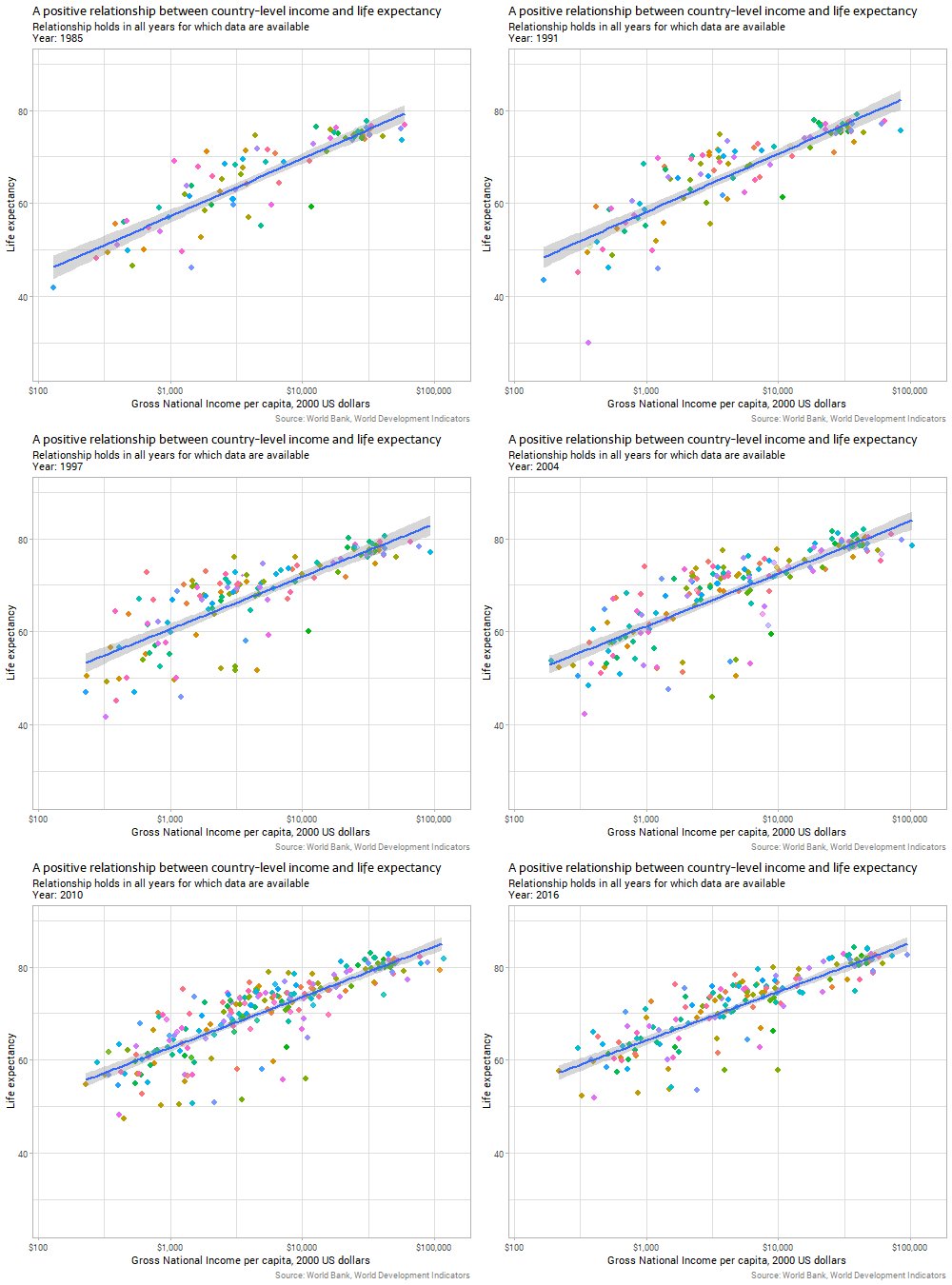
Let’s start with the genuinely and obviously strong relationship between a country’s gross national income per capita and life expectancy:

Note: all the code for today’s post is at the bottom of the post, to avoid breaking up the flow of the text; the animations were produced using the amazing gganimate package. Income is on a logarithmic scale, but other variables in this post are untransformed. If you’re wondering, the purple country that has volatile and low measures of life expectancy is Rwanda, reflecting the horrors in that country in the 1990s.
The strength and size of the relationship between income and life expectancy seems pretty constant over time, in terms of the gently curving slope on that chart, but interestingly the data gradually gain “height” on the chart over time. That is, there is an increasing intercept in the generalized additive model that is implicit behind the curve, shown in the line gradually climbing a few years in average life expectancy over the period of the data. If life expectancy was improving over time purely because of increasing income, we’d expect to see the line stay where it is but dots move upwards and rightwards along it in recent years; instead, in addition to the countries’ dots moving diagnoally up along the line, we see the line itself moving vertically. This suggests that there is something improving life expectancy beyond the increasing average incomes in countries. Investigating this further would be out of the scope of this blog post.
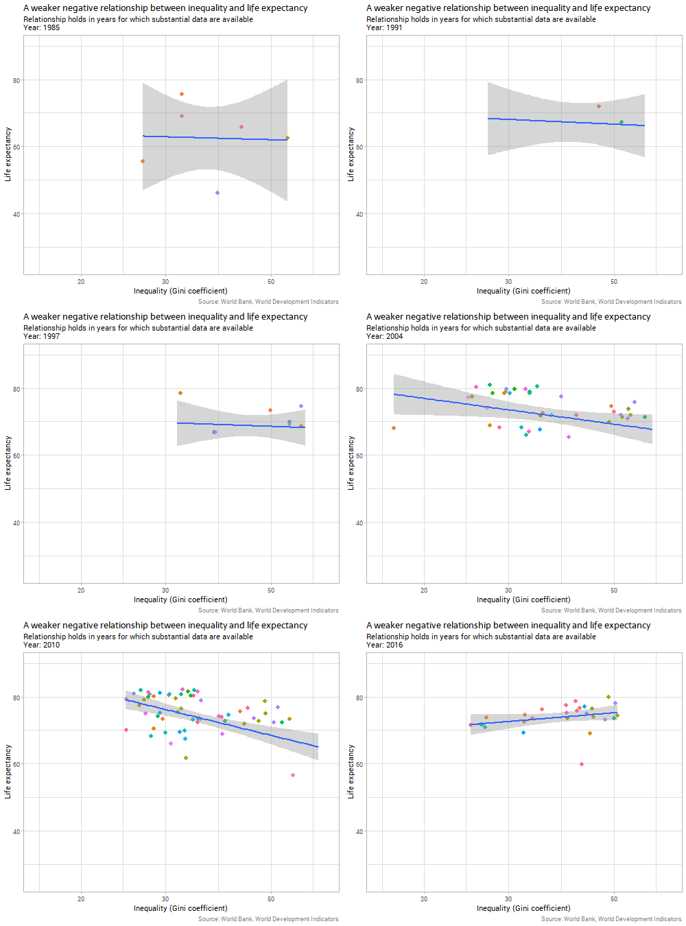
Second, let’s look at the main subject at issue today - the country-level relationship between inequality and life expectancy:

The data are sparser and noisier in this case, but there are still 20 or so years with a good collection of data. Generally, the relationship is negative, as argued by The Spirit Level and similar advocates of the importance of inequality. That is, countries with a higher Gini coefficient for income (more inequality) have slightly lower life expectancies.
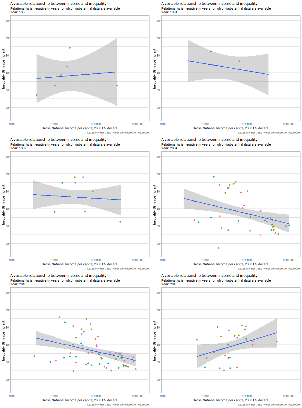
However, there’s a problem here before we can conclude a relationship between the variables, which is that the two explanatory variables we’ve considered so far are themselves correlated. The next animation shows the relationship between inequality and income over time:

We can see that in the years where there are enough data for substantive conclusions, richer countries tend to have lower inequality. There are certainly complex historical and economic reasons for this which I don’t have time to go into here; suffice it to say that it is not because countries follow a Kuznets curve for any deterministic reason; the evidence accumulated since Kuznets’ time is strongly against any such explanation.
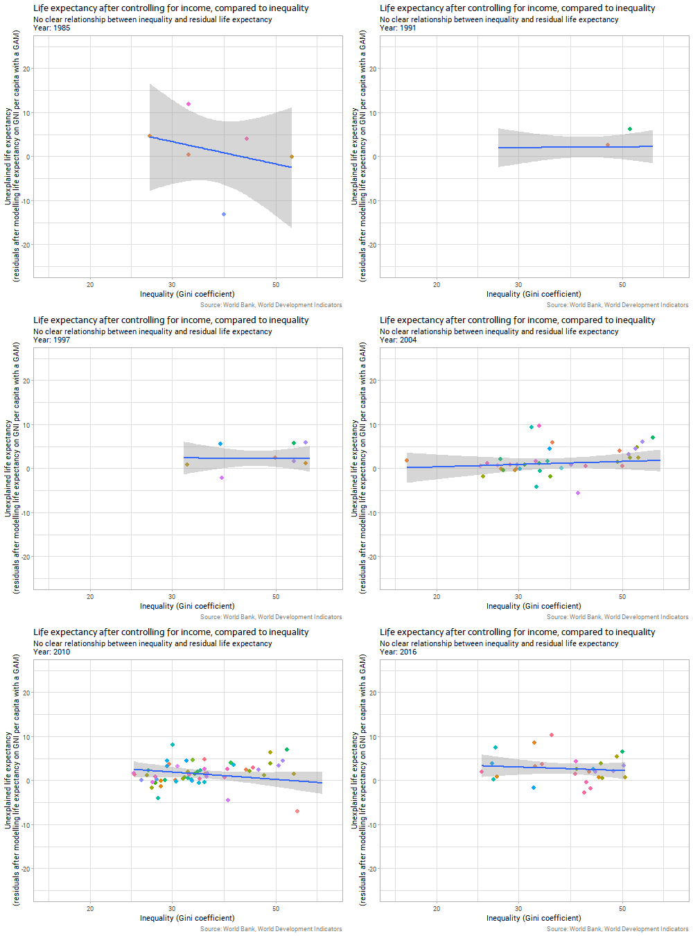
Because the impact of income on life expectancy is uncontroversial, reasonably direct, and obvious to the eye it makes sense to control for it before trying to identify the impact of country-level inequality on the same response variable. We can do this by first fitting a model predicting life expectancy on the basis of income (I chose a gently curving generalized additive model with a different curve allowed for each year); and then using the residuals from that model as the response variable to compare to inequality. This is essentially the process behind a partial regression plot, although more normally used in linear regression than in the non-linear context here. When we do this we get the following:

The relationship between inequality and “unexplained life expectancy” (ie the residuals from our earlier model on income) is very weak and unstable. Whatever relationship there is in country-level data between inequality and life expectancy outcomes, it is clearly much weaker than the relationship with income, particularly when we consider the two variables together and control for income before we look for the inequality effect.
A variant of the ecological fallacy?
So far, the points are with the critics of The Spirit Level. But I wanted to look at an additional potential problem to those highlighted by Sommet in his tweet, which is a problem with using country-level data for individual-level inferences. If we look at Inequality.org we see the argument that
“By greater inequality, epidemiologists … don’t just mean poverty. Poor health and poverty do go hand-in-hand. But high levels of inequality, the epidemiological research shows, negatively affect the health of even the affluent, mainly because, researchers contend, inequality reduces social cohesion, a dynamic that leads to more stress, fear, and insecurity for everyone.” Inequality.org
It is clear that the argument is not just that unequal societies have more poor people, and poor people have poorer health, but that individuals with the same income are worse off surrounded by inequality than in an equal society. The evidence provided in favour is mostly or entirely in the form of cross-sectional country-level scatter plots.
Unfortunately I’m pretty sure there is a statistical fallacy in using country-level data for this sort of argument. It’s a variant of the ecological fallacy. An ecological fallacy is a mistaken inference about individuals from group level data. The classic form is:
Imagine we could survey animals how much they worried about wolves. In the areas with relatively high numbers of wolves, concerns will be higher than in the areas with few or no wolves. A scatter plot of “percentage of wolves in area” by “percentage of animals worried by wolves” would show a strongly positive relationship. But it would be very wrong to infer from this that wolves are more worried by wolves than are other animals; it is the presence of wolves that makes other individuals worried about them, creating a group level positive relationship.
In this contrived example the fallacy seems obvious, but unfortunately people fall for it fairly frequently. A particular trap is analysis of census data aggregated by area (often the only form available to researchers for confidentiality reasons), where the fallacy is often present in exactly this form, albeit with less obviously nonsensical content.
In our own case, there’s a twist on the most common ecological fallacy, as per my wolves example.
- In the wolves example, a genuine group-level effect (being in an area with a lot of wolves directly impacts on your fear of wolves) is mistaken for the individual level (being a wolf makes you fear wolves).
- In the case of inequality, I suspect that the genuine effect is overwhelmingly at the individual level (being poor is bad for health outcomes; the poorer you are the more important the effect; and unequal societies have more very poor people given average income) and this has been mistaken for a group effect (being in an unequal society is directly bad for your health).
To understand this, I’ll show how easy it is to simulate data where the only impact on health comes from being a poor individual, but we see a country level effect that appears to be inequality impacting on life expectancy, even when controlling for income
Identical average income, two levels of inequality, simple relationship of income to health
Consider two countries - Equaltopia and Unevenland - with identical mean income of $20,000 per year but very different inequality of income, as measured by Gini coefficient. The income distribution looks like this:
… or in a Lorenz curve, sometimes preferred in inequality discussions, like this:
The diagonal line represents perfect equality where everyone has the same income, and the gap between that and the line which actually shows the cumulative proportion of income received by the cumulative proportion of people forms part of the definition of the Gini coefficient. Equaltopia and Unevenland have very different income distributions, but are within plausible ranges.
Now, I allocate each individual in Equaltopia and Unevenland a lifespan that is a random variable but which depends on their individual income. If their individual income is less than $10,000 per year the mean life expectancy is 50 years and standard deviation of 7 years; if above, it is 70 years and standard deviation of 10 years (this simplistic model will be made more realistic later on). If we draw a scatter plot at the individual level relating income and lifespan we see this:
Because Unevenland has a small number of very rich people but the same mean income as Equaltopia, statistically speaking it has to have a large number of poor people. Resulting from this, a higher proportion of the population fall below the “good health” threshhold of $10,000. We see the results starkly in this simple summary table of the average results:
| country | Inequality | Mean income | Mean life expectancy |
|---|---|---|---|
| Equaltopia | 0.23 | 20000 | 68.4 |
| Unevenland | 0.63 | 20000 | 61.1 |
So, in this simple example, we see how a more unequal country will have poorer health outcomes than an equal country, even though there is no direct impact of inequality; only an individual income effect where poorer people have poorer health.
Varying average incomes, varying inequality, complex relationship of income to health
The illusionary country-level inequality effect comes about because there is a diminishing marginal impact of an individual’s income on their health. This is realistic - adding $10,000 to the income of a millionaire has virtually no impact on their life expectancy, while it could change the life for the better of a homeless person. However, it’s not as stark as a simple cut-off point beyond which health is improved but can get no better.
To make the simulation more realistic, I change the relationship between income and mean life expectancy so it looks like this:
To further extend the simulation, I created countries with a range of mean incomes and inequality of income, simulated individuals’ incomes within each country, and then simulated individual lifespans based on the curve above. Then when we aggregate the data back to country-level we see the following:
This is actually very similar to what the real life country-level data look like, except that if anything the illusionary inequality impact on life expectancy is even stronger in my simulated data than in the actual data. We see
- a strong relationship between a country’s average income and life expectancy;
- a weak (if any) relationship between income and inequality; and
- a medium-strength relationship between country inequality and average life expectancy… despite the fact that there is no such group level effect; income impacts on life expectancy, and inequality does not in this simulated data other than via creating larger numbers of poor people.
Importantly, we can’t correct for this problem by fitting a model that “controls for” mean income. Inequality will still come out as a statistically signficant predictor of lower life expectancy in such a model, for the same reason as Unevenland had a lower life expectancy as Equaltopia despite identical mean income and life span being determined purely by individual income.
What does it all mean?
I find the reasons given for a potential direct impact of country-level inequality on individuals’ health plausible, but the evidence for them is weak.
Because of the reasons given here and demonstrated in the simulations above, country-level evidence by itself is simply inadmissable; there is no way that country-level averages and inequality measures can demonstrate a group-level impact of inequality. Only mixed individual and country level data, comparing rich and poor people in equal societies with rich and poor people in unequal societies, could do this. A study along these lines could be done with harmonised income and health microdata. It would be difficult but not impossible, and if it has been done it doesn’t get the attention that the much simpler cross-country analysis gets.
However, the country level data can and does suggest that if there is a direct impact of inequality on health outcomes, it is much weaker than the impact of country-level income.
But all the above is of little importance for policy purposes because it is clear and uncontroversial that individual income is very strongly related to individual health outcomes. So it isn’t necessary to argue for a country-level inequality effect to argue that inequality is indirectly important. Inequality means more poor people below a given poverty threshold, for a given average income.
A very basic result in welfare economics is that:
- given diminishing marginal returns for more income for rich people…
- better overall life outcomes can always be achieved by redistributing income from rich to poor and reducing inequality…
- if it can be done without reducing overall mean income (which possibility is of course contested, but outside today’s scope).
Code
# to install gganimate:
devtools::install_github('thomasp85/gganimate')
library(tidyverse)
library(ineq)
library(gganimate)
library(GGally)
library(WDI)
library(MASS)
library(mgcv)
library(knitr)

#===================Real data=================================
# Find the indicators we need with commands like:
# WDIsearch("gini") %>% View
# This gives us:
#  - GINI index (World Bank estimate)
#  - GNI per capita (constant 2010 US$)
#  - Life expectancy at birth, total (years)

# Download data:
country_data_orig <- WDI(indicator = c("SI.POV.GINI", "NY.GNP.PCAP.KD", "SP.DYN.LE00.IN"),
                         country = "all", start = 1960, end = 2020)


country_data <- country_data_orig %>%
  as_tibble() %>%
  rename(inequality =SI.POV.GINI, income = NY.GNP.PCAP.KD, life =  SP.DYN.LE00.IN) %>%
  mutate(log_income = log(income),
         log_life = log(life),
         log_inequality = log(inequality)) %>%
  filter(iso2c != "" & !is.na(income) & !is.na(life)) %>%
  # limit ourselves to years with at least five observations (otherwsie 1983 has just 1):
  group_by(year) %>%
  filter(sum(!is.na(inequality)) > 5) %>%
  ungroup() %>%
  mutate(year_factor = as.factor(year),
         year = as.integer(year))

# All three variables (and log of income) in one recent year
country_data %>%
  filter(year == max(year) - 1)  %>%
  dplyr::select(income, log_income, inequality, life) %>%
  ggpairs() +
  ggtitle("Relationship between three key development indicators",
          paste("Income, life expectancy, and inequality (Gini coefficient) in", max(country_data$year) - 1)) +
  labs(caption = "Source: World Bank, World Development Indicators")


#-----------------------draw animations--------------
# life expectancy and income, all years (animation)

a1 <- ggplot(country_data, aes(x = income, y = life)) +
  scale_x_log10("Gross National Income per capita, 2000 US dollars", label = dollar) +
  geom_point(size = 2.5, aes(colour = country)) +
  geom_smooth(method = "gam") +
  ggtitle("A positive relationship between country-level income and life expectancy",
          subtitle = 'Relationship holds in all years for which data are available\nYear: {frame_time}') +
  labs(y = 'Life expectancy',
       caption = "Source: World Bank, World Development Indicators") +
  transition_time(year) +
  ease_aes('linear') +
  enter_fade() +
  exit_shrink() +
  coord_cartesian(ylim = c(25, 90)) +
  theme(legend.position = "none")

# reality check - who has that big up-and-down in life expectancy?
country_data %>%
  group_by(country) %>%
  summarise(volatility =  sd(life, na.rm = TRUE)) %>%
  arrange(desc(volatility))

a2 <- ggplot(country_data, aes(x = inequality, y = life)) +
  scale_x_log10("Inequality (Gini coefficient)") +
  geom_point(size = 2.5, aes(colour = country)) +
  geom_smooth(method = "gam") +
  ggtitle("A weaker negative relationship between inequality and life expectancy",
          subtitle = 'Relationship holds in years for which substantial data are available\nYear: {frame_time}') +
  labs(y = 'Life expectancy',
       caption = "Source: World Bank, World Development Indicators") +
  transition_time(year) +
  ease_aes('linear') +
  enter_fade() +
  exit_shrink() +
  coord_cartesian(ylim = c(25, 90)) +
  theme(legend.position = "none")

a3 <- ggplot(country_data, aes(x = income, y = inequality)) +
  scale_x_log10("Gross National Income per capita, 2000 US dollars", label = dollar) +
  geom_point(size = 2.5, aes(colour = country)) +
  geom_smooth(method = "gam") +
  ggtitle("A variable relationship between income and inequality",
          subtitle = 'Relationship is negative in years for which substantial data are available\nYear: {frame_time}') +
  labs(y = 'Inequality (Gini coefficient)',
       caption = "Source: World Bank, World Development Indicators") +
  transition_time(year) +
  ease_aes('linear') +
  enter_fade() +
  exit_shrink() +
  coord_cartesian(ylim = c(15, 70)) +
  theme(legend.position = "none")

# save animations.
nf <- 500
animate(a1, nframes = nf, fps = nf / 10,
        renderer = gifski_renderer(file = "0136-income-life.gif"),
		width = 500, height = 450)

animate(a2, nframes = nf, fps = nf / 10,
        renderer = gifski_renderer(file = "0136-inequality-life.gif"),
		width = 500, height = 450)

animate(a3, nframes = nf, fps = nf / 10,
        renderer = gifski_renderer(file = "0136-income-inequality.gif"),
		width = 500, height = 450)


#-------------------------"unexplained" life expectancy-----------------

model1 <- lm(life ~ year_factor * log_income, data = country_data)
par(mfrow = c(2, 2), bty = "l")
plot(model1)


model2 <- gam(life ~ year_factor + s(log_income, year_factor, bs = "fs"),
              data = country_data)
summary(model2) # R squared of 0.76
summary(model1) # R squared of 0.72

country_data$unexplained_life <- residuals(model2)

a4 <- ggplot(country_data, aes(x = inequality, y = unexplained_life)) +
  scale_x_log10("Inequality (Gini coefficient)") +
  geom_point(size = 2.5, aes(colour = country)) +
  geom_smooth(method = "gam") +
  ggtitle("Life expectancy after controlling for income, compared to inequality",
          subtitle = 'No clear relationship between inequality and residual life expectancy\nYear: {frame_time}') +
  labs(y = 'Unexplained life expectancy\n(residuals after modelling life expectancy on GNI per capita with a GAM)',
       caption = "Source: World Bank, World Development Indicators") +
  transition_time(year) +
  ease_aes('linear') +
  enter_fade() +
  exit_shrink() +
  coord_cartesian(ylim = c(-25, 25)) +
  theme(legend.position = "none")

animate(a4, nframes = nf, fps = nf / 10,
        renderer = gifski_renderer(file = "0136-inequality-unexplained-life.gif"),
		width = 500, height = 450)


#======================Simulated data====================================
#' Function to generate a log normal distribution that is vaguely income-like
#'
#' @details Generates a log normal distribution of mean \code{mu} and inequality that will depend on \code{sd}.
#' @param n sample size
#' @param mu mean of the log-normal distribution
#' @param sd standard deviation of the underlying normal distribution
rinc <- function(n = 1000, mu = 20000, sd = 1){
  x <- exp(rnorm(n, mean = log(mu), sd = sd))
  x <- x - mean(x) + mu
  return(x)
}

#--------------------Simple two-country situation--------------------------
n <- 1000
x1 <- rinc(n = n, sd = 0.8)
x2 <- rinc(n = n, sd = 0.4)
data1 <- data_frame(
  income = c(x1, x2),
  country = rep(c("Unevenland", "Equaltopia"), each = n)
) %>%
  mutate(lifespan = ifelse(income < 10000, rnorm(n(), 50, 7), rnorm(n(), 70, 10)))

ginis <- data1 %>%
  group_by(country) %>%
  summarise(ineq = Gini(income))

data1a <- data1 %>%
  left_join(ginis, by = "country") %>%
  mutate(label = paste0(country, ": Gini = ", round(ineq, 2)))

#density plots
data1a %>%
  ggplot(aes(x = income, fill = label)) +
  geom_density(alpha = 0.5, colour = NA) +
  scale_x_continuous(label = dollar) +
  labs(fill = "") +
  ggtitle("Two simulated income distributions with identical mean income",
          "Statistical density plots")

# lorenz curves
data1a %>%
  group_by(country) %>%
  arrange(income) %>%
  mutate(cum_income = cumsum(income),
         cum_inc_prop = cum_income / max(cum_income),
         inc_level = 1:n() / n()) %>%
  ggplot(aes(x = inc_level, y = cum_inc_prop, fill = label)) +
  facet_wrap(~country) +
  geom_line() +
  geom_abline(slope = 1) +
  geom_ribbon(aes(x = inc_level, ymin = cum_inc_prop, ymax = inc_level),
              alpha = 0.5) +
  coord_equal() +
  ggtitle("Two simulated income distributions with identical mean income",
          "Lorenz curve plots; shaded area shows the gap to pure equality.") +
  labs(x = "Cumulated proportion of people, poorest to richest",
       y = "Cumulative income received",
       fill = "")

ggplot(data1, aes(x = income, y = lifespan, colour = country)) +
  geom_point(alpha = 0.5) +
  scale_x_continuous("Individual income", label = dollar) +
  labs(y = "Individual life span",
       colour = "Country") +
  ggtitle("Relationship between life expectancy and income",
          "Simulated data, simplified relationship where $10k per year is a threshold for health benefits")

# aggregate table:
data1 %>%
  group_by(country) %>%
  summarise(Inequality = round(Gini(income), 2),
            `Mean income` = mean(income),
            `Mean life expectancy` = round(mean(lifespan), 1)) %>%
  kable()


#-------------------------Multi country situation---------------------------

# a more sophisticated relationship of income to life expectancy:
x <- 0 :100000
y <- 50 + x ^ 0.5 / 7

# visual demo of relationship:
par(family = main_font, font.main = 1, bty = "l")
plot(x, y, type = "l", xlab = "Income", ylab = "Average life span",
     main = "Simulated dimininishing marginal impact of income on mean life expectancy",
     xaxt = "n")
marks <- seq(from = 0, to = 100000, length.out = 6)
axis(1,at = marks,labels = paste0("$", format(marks, scientific = FALSE, big.mark = ",")))
grid()

data2 <- data_frame(country = rep(paste("Country", 1:100), each = n),
                    country_mean = rep(rnorm(100, 20000, 5000), each = n),
                    country_sd =   rep(runif(100, 0.1, 0.9), each = n)) %>%
  group_by(country) %>%
  mutate(income = rinc(n(), mu = unique(country_mean), sd = unique(country_sd))) %>%
  ungroup() %>%
  mutate(lifespan = rnorm(n(), 50 + pmax(0, income) ^ 0.5 / 7, sd = 5))


data3 <- data2 %>%
  group_by(country) %>%
  summarise(mean_income = mean(income),
            inequality = Gini(income),
            life_exp = mean(lifespan)) %>%
  ungroup()

data3 %>%
  dplyr::select(-country) %>%
  ggpairs() +
  ggtitle("Relationship between three key development indicators",
          "Inequality appears to have a country-level impact on life expectancy, even though the relationship is purely\nvia individual income.") +
  labs(caption = "Source: Simulated data where individual income impacts on life expectancy, but country level inequality has no direct effect.")


# model with scaled data to make it easier to compare the two coefficients
mod <- lm(life_exp ~ mean_income + inequality, data = as.data.frame(scale(dplyr::select(data3, -country))))
anova(mod)
summary(mod)
confint(mod)


