Total fertility rate
This is my second blog post while familiarising myself with the arithmetic of demography.
In my earlier post I looked at how life expectancy is calculated. “Period life expectancy at birth” as estimated by national statistical offices is actually best thought of as a summary of death rates by age group in a particular year; the calculation is effectively “what would be the life expectancy of someone born today, if all through their life the death rates in each age bracket are the same as they are today.” That is (for quite defensible reasons), no effort is made to forecast changes in the death rates; so in a time of decreasing death rates as we have been lucky to be living through for a while now, the actual life expectancy of various cohorts as observed once they’re all dead has been more than that reported in official statistics.
It turns out that a similar calculation is done with total fertility rate, which is the average number of children born to a woman over her lifetime. It has the same problem of life expectancy. For historical periods with sufficient data, we can look at any cohort of women and calculate the average number of children directly. But at any point in time, we don’t know what is going to happen to future birth rates, and hence the total fertility rate of women alive today is unknown.
The solution adopted by demographers is the same for total fertility rate as for life expectancy. To quote Wikipedia:
total period fertility rate (TPFR) of a population is the average number of children that would be born to a woman over her lifetime if: she were to experience the exact current age-specific fertility rates (ASFRs) through her lifetime; and she were to survive from birth through the end of her reproductive life.
In other words, just like period life expectancy is a summary of today’s death rates per age group, period fertility rate is a summary of today’s rates of giving birth per age group.
Converting total fertility rate into probability of giving birth this year
Why do I care? It’s because the ultimate purpose of both of these blog posts (previously hidden, dear reader) is to build a simple simulation model with a small number of user-specified starting parameters, and total fertility rate is a logical choice for one of those parameters. It’s easy to understand (anyone can intuit that 2.1 live children per woman is going to be roughly the replacement rate) and unlike crude birth rates per 100,000 which means different things in countries with different age profiles, it is self-standardising.
My simulation model needs a vector of probabilities for each woman in my population giving birth in a particular year, and to get those probabilities I need a way of converting the total fertility rate into a probability that any woman, given her age, will have a live birth this year. In effect, I need to reverse the calculation demographers do when they estimate the fertility rate in the first place, but whereas they are aggregating detailed data (birth rates per age group) into a single aggregate number I am doing the reverse.
This means I need to make some additional assumptions. Simplest would be to allocate the same probability to any woman of reproductive age, but this is obviously unrealistic. I need a sort of curve that gives higher chance of giving birth in the 20s and 30s but non-zero before and after that peak time; and adds up to an expected value of (say) 2.1 over the whole lifetime. Obviously I could estimate that curve with real data, but I don’t have any to hand, and I wanted something that would be easy to scale up and down to different fertility rates.
Now what’s a curve with definite bounds at the beginning and end, that’s guaranteed to have its area add up to some known constant? Any bounded probability distribution will do the job, and a beta distribution in particular is perfect. Just scale it from [0, 1] to whatever we deem the beginning and ending ages of fertility, choose some values of alpha and beta we like, and multiply the densities by the fertility rate. So for an average rate of 2.2 we can get something like this:

This is the approach I use in my model.
The simulation
The idea of the simulation is that you set your assumption-controlling levers at particular points, hit run, wait a minute, and then look at some standard results. Here’s a screenshot from the end product (click on it to go to the actual tool):
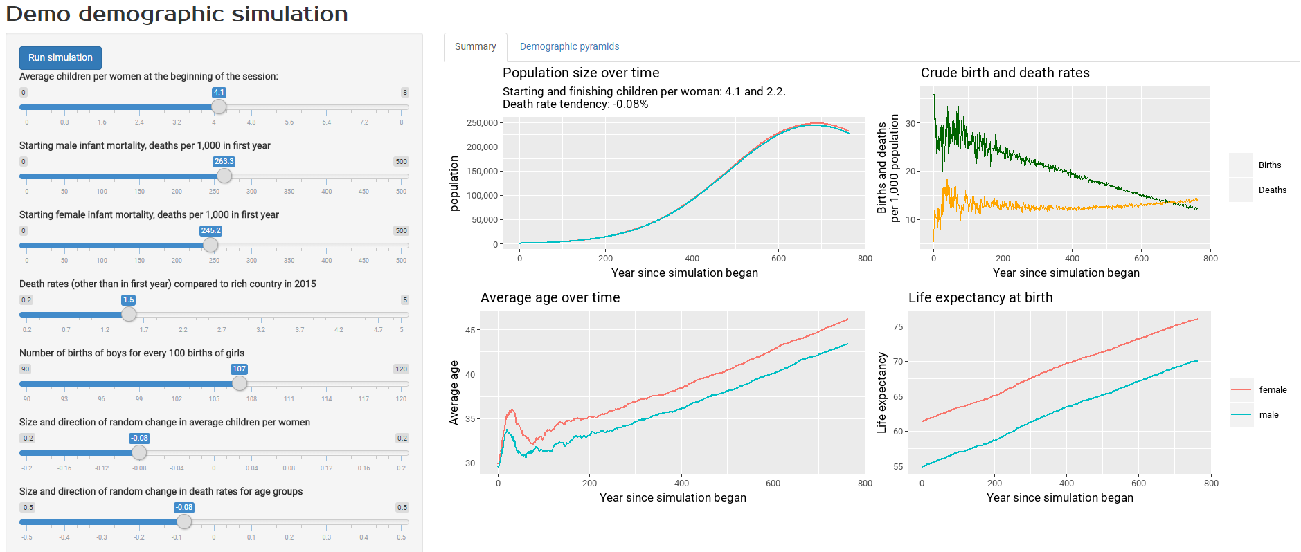
The assumptions you can control include:
- average children per woman at the beginning of the simulation period
- male and female infant mortality rates at the beginning of the simulation period
- death rates other than in the first year, as a multiple of death rates in France in 2015
- the ratio of male to female births (around 107 boys are born for every 100 girls, varying by country)
- the size and magnitude of drift upwards and downards in fertility and death rates over the period.
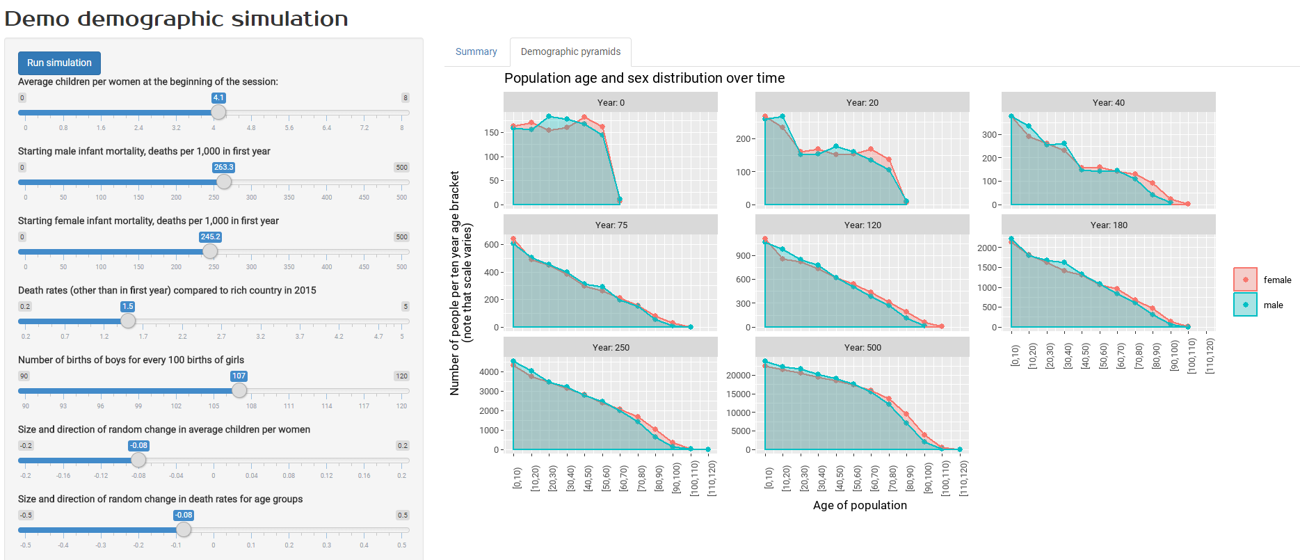
Having run the simulation, you get two sets of output to look at. The screenshot above shows standard results on things like population size, average age, and crude birth and death rates. The screenshot below shows population distribution by age group. This variable is usually shown in demographic pyramids but I’ve opted for straightforward statistical density charts here, because I actually think they are better to read.
With the particular settings used for the model in the screenshots, I’d chosen fairly high infant mortality, death and fertility rates, similar to those in developing countries in the twentieth century. By having all those things trend downwards, we can see the resulting steady increase in life expectancy, and an increasing but aging population for several centuries until a crucial point is reached where crude birth rates are less than death rates and the population starts to decrease.
In fact, playing around with those assumptions for this sort of result was exactly why I’d built this model. I wanted to understand (for example) how changes life expectancy can seemingly get out of sync with crude death rates for a time, during a period when the age composition of a population is changing. If you’re interested in this sort of thing, have a play!
Shining up Shiny
As always, the source code is on GitHub. There are a few small bits of polish of possible interest, including:
- non-default fonts in a ggplot2 image in a Shiny app (surprisingly tricky, with the best approach I know of being the use of
renderImageas set out in this Stack Overflow question and answer, in combination with theshowtextR package); - loader animations - essential during a simulation like this, where the user needs to wait for some seconds if not minutes - courtesy of the
shinycssloaderspackage; - Custom fonts for the web page itself via CSS stored in the
wwwsubfolder.