Traffic fatalities in the news
Fatalities from traffic crashes have been in the news in New Zealand recently, for tragic reasons. For once, data beyond the short term have come into the debate. Sam Warburton has written two good articles on the topic, with good consideration of the data. He has also, via Twitter, made his compilation of NZTA and other data and his considerable workings available.
Traffic, and crashes in particular, are characterised by large volumes of high quality data. Sam Warburton’s workings can be supplemented with a range of data from the NZTA. I know little about the subject and thought it seemed a good one to explore. This is a long blog post but I still feel I’ve barely touched the surface. I nearly split this into a series of posts but decided I won’t get back to this for months at least, so best to get down what I fiddled around with straight away.
Long term
I always like to see as long term a picture as I can in a new area. In one of the tabs in Sam Warburton’s Excel book is a table with annual data back to 1950. Check this out:

Interesting!
Here’s the R code that draws that graph, plus what’s needed in terms of R packages for the rest of the post:
library(tidyverse)
library(mapproj)
library(proj4)
library(ggmap)
library(ggthemes) # for theme_map
library(stringr)
library(forcats)
library(viridis)
library(leaflet)
library(htmltools)
library(broom)
library(openxlsx)
library(forecastHybrid)
library(rstan)

#=================long term picture========================
longterm <- read.xlsx("../data/vkt2.1.xlsx", sheet = "safety (2)",
                      cols = c(1, 17), rows = 2:69)

ggplot(longterm, aes(x = Year, y = Deaths)) +
  geom_line() +
  ggtitle("Road deaths in New Zealand 1950 - 2016",
          "Not adjusted for population or vehicle kilometres travelled") +
  labs(caption = "Source: NZTA data compiled by Sam Warburton")
Spatial elements
There have been a few charts going around of crashes and fatalities over time aggregated by region, but I was curious to see a more granular picture. It turns out the NZTA publish a CSV of all half a million recorded crashes (fatal and non-fatal) back to 2000. The data is cut back a bit - it doesn’t have comments on what may have caused the crash for example, or the exact date - but it does have the exact NZTM coordinates of the crash location, which we can convert to latitude and longitude and use for maps.
So I started as always with the big picture - where have all the fatal crashes been since 2000?

Unsurprisingly, they are heavily concentrated in the population centres and along roads. What happens when we look at this view over time?

So, turns out a map isn’t a great way to see subtle trends. In fact, I doubt there’s an effective simple visualisation that would show changing spatial patterns here; it’s definitely a job for a sophisticated model first, followed by a visualisation of its results. Outside today’s scope.
A map is a good way to just get to understand what is in some data though. Here are another couple of variables the NZTA provide. First, whether the accidents happened on a public holiday:

… and combination of vehicles they involved:

Here’s the code for downloading the individual crash data, converting coordinates from NZTM to latitude and longitude, and building those maps. This is a nice example of the power of the ggplot2 universe. Once I’ve defined my basic map and its theme, redrawing it with new faceting variables is just one line of code in each case.
#============download data and tidy up a bit======================
# The individual crash data come from
# https://www.nzta.govt.nz/safety/safety-resources/road-safety-information-and-tools/disaggregated-crash-data/


# caution, largish file - 27 MB
download.file("https://www.nzta.govt.nz/assets/Safety/docs/disaggregated-crash-data.zip",
              destfile = "disaggregated-crash-data.zip", mode = "wb")
unzip("disaggregated-crash-data.zip")

crash <- read.csv("disaggregated-crash-data.csv", check.names = FALSE)
dim(crash) # 586,189 rows

# I prefer lower case names, and underscores rather than dots:
names(crash) <- gsub(" ", "_", str_trim(tolower(names(crash))), fixed = TRUE)

# Convert the NZTM coordinates to latitude and longitude:
# see https://gis.stackexchange.com/questions/20389/converting-nzmg-or-nztm-to-latitude-longitude-for-use-with-r-map-library
p4str <- "+proj=tmerc +lat_0=0.0 +lon_0=173.0 +k=0.9996 +x_0=1600000.0 +y_0=10000000.0 +datum=WGS84 +units=m"
p <- proj4::project(crash[ , c("easting", "northing")], proj = p4str, inverse = TRUE)
crash$longitude <- p$x
crash$latitude <- p$y


#====================NZ maps========================
my_map_theme <- theme_map(base_family = "myfont") +
  theme(strip.background = element_blank(),
        strip.text = element_text(size = rel(1), face = "bold"),
        plot.caption = element_text(colour = "grey50"))

m <- crash %>%
  as_tibble() %>%
  filter(fatal_count > 0) %>%
  ggplot(aes(x = longitude, y = latitude, size = fatal_count))  +
  borders("nz", colour = NA, fill = "darkgreen", alpha = 0.1) +
  geom_point(alpha = 0.2) +
  coord_map() +
  my_map_theme +
  theme(legend.position = c(0.9, 0.05)) +
  labs(size = "Fatalities",
       caption = "Source: NZTA Disaggregated Crash Data") +
  ggtitle("Fatal crashes in New Zealand, 2000 - 2017")

m

m + facet_wrap(~crash_year)

m + facet_wrap(~multi_veh, ncol = 4)

m + facet_wrap(~holiday)
Closer up maps
I live in New Zealand’s capital, Wellington, and was interested in a closer view of accidents in there. ggmap makes it easy to do this with a street map in the background:
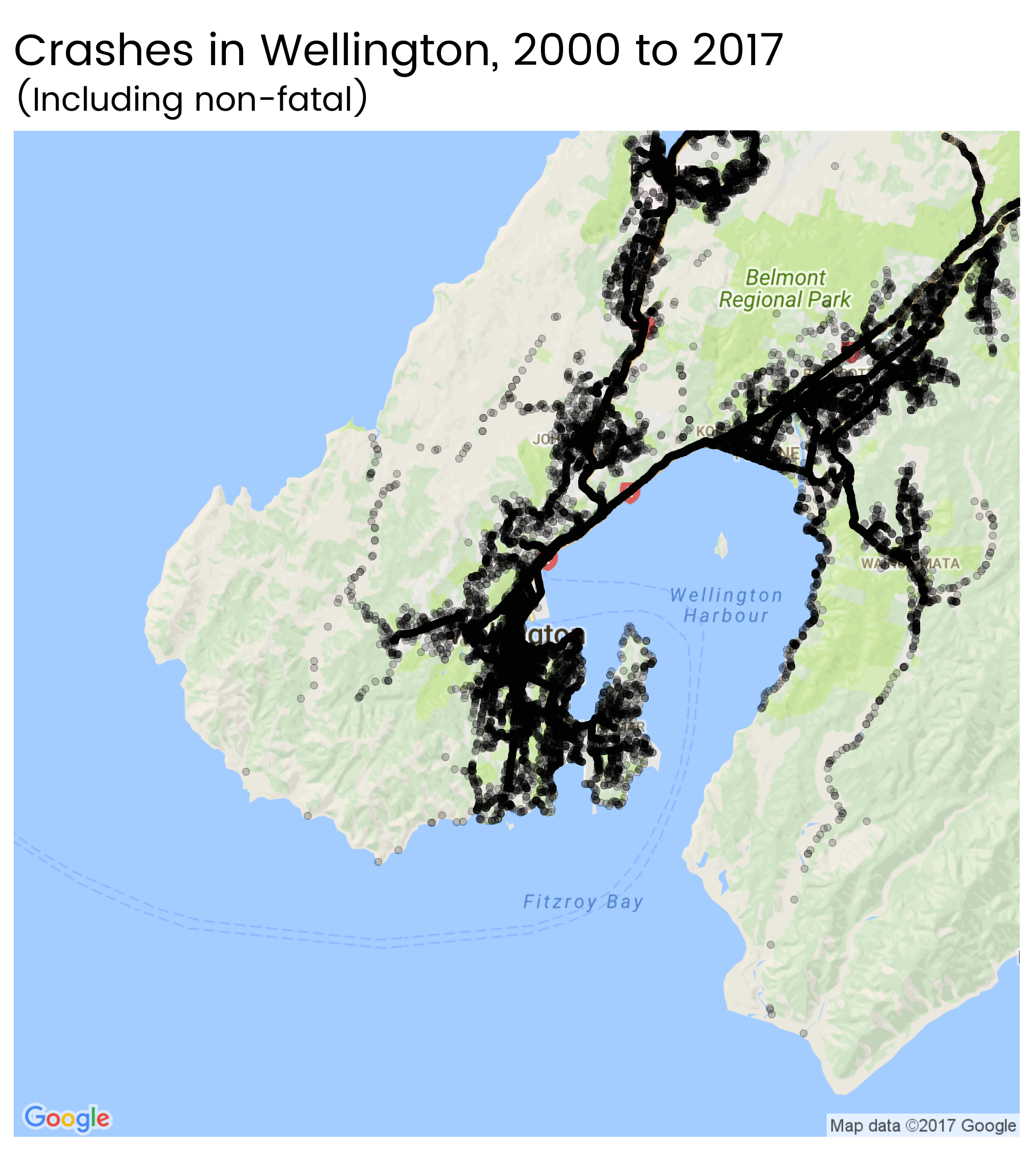
wtn <- get_map("Wellington, New Zealand", maptype = "roadmap", zoom = 11)

ggmap(wtn) +
  geom_point(aes(x = longitude, y = latitude), data = crash, alpha = 0.2) +
  my_map_theme +
  ggtitle("Crashes in Wellington, 2000 to 2017",
          "(Including non-fatal)")
But clearly there’s a limit to how many small, static maps I’ll want to make. So I made an interactive version covering the whole country:
You can zoom in and out, move the map around, and hover or click on points to get more information. Full screen version also available.
Is there a trend over time?
Much of the public discussion is about whether there is significant evidence of the recent uptick in deaths being more than the usual year-on-year variation. The most thorough discussion was in Thomas Lumley’s StatsChat. He fit a state space model to the fatality counts, allowing latent tendency for fatalities per kilometres travelled to change at random over time as a Markov chain, with extra randomness each year on top of the randomness coming from a Poisson distribution of the actual count of deaths. He concluded that there is strong evidence of a minimum some time around 2013 or 2014, and growth since then.
To keep the Bayesian modelling part of my brain in practice I set out to repeat and expand this, using six monthly data rather than annual. The disaggregated crash data published by NZTA has both calendar year and financial year for each crash, which we can use to deduce the six month period it was in. The vehicle kilometres travelled in Sam Warburton’s data is at a quarterly grain, although it looks like the quarters are rolling annual averages.
First, to get that data into shape and check out the vehicle kilometres travelled data. I decided to divide the original numbers by four on the assumption they are rolling annual averages to convert them to a quarterly grain. I might be missing something, but it looked to me that the kilometres travelled data stop in first quarter of 2016, so I forecast forward another couple of years using the forecastHybrid R package as a simple way to get an average of ARIMA and exponential state space smoothing models. The forecast looks like this:

#------------------vehicle kilometres travelled--------------------------
vkt <- read.xlsx("../data/vkt2.1.xlsx", sheet = "VKT forecasts (2)",
                 cols = 3, rows = 6:62, colNames = FALSE) / 4

vkt_ts <- ts(vkt$X1, start = c(2001, 4), frequency = 4)
vkt_mod <- hybridModel(vkt_ts, models = c("ae"))
vkt_fc <- forecast(vkt_mod, h = 8)

autoplot(vkt_fc) +
  ggtitle("Vehicle kilometres travelled per quarter in New Zealand, 2001 to 2017",
          "Forecasts from 2016 second quarter are an average of auto.arima and ets") +
  labs(x = "", y = "Billions of vehicle kilometres travelled",
       fill = "Prediction\nintervals",
       caption = "Source: NZTA data compiled by Sam Warburton;\nForecasts by Peter's Stats Stuff")
Then there’s a bit of mucking about to get the data in a six monthly state and ready for modelling but it wasn’t too fiddly. I adapted Professor Lumley’s model to Stan (which I’m more familiar with than JAGS which he used) to a six monthly observations. Here’s the end result

Consistent with Professor Lumley, I find that 88% of simulations show the first half of 2017 (where my data stops) having a higher latent crash rate per km travelled than the second half of 2013.
Fitting a model like this takes three steps:
- data management in R
- model fitting in Stan
- presentation of results in R
First, here’s the code for the two R stages. The trick here is that I make one column with year (eg 2005) and one called six_month_period which is a for the first six months of the year, and b for the rest. I do this separately for the vehicle kilometres travelled (which needs to be aggregated up from quarterly) and the deaths (which needs to be aggregated up from individual, taking advantage of the fact that we know both calendar and financial years in which it occurred).
#==================combining vkt and crashes============
vkt_df <- data_frame(vkt = c(vkt[ ,1, drop = TRUE], vkt_fc$mean),
                     t = c(time(vkt_ts), time(vkt_fc$mean))) %>%
  mutate(six_month_period = as.character(ifelse(t %% 1 < 0.4, "a", "b")),
         year = as.integer(t %/% 1)) %>%
  group_by(year, six_month_period) %>%
  summarise(vkt = sum(vkt))

crash_six_month <- crash %>%
  as_tibble() %>%
  filter(fatal_count > 0) %>%
  mutate(fin_year_end = as.numeric(str_sub(crash_fin_year, start = -4)),
         six_month_period = ifelse(fin_year_end == crash_year, "a", "b")) %>%
  rename(year = crash_year) %>%
  group_by(year, six_month_period) %>%
  summarise(fatal_count = sum(fatal_count)) %>%
  left_join(vkt_df, by = c("year", "six_month_period")) %>%
  mutate(deaths_per_billion_vkt = fatal_count / vkt) %>%
  filter(year > 2001) %>%
  arrange(year, six_month_period)

dpbv_ts <- ts(crash_six_month$deaths_per_billion_vkt, frequency = 2, start = c(2002, 1))

# high autocorrelation, as we'd expect:
ggtsdisplay(dpbv_ts,
            main = "Crash deaths per billion vehicle kilometres travelled, six monthly aggregation")

# fit an ARIMA model just to see what we get:
auto.arima(dpbv_ts) # ARIMA(1,1,0)(0,0,1)[2] with drift

#===============bayesian model=====================
d <- list(
  n      = nrow(crash_six_month),
  deaths = crash_six_month$fatal_count,
  vkt    = crash_six_month$vkt
)

# fit model
stan_mod <- stan(file = "0113-crashes.stan", data = d,
                 control = list(adapt_delta = 0.99, max_treedepth = 15))


# extract and reshape results:
mu <- t(as.data.frame(extract(stan_mod, "mu")))

mu_gathered <- mu %>%
  as_tibble() %>%
  mutate(period = as.numeric(time(dpbv_ts))) %>%
  gather(run, mu, -period)

mu_summarised <- mu_gathered %>%
  group_by(period) %>%
  summarise(low80 = quantile(mu, 0.1),
            high80 = quantile(mu, 0.9),
            low95 = quantile(mu, 0.025),
            high95 = quantile(mu, 0.975),
            middle = mean(mu))

# chart results:
mu_gathered %>%
  ggplot(aes(x = period)) +
  geom_line(alpha = 0.02, aes(group = run, y = mu)) +
  geom_ribbon(data = mu_summarised, aes(ymin = low80, ymax = high80),
              fill = "steelblue", alpha = 0.5) +
  geom_line(data = mu_summarised, aes(y = middle), colour = "white", size = 3) +
  geom_point(data = crash_six_month,
             aes(x = year + (six_month_period == "b") * 0.5,
                 y = deaths_per_billion_vkt),
             fill = "white", colour = "black", shape = 21, size = 4) +
  labs(x = "", y = "Latent rate of deaths per billion km",
       caption = "Source: data from NZTA and Sam Warburton;
Analysis by Peter's Stats Stuff") +
  ggtitle("State space model of crash deaths in New Zealand",
          "Six monthly observations")

mu_gathered %>%
  filter(period %in% c(2017.0, 2013.5)) %>%
  summarise(mean(mu[period == 2017.0] > mu[period == 2013.5])) # 88%
…and here’s the model specification in Stan:
// save as 0113-crashes.stan

// Simple Bayesian model for traffic deaths in New Zealand at six monthly intervals
// Peter Ellis, 15 October 2017

// State space model with random walk in the latent variable and actual measurements
// are log normal - Poisson combination.
// Adapted from Thomas Lumley's model for the same data (but annual) at
// https://gist.github.com/tslumley/b73d54d1505a3d4478998c79ef271d39


data {
  int n;          // number of six-monthly observations
  int deaths[n];  // deaths (actual count), six month period
  real vkt[n];    // vehicle kilometres travelled in billions
}

parameters {
  real mu1;            // value of mu in the first period
  real delta[n - 1];  // innovation in mu from period to period
  vector[n] epsilon;         // the 'bonus' deviation in each period
  real <lower=0> tau;   // standard deviation of delta
  real <lower=0> sigma; // standard deviation of epsilon

}

transformed parameters {
  real mu[n];         // the amount to multiply km travelled by to get lambda.  In other words, death per billion vkt
  real lambda[n];    // lambda is the expected mean death count in any year

  mu[1] = mu1;
  for(i in 2:n) mu[i] = mu[i - 1] * exp(delta[ i - 1] * tau);

  for(i in 1:n)  lambda[i] = mu[i] * vkt[i] * exp(epsilon[i] * sigma);

}

model {
  // priors
  // probably not great choices of priors actually, needs a rethink (but doesn't seem to impact)
  mu1 ~ gamma(2, 1.0 / 10);
  tau ~ gamma(1, 1);
  sigma ~ gamma(1, 1);

  // innovation each period:
  delta ~ normal(0, 1);

  // bonus deviation each period:
  epsilon ~ normal(0, 1);

  //measurement
  deaths ~ poisson(lambda);
}
Objects hit during crashes
Finally, there were a few things I spotted along the way I wanted to explore.
Here is a graphic of the objects (excluding other vehicles and pedestrians) hit during crashes.

crash %>%
  as_tibble() %>%
  filter(fatal_count > 0) %>%
  mutate(fin_year_end = as.numeric(str_sub(crash_fin_year, start = -4))) %>%
  select(fin_year_end, post_or_pole:other) %>%
  mutate(id = 1:n()) %>%
  gather(cause, value, -fin_year_end, -id) %>%
  group_by(fin_year_end, cause) %>%
  summarise(prop_accidents = sum(value > 0) / length(unique(id))) %>%
  ungroup() %>%
  mutate(cause = gsub("_", " ", cause),
         cause = fct_reorder(cause, -prop_accidents)) %>%
  ggplot(aes(x = fin_year_end, y = prop_accidents)) +
  geom_point() +
  geom_smooth(se = FALSE) +
  facet_wrap(~cause) +
  scale_y_continuous("Proportion of accidnets with this as a factor\n", label = percent) +
  ggtitle("Factors relating to fatal crashes 2000 - 2017",
          "Ordered from most commonly recorded to least") +
  labs(caption = "Source: NZTA disaggregated crash data",
       x = "Year ending June")
Regional relationship with holidays
I expected there to be a relationship between region and holidays - some regions would see a higher proportion of their accidents in particular periods than others. I was only able to scratch the surface of this, as everything else, of course.
I started by creating a three-way cross tab of year, region and holiday (four holidays plus “none”). I used the frequency count in each cell of this cross tab as the response in a generalized linear model and tested for an interaction effect between region and holiday. It’s there but it’s marginal; a Chi square test shows up as definitely significant (p value < 0.01), but on other criteria the simpler model could easily be the better one.
I extracted the interaction effects and presented them in this chart:

So we can see, for example, that the West Coast (on the South Island) has a particularly strong Christmas time effect (expected); Gisborne gets disproportionate rate of its fatal accidents on Labour Day Weekend (not expected, by me anyway); and so on. The horizontal lines indicate 95% confidence intervals.
To check this wasn’t out to lunch, I also did the simpler calculation of just looking at what percentage of each region’s fatal accidents were on each of the four holidays:

This is much easier to interpret and explain!
Here’s the code for that region-holiday analysis:
#=========================changing relationship between holidays and numbers==============

crash_counts <- crash %>%
  group_by(crash_fin_year, lg_region_desc, holiday) %>%
  summarise(fatal_count = sum(fatal_count)) %>%
  filter(lg_region_desc != "") %>%
  mutate(holiday = relevel(holiday, "None"))


mod1 <- glm(fatal_count ~ crash_fin_year + lg_region_desc + holiday,
            family = "poisson",
            data = crash_counts)

mod2 <- glm(fatal_count ~ crash_fin_year + lg_region_desc * holiday,
            family = "poisson", data = crash_counts)

# marginal choice between these two models - there's a lot of extra degrees of freedom
# used up in mod2 for marginal improvement in deviance.  AIC suggests use the simpler
# model; Chi square test says the interaction effect is "significant" and use the complex one.
anova(mod1, mod2, test = "Chi")
AIC(mod1, mod2)

# tidy up coefficients:
cfs <- tidy(mod2)

cfs %>%
  filter(grepl(":", term)) %>%
  extract(term, into = c("region", "holiday"), regex = "(.+):(.+)") %>%
  mutate(region = gsub("lg_region_desc", "", region),
         holiday = gsub("holiday", "", holiday)) %>%
  ggplot(aes(x = estimate, y = region,
             label = ifelse(p.value < 0.05, as.character(region), ""))) +
  geom_vline(xintercept = 0, colour = "grey50") +
  geom_segment(aes(yend = region,
                   x = estimate - 2 * std.error,
                   xend = estimate + 2 * std.error), colour = "grey20") +
  geom_text(size = 3.5, nudge_y = 0.34, colour = "steelblue") +
  ggtitle("Distinctive region - holiday interactions from a statistical model",
          "Higher values indicate the holiday has a higher relative accident rate in that particular region than in Auckland") +
  labs(y = "", caption = "Source: NZTA Disaggregated Crash Data",
       x = "Estimated interaction effect in a generalized linear model with Poisson response:
frequency ~ year + holiday * region") +
  facet_wrap(~holiday)

crash %>%
  filter(lg_region_desc != "") %>%
  group_by(lg_region_desc, holiday) %>%
  summarise(fatal_count = sum(fatal_count)) %>%
  group_by(lg_region_desc) %>%
  mutate(share = fatal_count / sum(fatal_count)) %>%
  filter(holiday != "None") %>%
  ggplot(aes(x = share, y = lg_region_desc)) +
  facet_wrap(~holiday) +
  geom_point() +
  scale_x_continuous("\nProportion of all fatalities in region that occur in this holiday",
                     label = percent) +
  labs(y = "", caption = "Source: NZTA Disaggregated Crash Data") +
  ggtitle("Proportion of each regions fatalities on various holidays",
          "This simpler calculation is designed as a check on the modelled results in the previous chart")


#==========clean up===========
unlink("disaggregated-crash-data.zip")
unlink("disaggregated-crash-data.csv")
That will do for now. Interesting data, very unsatisfactory state of the world.