Disclaimer on all that follows - I am not an earthquake scientist and have cobbled together this post from sources like Wikipedia, official open data, and a range of information sites. There may be mistakes and misinterpretations that follow.
Energy release from earthquakes is extremely variable
My last blog post left me interested in finding out more about energy generated by earthquakes and how it relates to magnitude. I was vaguely aware that magnitude was on a logarithmic scale so something is ten times the size for increase of one in magnitude, but it turns out that that is the shaking amplitude. Energy is going to be proportionate to \(10^{1.5}\) to the power of magnitude, which means an increase in one magnitude point increases the energy released by about 31.6. Here’s an R function I cobbled together to convert earthquake magnitudes into rough equivalent megatons of TNT, a measure usually used to measure the oomph of nuclear weapons.
library(testthat)
#' function that converts an earthquake magnitude approximately to an energy estimate
#' in megatonnes of TNT (ie millions of tonnes)
magn_to_megat <- function(magnitude){
   # Formula from http://alabamaquake.com/energy.html#/
   ergs <- 10 ^ (11.8 + 1.5 * magnitude)

   # Conversion rates from http://www.atmosp.physics.utoronto.ca/people/codoban/PHY138/Mechanics/dimensional.pdf.
   grammes_tnt <- ergs / (4 * 10 ^ 10)
   megatonnesTNT <- grammes_tnt / 10 ^ 6 / 10 ^ 6
   return(megatonnesTNT)
}

# checks against the rough conversions in a table at
# http://www.openhazards.com/faq/earthquakes-faults-plate-tectonics-earth-structure-user-submitted-questions/what-energy
expect_lt(abs(magn_to_megat(6) - 0.015), 0.01)
expect_lt(abs(magn_to_megat(7) - 0.5), 0.1)
expect_lt(abs(magn_to_megat(8) - 15), 1)
The pie chart that I had taken from the media and polished up in my last post, which showed how much of the earthquake energy in recent years came in a single day last weekend, had a slightly naughtily chosen starting point of 2010. Extending this a year back would have made the pie chart much more nuanced. But rather than battle it out with pie charts, I downloaded all the data on individual earthquakes (some of them back to well before 1800!) from the https://quakesearch.geonet.org.nz site, converted each magnitude to energy (ignoring for my purposes the nuances of different ways that magnitudes were measured and slightly different scales), and aggregated the total energy up by day. That delivered this revealing chart (note that dates are in Greenwich mean time, which is not how earthquakes’ dates are usually referred to locally of course):
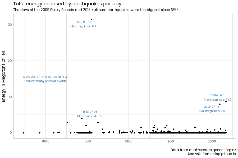
Yes, the 2009 Dusky Sounds earthquake and last weekend’s Kaikoura earthquake dwarf everything back until the 1855 Wairarapa earthquake. It should be noted that the further back this chart goes, the more it underestimates total energy released, because only very major events have estimates and the energy released by aftershocks and day to day events were not recorded. Even in the instrument-measured era, the instruments have changed over time.
This is a good reminder that destructiveness is only weakly related to magnitude. Obviously, location, depth and timing are key factors. While the Canterbury earthquakes in 2010 and 2011 were low energy relative to the larger ones New Zealand has experienced, they were devasting to life and property.
Maps should show the energy more
This exercise made me think about the maps which are commonly drawn of earthquakes, with the area of points representing the magnitude. In fact, to avoid misleading, it might be better for the area to represent on a non-logarithmic scale the shaking or the energy released. This would make maps look more like this one:
Big events like last Sunday night release so much energy that everything else looks like a pin prick in comparison.
Some interesting historical patches
One thing I was interested in was the largest magnitude earthquake in any particular day, so I made this graphic:
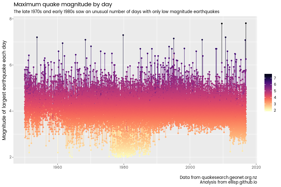
Those are some interesting periods of time, where for a reasonable proportion of days the largest magnitude earthquake was not particularly large. So that prompted me to wonder if there was a connection between the number of earthquakes and their average and maximum magnitudes. There is in fact a relationship of that sort in the data, but it looks to be an artefact of the improving measurement - the better the monitors get, the more small earthquakes they pick up and record, which gives the impression that over time there are more and more earthquakes but on average they are getting smaller. Discovering this was one of the things that made me want to estimate energy and aggregate it, so the plethora of small low energy earthquakes don’t warp the overall picture. To mitigate the impact of improving measurement over time, I knock out all earthquakes of magnitude less than two before estimating total energy. I don’t think this would have much substantive impact.
Here is an interesting image of the number of earthquakes of magnitude two or higher:
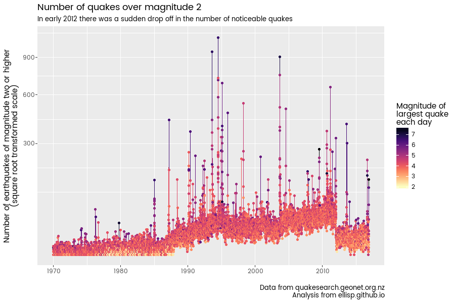
That’s a very marked drop in 2012. So marked in fact that my first reaction was to think there might have been a change in how the measurement was happening. A quick google didn’t reveal what was going on there. Anyone who knows - whether it’s a bug in my code, or something more interesting - please leave a comment!
Total energy on a logarithmic scale
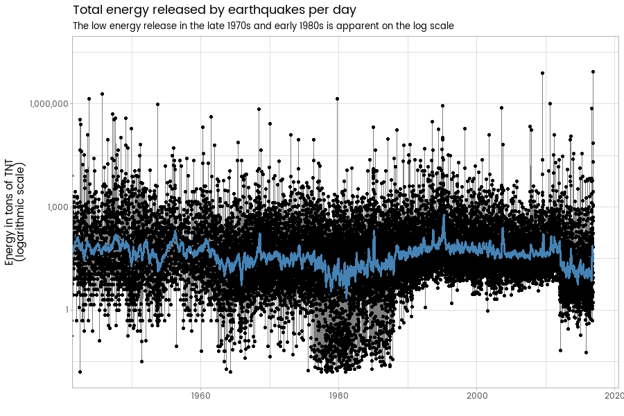
While the first graphic in this post is good at showing the rarity of the really high energy earthquake events, it’s no good at showing trends over time. The simpler plots just above, looking at the biggest earthquake each day and the number of earthquakes greater than magnitude two each day, are not satisfactory either.
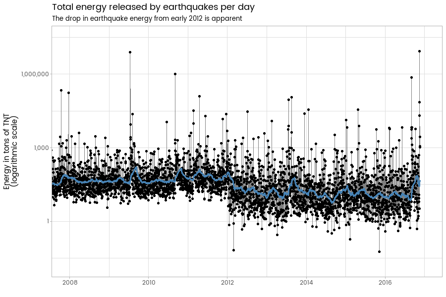
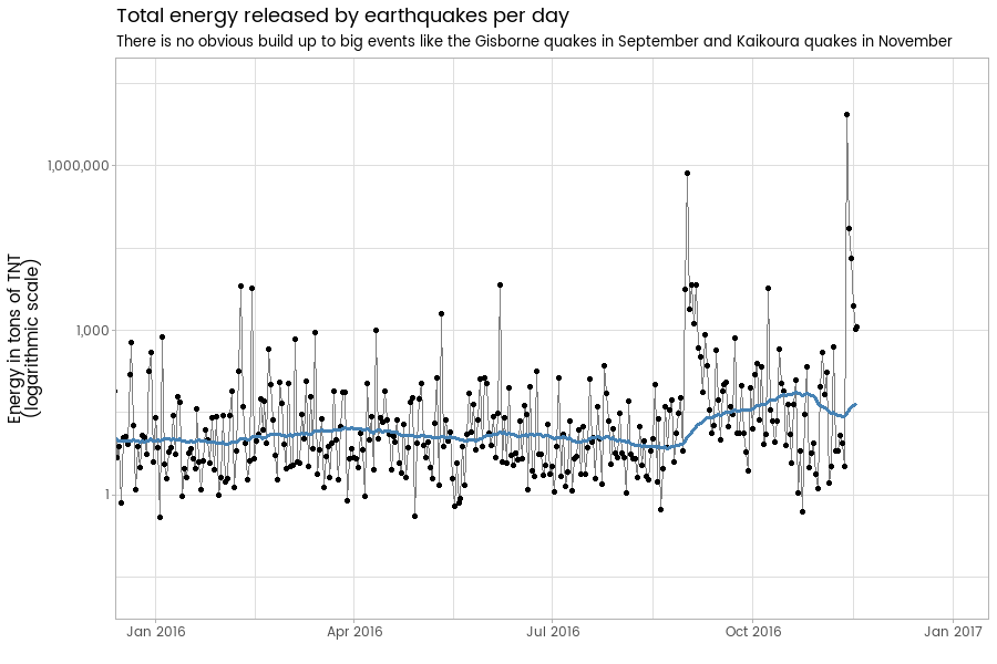
Putting daily total earthquake energy on a logarithmic scale is a good way to visually inspect for trends. At a medium time scale, we see again that drop in energy in early 2012, and an irregular cycle of spikes. The blue line in the next three graphics shows a 60 day moving average:
Here’s the code behind all that. As I’m not sure geonet would be thrilled at people copying my code and doing bulk downloads, I’ve saved a copy of the cut down data needed to reproduce this on my own site. The actual source code to download it is simple enough and is available in the
#=============download snapshot of quake data, current as at 19 November 2016=======
library(dplyr)
library(ggplot2)
library(viridis) # for colours
library(ggseas)  # for stat_rollaplyr, rolling average on fly
library(scales)
library(ggrepel)

# About 12 MB
download.file("https://github.com/ellisp/ellisp.github.io/raw/master/data/quakes_df.rda", destfile = "quakes_df.rda")
load("quakes_df.rda")
# cleanup:
unlink("quakes_df.rda")

#==================analysis=============

# facet map
m1 <- quakes_df %>%
   filter(day >= as.Date("2016-11-09")) %>%
   ggplot(aes(x = longitude, y = latitude, size = energy, colour = depth)) +
   borders('nz', colour = NA, fill = terrain.colors(7)[7]) +
   geom_point(alpha = 0.5) +
   coord_map() +
   ggmap::theme_nothing(legend = TRUE) +
   theme(legend.position = "none") +
   scale_size_area("Energy",max_size = 25) +
   facet_wrap(~day, ncol = 5) +
   scale_color_viridis("Depth") +
   ggtitle("Earthquakes in New Zealand, ten days in November 2016",
           subtitle = "Circle area is proportionate to energy released,.\nDates are based on Greenwich mean time.") +
   labs(caption = "Data from quakesearch.geonet.org.nz\nAnalysis from ellisp.github.io")
print(m1)

#=======aggregate by day===============
quakes_g <- quakes_df %>%
   filter(eventtype == "earthquake") %>%
   filter(magnitude >= 2) %>%
   group_by(day) %>%
   summarise(NumberOver2 = length(magnitude),
             NumberOver4 = sum(magnitude >= 4),
             NumberOver5 = sum(magnitude >= 5),
             NumberOver6 = sum(magnitude >= 6),
             NumberOver7 = sum(magnitude >= 7),
             MeanMagnitude = mean(magnitude, na.rm = TRUE),
             MaxMagnitude = max(magnitude, na.rm = TRUE),
             MeanDepth = mean(depth),
             TotalEnergy = sum(energy)) # ie megatons of TNT

quakes_g %>%
   arrange(desc(TotalEnergy))


#==============graphics of daily energy, magnitude, counts===============
# note the period in 1977 - 1988 when many days had no earthquake > 3
p1 <- quakes_g %>%
   filter(day > as.Date("1949-12-31")) %>%
   ggplot(aes(x = day, y = MaxMagnitude, colour = MaxMagnitude)) +
   geom_line() +
   geom_point() +
   theme_grey(base_family = "myfont") +
   scale_color_viridis(option = "A", direction = -1) +
   ggtitle("Maximum quake magnitude by day",
      subtitle = "The late 1970s and early 1980s saw an unusual number of days with only low magnitude earthquakes") +
   labs(x = "", y ="Magnitude of largest earthquake each day", color = "",
        caption = "Data from quakesearch.geonet.org.nz\nAnalysis from ellisp.github.io")
print(p1)

# six months after the 2010 and 2011 earthquakes a sudden big drop in the number of quakes > 2
p2 <- quakes_g %>%
   filter(day > as.Date("1969-12-31")) %>%
   ggplot(aes(x = day, y = NumberOver2, colour = MaxMagnitude)) +
   geom_line() +
   geom_point() +
   theme_grey(base_family = "myfont") +
   scale_color_viridis(option = "A", direction = -1) +
   scale_y_sqrt() +
   ggtitle("Number of quakes over magnitude 2",
      subtitle = "In early 2012 there was a sudden drop off in the number of noticeable quakes") +
   labs(x = "", y = "Number of earthquakes of magnitude two or higher\n(square root transformed scale)",
        color = "Magnitude of\nlargest quake\neach day",
        caption = "Data from quakesearch.geonet.org.nz\nAnalysis from ellisp.github.io")
print(p2)


p_basis <- quakes_g %>%
   filter(day > as.Date("1750-12-31")) %>%
   ggplot(aes(x = day, y = TotalEnergy)) +
   geom_point()

set.seed(123)
small_data <- quakes_g %>%
   filter(day > as.Date("1750-12-31")) %>%
   filter(MaxMagnitude > 7.5) %>%
   mutate(lab = paste0(day, "\nMax magnitude: ", round(MaxMagnitude, 2)))

p3 <- p_basis +
   geom_text_repel(data = small_data, aes(label = lab), size = 3, colour = "steelblue") +
   scale_y_continuous(label = comma) +
   ggtitle("Total energy released by earthquakes per day",
           subtitle = "The days of the 2009 Dusky Sounds and 2016 Kaikoura earthquakes were the biggest since 1855") +
   labs(x = "", y = "Energy in Megatons of TNT",
        caption = "Data from quakesearch.geonet.org.nz\nAnalysis from ellisp.github.io") +
   annotate("text", x = as.Date("1800-01-01"), y = 15, size = 3, colour = "steelblue",
            label = "Data from before the 1950s fails to \ninclude many smaller events")
print(p3)


p4 <- quakes_g %>%
   filter(day > as.Date("1750-12-31")) %>%
   ggplot(aes(x = day, y = TotalEnergy * 10 ^ 6)) +
   geom_line(colour = "grey50") +
   geom_point() +
   scale_y_log10(label = comma) +
   stat_rollapplyr(width = 60, colour = "steelblue", size = 1.2)+
   coord_cartesian(xlim = as.Date(c("1945-01-01", "2016-12-30"))) +
   labs(x = "", y = "Energy in tons of TNT\n(logarithmic scale)") +
   ggtitle("Total energy released by earthquakes per day",
           subtitle = "The low energy release in the late 1970s and early 1980s is apparent on the log scale")
print(p4)

p5 <- p4 +
   coord_cartesian(xlim = as.Date(c("2008-01-01", "2016-12-30"))) +
   ggtitle("Total energy released by earthquakes per day",
           subtitle = "The drop in earthquake energy from early 2012 is apparent")
print(p5)

p6 <- p4 +
   coord_cartesian(xlim = as.Date(c("2016-01-01", "2016-12-30"))) +
   ggtitle("Total energy released by earthquakes per day",
           subtitle = "There is no obvious build up to big events like the Gisborne quakes in September and Kaikoura quakes in November")
print(p6)