Control charts
I wanted to help explore the implications of changing sample size for a quality control process aimed at determining the defect rate in multiple sites. Defect in this particular case is binary ie the products are either good or not. Much of the advice on this in the quality control literature strikes me as rather abstract and technical, while still not sufficiently detailed on what really needs to be done for power calculations. My idea was to instead let an end user see in advance what sort of thing they would see if they went into the exercise with different sample sizes.
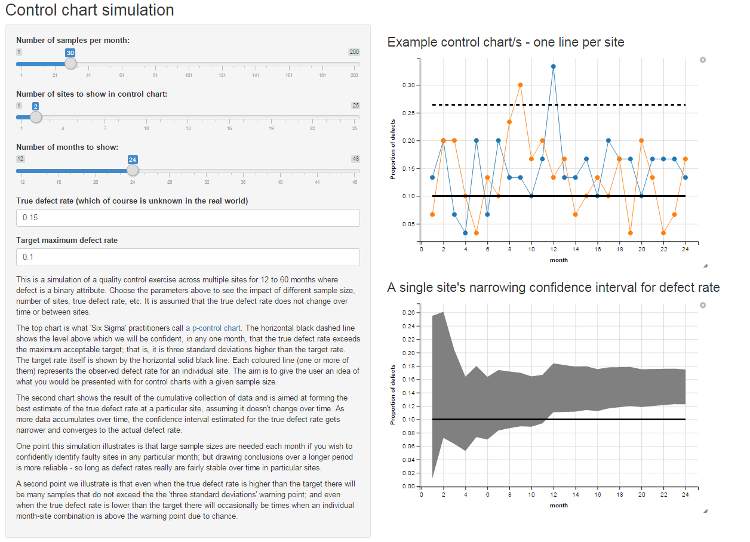
The result was this interactive R/Shiny/ggvis web app:

I’m not an expert in statistical quality control by any means, but the statistics are straightforward. The “p-chart” is simply a time series of the proportion of recorded defects in samples taken over time, compared to horizontal lines for the central tendency of the process “under control” and upper and lower limits of acceptability before being seen as “our of control”. When they exceed some margin - typically three standard deviations, but see below - beyond some central acceptable target you conclude there’s strong evidence of something going wrong in that particular process at that particular point of time. Of course, about 3 times in 1,000 if the true defect rate is bang on the target you’ll still get that “three standard deviations too big” threshold, but that’s deemed an acceptable false positive rate.
3 x sigma versus exact binomial
Coming to this for the first time from a more general statistics backgroun, I raised an eyebrow at the “Six Sigma” approach of just making an Upper Control Limit (UCL) of 3 standard deviations away from the general population. This rule of thumb comes from a judgement of what an acceptable false positive / false negative rate is when the observations have a Gaussian (‘Normal’) distribution. It turns out that in some quarters this is known as “American practice”; and the “British practice”, in contrast, is to specify a given confidence level calculated on the basis of the actual distribution of the observed variable (in this case, binomial) and set the UCL on that basis. The results are pretty much equivalent so long as you choose the correct confidence level if using the ‘British’ approach; in my Shiny app I’ve given the option to use either. I think the Six Sigma simplification is fully justified if it gets the core concepts out to a wider audience than mathematical statisticians.
A stable Upper Control Limit
The example p control charts I found (eg Figure 12 on this iSixSigma site) look to calculate the standard deviation independently at each time point. Instead, I’ve taken the approach of treating the idea “the true rate is at the target rate” as my null hypothesis, and calculating the standard deviation on the assumption that the null hypothesis is true. This is consistent with a big stream of statistical practice and has the advantage of making a neater graph (a horizontal line for the upper control limit rather than a wobbly one - my approach only introduces wobbles when the sample size changes, not the observed rate at a particular point in time). The standard p-chart practice, from what I can tell, calculates the standard deviation for each time period based on the observed defect rate and has the counter-intuitive result that the higher the observed defect rate in any particular sample, the higher the Upper Control Limit and hence it becomes easier to be officially noted as officially “in control”. In practice, this doesn’t matter much.
An alternative to the P chart for a slightly different purpose
For some purposes, I’m not happy with the approach the P chart takes of treating each sample in each time period as independent. This makes sense in a context where you’ve got a process you’re happy with, and you just want to get warning when it starts going out of control - in fact, the classic stable QC process question such as “are 99.99% of memory chips we product going to work, as they have over the past two years of production?”. But in many real world situations, one isn’t yet “happy” with the process and just watching for change over time - we might instead want to find out if the overall process is good or bad, from a position of basic ignorance. For this purpose it makes sense to cumulatively pool the data as it comes in and create an estimate of the overall defect rate, over the full time period, for a particular site or process. Hence the second graphic in the Shiny app, at bottom right of the screen, lets a user see how the confidence interval for the defect rate narrows over time.
Check it out:
- The Shiny app itself
- The source code
Suggestions welcomed. This was done in a bit of a rush and I may well have gotten something muddled up.