World Development Indicators
After my last post on deaths from assault, I got a few comments both on and off-line asking for exploration of developing country issues, in contrast to the OECD focus of the previous post. I’d always intended at some point to do something with the World Bank’s World Development Indicators so now seems a good time to at least get started.
“World Development Indicators (WDI) is the primary World Bank collection of development indicators, compiled from officially recognized international sources. It presents the most current and accurate global development data available, and includes national, regional and global estimates”
I’ll be analysing the data using Vincent Arel-Bundock’s WDI R package which makes it super easy to grab data via the World Bank’s Application Programming Interface, including fast searching a cached version of the indicator names and of course downloading the actual data into an R session. With that search ability and the Bank’s own page with its categorisations of indicators it wasn’t hard to find data that I was interested in.
However I quickly found myself doing some repetitive tasks - downloading a dataset and turning them into a standard faceted time series plot. Following the DRY (Don’t Repeat Yourself) fundamental principle of programming I decided this phase of exploration was more suited to a graphic user interface so I spun up this web-app using Shiny.
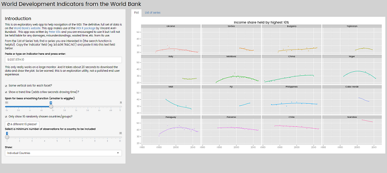
The app has my standard plot I was making each time I looked at a new indicator:

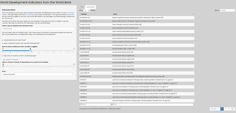
and a responsive, fast, searchable table of the available indicators:

The source code is available in the <source> branch of my blog repository if anyone wants to hunt it down.
As well as producing my standard plot quickly for me, putting all the 3,700 indicators into a JavaScript DataTable gave me even more convenient searching and navigating. While developing that app I did a one-off download all 7,145 available indicators, which is the number of rows returned in this snippet of code:
library(WDI)
search_results <- WDIsearch("")
nrow(search_results)
This was convenient to have a local copy of all that data (1.1GB of download - took about 10 hours - but only about 70MB when saved in R’s super efficient .rda format), but the main motivation for doing this was identifying which series actually have data. Only the 3,700 series with at least one row of data on 3 December 2015 are listed in my Shiny app. The app does download the live data, not using my cached copy; this obviously makes the performance quite slow (about 10 - 20 seconds of apparent unresponsiveness when downloading a dataset) but saves me having a very large shiny app on a hosted server, and ensures the data are current.
Inequality measures
There are five measures that I found in the WDI that are related to income inequality:
| Indicator code | Indicator name |
| SI.POV.GINI | Gini coefficient of income |
| SI.DST.10TH.10 | Income share held by highest 10% |
| SI.DST.05TH.20 | Income share held by highest 20 |
| SI.DST.FRST.10 | Income share held by lowest 10% |
| SI.DST.FRST.20 | Income share held by lowest 20% |
With these, I’ll also create two other common measures: the P80P20 and P90P10 measures. The first of these is the income share of the highest earning 20% divided by that of the lowest earning 20%; the second is the same but for the 10th percentile instead.
I’ve talked a bit about the definitions of these measures in an earlier post.
Once we’ve brought in the data and created our two new variables we can have a look at what we’ve got. I do this by picking six countries at random and looking at the full data for those six:
From just this example (and a few others I ran and some back up analysis but won’t bother to show) a few things suggest themselves:
- country data are pretty much equally complete across the measures. For example, Fiji has values for two years for every measure; France has about 10; etc.
- the variables change over time in consistent ways (not surprising given they are all based on the same underlying data). For example, as the proportion of the country’s income that goes to the bottom percentile (P10) in Cyprus goes down, so does the P20; and the Gini coefficient, P90 (income share of the top 10%) and P80 (income share of the top 20%) all go up together.
- P90P10 and P80P20 are the measures in which it is hardest to detect variation visually on the untransformed scale. For example, Central African Republic’s high inequality dominates the scale in each measure’s row, but only in P90P10 and P80P20 does it do so so much that it’s difficult to see variation at all in the other countries.
Looking at the average values for each measure over time gives a rough sense of their correlation. In the pairs plot below, each of the 156 points represents a single country’s trimmed mean value on a particular inequality measure over all the years where they had data. Countries aren’t comparable to eachother (as they have different years of data), but variables are (because countries have observations on all measures for the same years, for that particular country).
Bhutan is excluded from this plot because its average values on P90P10 and P80P20 were so extreme other variation couldn’t be seen. Suriname is excluded because it only has a value for Gini coefficient, not the other variables. A small number of other excluded countries (including New Zealand!) are absent from the entire World Bank dataset on these variables.
Overall, I’m happy that the measures of the Gini coefficient and of the share going to the richest X% are highly correlated. As I’ve mentioned before, I can see the argument (by Thomas Picketty) that the proportion of national income going to the richest X% is a good measure for interpetability and ease of explanation, but I disagree with some of the other criticisms of the Gini coefficient. However, I’m more convinced than ever that Picketty is correct that the P90P10 and P80P20 measures aren’t good choices, because of the instability that comes from dividing a large number by a small number.
Here’s the code in R for the inequality plots.
library(WDI)
library(ggplot2)
library(scales)
library(dplyr)
library(tidyr)
library(GGally)   # for ggplot pairs plot
library(showtext) # for fonts

# import fonts
font.add.google("Poppins", "myfont")
showtext.auto()

# import data from the World Bank
gini <- WDI(indicator = "SI.POV.GINI", end = 2015, start = 1960)
p90 <- WDI(indicator = "SI.DST.10TH.10", end = 2015, start = 1960)
p80 <- WDI(indicator = "SI.DST.05TH.20", end = 2015, start = 1960)
p10 <- WDI(indicator = "SI.DST.FRST.10", end = 2015, start = 1960)
p20 <- WDI(indicator = "SI.DST.FRST.20", end = 2015, start = 1960)


# merge and tidy up
inequality <- merge(gini, p10, all = TRUE) %>%
   merge(p20, all = TRUE) %>%
   merge(p80, all = TRUE) %>%
   merge(p90, all = TRUE) %>%
   # create synthetic variables
   mutate(P90P10 = SI.DST.10TH.10 / SI.DST.FRST.10,
          P80P20 = SI.DST.05TH.20 / SI.DST.FRST.20) %>%
   select(-iso2c) %>%
   # gather into long form
   gather(variable, value, -country, -year) %>%
   filter(!is.na(value)) %>%
   # rename the variables:
   mutate(variable = gsub("SI.DST.FRST.", "P", variable),
          variable = gsub("SI.DST.10TH.10", "P90 (Share of richest 10%)", variable),
          variable = gsub("SI.DST.05TH.20", "P80 (Share of richest 20%)", variable),
          variable = gsub("SI.POV.GINI", "Gini", variable, fixed = TRUE))

all_countries <- unique(inequality$country) # 158 countries

#---------------all 7 measures over time?-------------
# example plot of 6 random countries over time
svg("../img/0022-eg-countries.svg", 8, 8)
set.seed(127)
inequality %>%
   filter(country %in% sample(all_countries, 6, replace = FALSE)) %>%
   mutate(variable = str_wrap(variable, 20)) %>%
   ggplot(aes(x = year, y = value)) +
   geom_point() +
   geom_line() +
   facet_grid(variable ~ country, scales = "free_y")
dev.off()

# average observations per country and variable:
inequality %>%
   group_by(variable, country) %>%
   summarise(ObsPerCountry = length(value)) %>%
   group_by(variable) %>%
   summarise(AveObsPerCountry = mean(ObsPerCountry),
             Countries = length(ObsPerCountry))

#---------trimmed mean for each country on each variable, in wide format----------
inequality_aves <- inequality %>%
   group_by(country, variable) %>%
   summarise(value = mean(value, tr = 0.2)) %>%
   spread(variable, value) %>%
   # make the column names legal
   data.frame(stringsAsFactors = FALSE, check.names = TRUE)
names(inequality_aves) <- gsub(".", "", names(inequality_aves), fixed = TRUE)

# what are the extreme values of those averages of ratios:
inequality_aves %>%
   arrange(P90P10) %>%
   tail()

# Draw pairs plots
svg("../img/0022-pairs.svg", 12, 12)
inequality_aves %>%
   # Bhutan has an average P90P10 of 600 so we exclude it
   filter(country != "Bhutan") %>%
   select(-country) %>%
   ggpairs()
dev.off()
