Silver trade
I’ve been reading Ronald Findlay and Kevin H. O’Rourke’s 2009 book Power and Plenty: Trade, War, and the World Economy in the Second Millennium and finding it an excellent piece of big picture economic history.
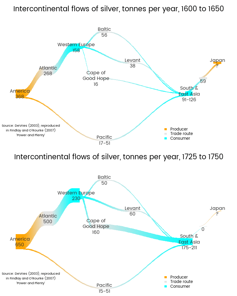
I felt the urge to re-express one of their figures (Figure 4.7 in the original). The original is made up of two flow diagrams, summarising a fantastic piece of work by Jan DeVries pulling together the best understanding of where silver was traded from and to in the seventeenth and eighteenth centuries. Here’s my reworked effort:

Some points worth noting:
- Substantial amounts of silver remained in Europe. The trade was not, by a long shot, all about shipping silver from the Americas to China via Europe, although this was clearly a significant feature.
- In the earlier period, there was more silver travelling from the Americas via the Pacific (stopping off at Manila) to China and the rest of East Asian than via Europe and the Cape of Good Hope. By the mid eighteenth century, the Europe/Cape route was far larger.
- Although the Chinese Ming dynasty fell in 1644, suspiciously soon after the seclusion of Japan from the outside world in 1635, the fall can’t be blamed on a shortage of silver because the decline was compensated for by increases from the Americas.
- Not all the silver going via the Baltic and Levant “routes” makes it to East Asia. Some stays in the Middle East and Russia. In the diagram above this is shown by the ribbons flowing from the Baltic and Levant to South East Asia being only half the width of those flowing from Western Europe to the Baltic and Levant. I’m not entirely happy with this aspect of the diagram, but it’s good enough for now.
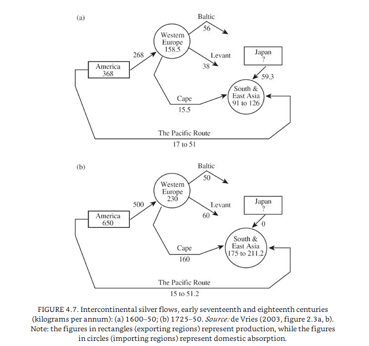
The original
I don’t have access to DeVries’ original 2003 article:
- “Connecting Europe and Asia: a quantitative analysis of the Cape-route trade, 1497– 1795”. In Global Connections and Monetary History, 1470– 1800 (ed. D. O. Flynn, A. Gir ´ ldez, and R. von Glahn). Aldershot: Ashgate.,
but it must be an impressive piece of detective work. Jan de Vries has a web page at Berkeley. Here’s his flow diagrams as reproduced by Findlay and O’Rourke:

Note that the caption says the flows are in kilogrammes per year, but it’s obvious from the text that this is a typo and in fact the measures are in tonnes per year.
Re-creating it
I wanted to improve this diagram in several ways to give it a more immediate visual impact related to the underlying data:
- use colour rather than shape to indicate which areas were producers and which were consumers
- use width of lines to show volumes so it becomes a Sankey diagram
- use animation to facilitate direct comparison of the two periods
In combination, this should be more effective than the wireframe original at drawing the viewer’s eye to the increase in volume in the Americas - Atlantic - Europe - Cape - Asia triangle, and the reduction to nothing in flows from Japan when the Tokugawa regime shut that country to the world and expelled the Portuguese traders who had been making a nice living carrying between China and Japan.
I also rounded a few decimal numbers that in the original gave a false idea of precision.
To do this efficiently for two diagrams that have the same basic structure, I created a project-specific function in R for the purpose of drawing a Sankey chart for different levels of silver flows. The two images are created separately as PNG files, and then I use ImageMagick to tie them together into an animated GIF. To allow the whole thing to be run programmatically from R, I send the command to ImageMagick from R, effectively using R as a shell script for that part of the program. This means I don’t need to leave my R development environment to run iterations of the program (for example, while tweaking exactly where each continent’s label is placed on the page).
The actual drawing of the plots is done by January Weiner’s excellent riverplot R package. Until riverplot came out some time in the last year or so, drawing Sankey charts was either a pain, or impossible without specialist software. It’s great that we can now draw and polish (to a degree) Sankey charts without leaving the R environment.
One trick needed for this, common when you want to set a scale to be the same in multiple plots, was to draw an invisible (ie white) ribbon connecting two invisible nodes at the top of the diagram, reflecting movement of 650 tonnes per year of silver between two imaginary locations. This value is controlled by the cal_width argument in my silver() function below. As 650 is equal to or larger than any of the actual flows, it forms the calibration value against which all the other ribbon widths are defined. This means the widths of the ribbons in the two images are comparable and on the same scale.
library(riverplot)   # for Sankey charts
library(dplyr)
library(grid)
library(showtext)    # for fonts
library(stringr)

font.add.google("Poppins", "myfont")
showtext.auto()


silver <- function(node_values, edge_values, title,
                   pal = c("orange", "cyan", "grey90"), family = "myfont",
                   cal_width = 650){
   # Function that draws a Sankey chart of intercontinental silver flows
   # @node_values - the number of production / consumption / travel to be added
   #   to America, Western Europe, Levant, Baltic, Cape, Japan, SE Asia, Atlantic, Pacific, Sea of Japan
   # @edge_values - the width of the connections in this order:
   #    America to Pacific to South East Asia
   #    America to Atlantic to Western Europe
   #    Western Europe to Baltic to South East Asia
   #    Western Europe to Levant to South East Asia
   #    Western Europe to Cape to South East Asia
   #    Japan to Sea of Japan to South East Asia
   # @title title for plot
   # @pal vector of colours for producers, consumers, and travel routes respectively
   # @family font family to use
   # @cal_width width of an invisible white ribbon to draw, implicitly the maximum,
   #    so scale is constant for multiple plots

   # edge_values comes in as just a single number and we need two edges for
   # each (eg America to Pacific to SE Asia is two edges)
   edge_values <- rep(edge_values, each = 2)

   # we don't know how much of the silver that goes via the Baltic and the Levant
   # actually gets to Asia (as opposed to staying in middle East and Russia),
   # so to represent this we halve the width of those two edges:
   edge_values[ c(6, 8)] <- edge_values[ c(6, 8)] / 2

   nodes <- data.frame(

      # The X and Y coordinates of the nodes (Americas, Atlantic, etc) are
      # just chosen by hand:
      x = c(2, 4, 6, 5, 4.7, 9, 8, 3,   5, 8.5, 2, 9),
      y = c(3, 6, 5, 7, 4,   5, 3, 4.5, 0, 4,   8, 8),
      ID = LETTERS[1:12],
      labels = c("America", "Western Europe", "Levant", "Baltic", "Cape of\nGood Hope", "Japan", "South &\nEast Asia",
                 "Atlantic", "Pacific", "", "", ""),
      amount = c(node_values, "", ""),
      col = c(pal[c(1, 2, 3, 3, 3, 1, 2, 3, 3, 3)], "white", "white"),
      stringsAsFactors = FALSE) %>%
      mutate(labels = paste(labels, amount, sep = "\n"),
             labels = gsub("\n59.3", "59.3", labels))

   edges <- data.frame(
      # Each N1 - N2 pair connects two nodes eg A-I connects America to Atlantic:
      N1 =    c("A", "I", "A", "H", "B", "D", "B", "C", "B", "E",  "F", "J", "K"),
      N2 =    c("I", "G", "H", "B", "D", "G", "C", "G", "E", "G",  "J", "G", "L"),
      Value = c(edge_values, cal_width)
   )

   p <- makeRiver(nodes, edges)
   my_style <- default.style()
   my_style$textcol <- "grey20"
   my_style$srt = 0

   par(family = family)
   plot(p, default_style = my_style, plot_area = 0.9)
   grid.text(x = 0.5, y = 0.94, title,
             gp = gpar(fontfamily = family, cex = 1.5))
   grid.text(x = 0.13, y = 0.12,
             str_wrap("Source: DeVries (2003), reproduced in Findlay and O'Rourke (2007) 'Power and Plenty'", 34),
             gp = gpar(fontfamily = family, fontface = "italic", cex = 0.7))
   legend(7, 1, legend = c("Producer", "Trade route", "Consumer"),
          bty = "n", fill = pal[c(1, 3, 2)], border = FALSE, cex=0.8)
}

# draw the two images
png("01.png", 800, 500, res = 100)
   silver(
      node_values = c(368, 158, 38, 56, 16, "?", "91-126", 268, "17-51", "59"),
      edge_values = c(34,  268,  56,  38, 15.5, 59.3),
      title = "Intercontinental flows of silver, tonnes per year, 1600 to 1650")
dev.off()

png("02.png", 800, 500, res = 100)
silver(
   node_values = c(650, 230, 60, 50, 160, "?", "175-211", 500, "15-51", "0"),
   edge_values = c(33.1,  500,  50,  60, 160, 0.00),
   title = "Intercontinental flows of silver, tonnes per year, 1725 to 1750")
dev.off()

# combine them into an animated GIF
system('"C:\\Program Files\\ImageMagick-6.9.1-Q16\\convert" -loop 0 -delay 250 *.png "silver.gif"')

# move the asset over to where needed for the blog
file.copy("silver.gif", "../img/0015-silver.gif", overwrite = TRUE)

# cleanup
unlink(c("0?.png", "silver.gif"))