This post is the fifth of a series of seven on population issues in the Pacific, re-generating the charts I used in a keynote speech before the November 2025 meeting of the Pacific Heads of Planning and Statistics in Wellington, New Zealand. The seven pieces of the puzzle are:
- Visual summaries of population size and growth
- Net migration
- World cities with the most Pacific Islanders
- Pacific diaspora
- Population pyramids (this post, today)
- Remittances (to come)
- Tying it all together (to come)
Today’s post is about population pyramids, and is familiar territory for regular readers of the blog, if any. The code is basically an adaptation of that used to create these animated population pyramids, tweaked to create still images that I needed to make the point in my talk.
Kiribati and Marshall Islands
In the first instance that meant this image, which contrasts the demographic shape and growth of two coral atoll nations, Kiribati and Marshall Islands:
Kiribati today has about four times the population of Marshall Islands but in 1980 was only about double. The significant thing here is the wasp waist of the Marshall Islands pyramid in 2025—while it had a similar shape to Kiribati in 1980. People at peak working and reproductive age are literally absent from today’s Marshall Islands—in this case, primarily in the USA, which gives automatic residence rights to the Compact of Free Association Countries (Marshall Islands, Palau and Federated States of Micronesia).
The result of this is that Marshall Islands not only benefits from its individuals having more freedom of movement and opportunity, and sending back remittances; but also having a pressure valve for what would otherwise be a rapidly (too fast?) growing population. To put it bluntly, Kiribati has a problem of too many people (particularly on crowded southern Tarawa); Marshall Islands, if it has a population problem, is one of too few. The contrast of crowded, relatively poor Tarawa and less-crowded, relatively well-off Majuro is an obvious and stark one to anyone travelling to them both in quick succession.
That first chart tries to show both the absolute size and shape at the same time. An alternative presentation lets the x axis be free, giving up comparability of size but making changes in shape more visible. There are pros and cons of each but the free axis version certainly dramatically shows the change in shape of Marshall Islands in particular:
Here’s the code to download the data from the Pacific Data Hub and draw those charts:
# this script draws population pyramids for 1980 and 2025, firstly
# for Marshall Islands and Kiribati together for comparison
# purposes, and then for each of the 21 PICTs (exlcuding Pitcairn)
# so we can pick and choose which ones
#
# Peter Ellis November 2025

library(tidyverse)
library(janitor)
library(rsdmx)
library(ISOcodes)
library(glue)

# see https://blog.datawrapper.de/gendercolor/
pal <- c("#D4855A", "#C5CB81")
names(pal) <- c("Female", "Male")

# Download all population data needed
if(!exists("pop2picts")){
  pop2picts <- readSDMX("https://stats-sdmx-disseminate.pacificdata.org/rest/data/SPC,DF_POP_PROJ,3.0/A.AS+CK+FJ+PF+GU+KI+MH+FM+NR+NC+NU+MP+PW+PG+WS+SB+TK+TO+TV+VU+WF.MIDYEARPOPEST.F+M.Y00T04+Y05T09+Y10T14+Y15T19+Y20T24+Y25T29+Y30T34+Y35T39+Y40T44+Y45T49+Y50T54+Y55T59+Y60T64+Y65T69+Y70T999?startPeriod=1980&endPeriod=2025&dimensionAtObservation=AllDimensions") |>
    as_tibble() |>
    clean_names()
}

# sort out the from and to ages, rename sex, and add country labels
d <- pop2picts |>
  mutate(age = gsub("^Y", "", age)) |>
  separate(age, into = c("from", "to"), sep = "T", remove = FALSE) |>
  mutate(age = gsub("T", "-", age),
         age = gsub("-999", "+", age, fixed = TRUE),
         sex = case_when(
           sex == "M" ~ "Male",
           sex == "F" ~ "Female"
         )) |>
  mutate(age = factor(age)) |>
  left_join(ISO_3166_1, by = c("geo_pict" = "Alpha_2")) |>
  rename(pict = Name) |>
  filter(time_period %in% c(1980, 2025))

#----------Marshalls and Kiribati-------------
# subset data to these two countries:
d1 <- d |>
  filter(pict %in% c("Kiribati", "Marshall Islands"))

# breaks in axis for Marshall and Kiribati chart:
x_breaks <- c(-6000, - 4000, -2000, 0, 2000, 4000, 6000)

# draw chart:
pyramid_km <- d1 |>
  # according to Wikipedia males are usually on the left and females on the right
  filter(sex == "Female") |>
  ggplot(aes(y = age)) +
  facet_grid(pict ~ time_period) +
  geom_col(aes(x = obs_value), fill = pal['Female']) +
  geom_col(data = filter(d1, sex == "Male"), aes(x = -obs_value), fill = pal['Male']) +
  labs(x = "", y = "Age group") +
  scale_x_continuous(breaks = x_breaks, labels = c("6,000", "4,000", "2,000\n(male)", 0 ,
                                                   "2,000\n(female)", "4,000", "6,000")) +
  theme(panel.grid.minor = element_blank(),
        strip.text = element_text(size = 14, face = "bold"))

print(pyramid_km)

pyramid_km_fr <- pyramid_km  +
  facet_wrap(pict ~ time_period, scales = "free_x")

print(pyramid_km_fr)
All Pacific island countries, one at a time
I used the same chart to generate a PNG image of each Pacific island country, one at a time. In the actual talk I pulled a few of these in to the PowerPoint to engage the audience and contrast different shapes. These plots are all sized to fit in to one frame in the PowerPoint template I was using.
For example, here is Tuvalu:
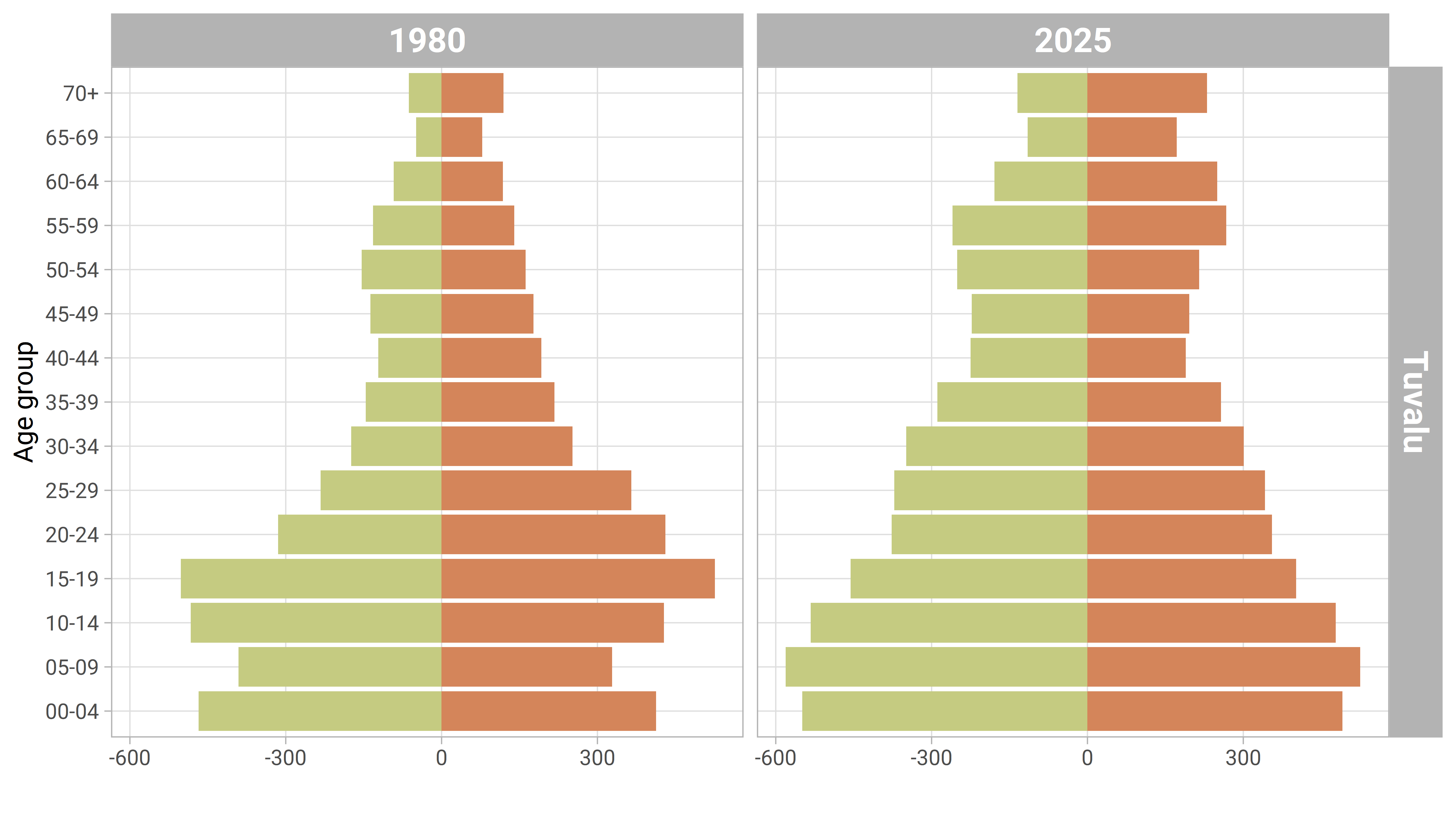
Until very recently, it has been relatively difficult to migrate out from Tuvalu. As a result we see a more or less regular population pyramid for a country in the late stage of demographic transition.
In contrast, here is French territory Wallis and Futuna:
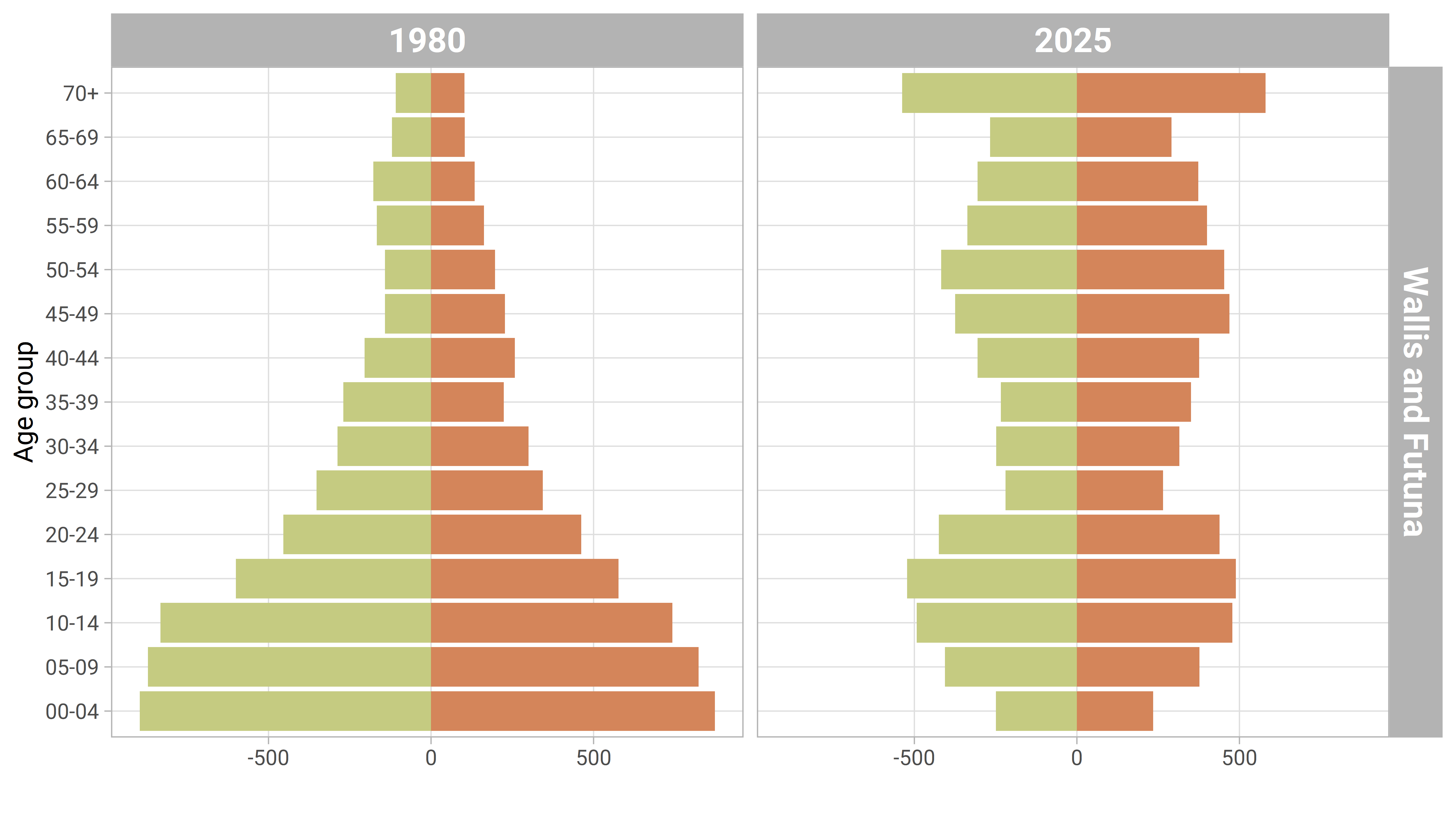
Wallis and Futuna’s inhabitants can move freely to other French territories such as New Caledonia, and have done so in considerable numbers. Hence we see a shortage in the 25-39 year age bracket.
Here’s the code to produce those pyramids for individual countries, saving them neatly in a folder for future use. Yes, I always use loops for this sort of thing, finding them both easy to write and to read (and saying loops are never any good in R is just outmoded prejudice):
#--------------population pyramid individual image for each pict-----------
# This section draws one chart and saves as an image for each PICT
dir.create("pic-pyramids", showWarnings = FALSE)

all_picts <- unique(d$pict)

for(this_pict in all_picts){
  this_d <- d |>
    filter(pict == this_pict)

  this_pyramid <- this_d  |>
    filter(sex == "Female") |>
    ggplot(aes(y = age)) +
    facet_grid(pict ~ time_period) +
    geom_col(aes(x = obs_value), fill = pal['Female']) +
    geom_col(data = filter(this_d, sex == "Male"), aes(x = -obs_value), fill = pal['Male']) +
    labs(x = "", y = "Age group") +
    theme(panel.grid.minor = element_blank(),
          strip.text = element_text(size = 14, face = "bold"))

  png(glue("pic-pyramids/pyramid-{this_pict}.png"), width = 5000, height = 2800,
      res = 600, type = "cairo-png")
  print(this_pyramid)
  dev.off()

}
That’s all for today. The final post in the series will say more about the implications of all this in the context of the other bits of analysis.